Have heard intervals.icu mentioned a few times on forums etc but never tried until today.
Still finding my way round but loving all the data and fitness display options. Just what I’ve been looking for, been finding Garmin connect very pretty but also kind of unreliable and fairly useless over the years.
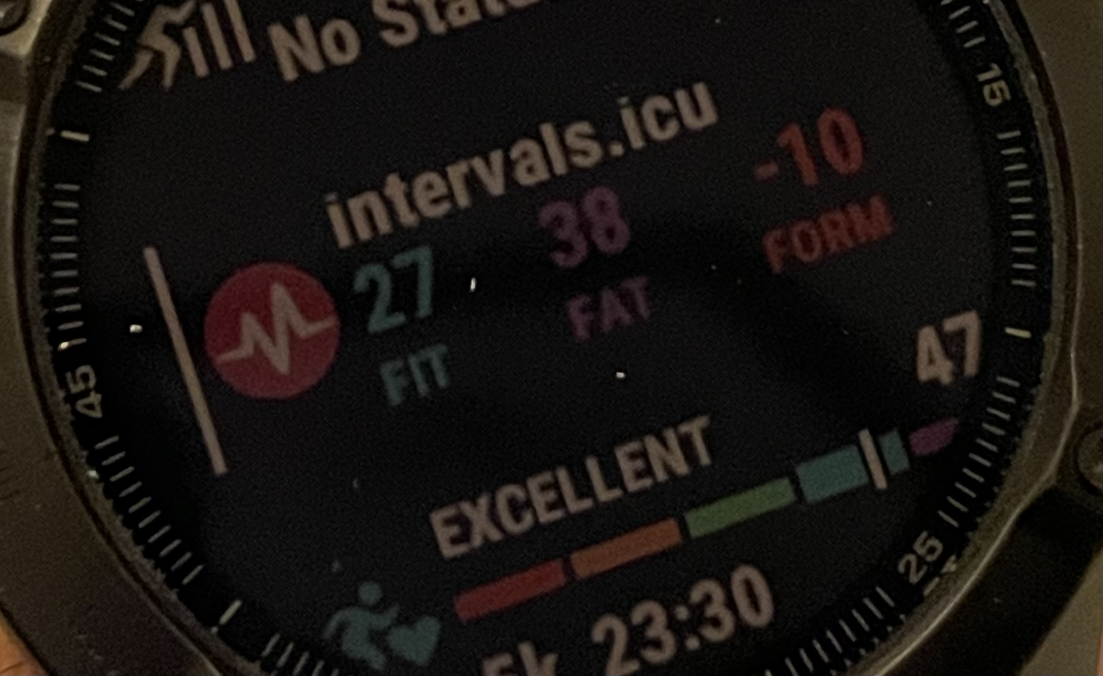
Anyway just installed this and works well on my Fenix 6 pro 47mm, with the notes below.
One question - should the colours be the same as the website? The first two (‘fit’ and ‘fat’) match on the watch but ‘form’ doesn’t - on the website the form is -12 and coloured green. On my watch, form is -12 and coloured red.
Trend indicators would be great and/or a guide to the effort to continue with vs rest?.or even a mini graph? Just ideas. Perhaps the numbers alone give me this - still unfamiliar.
Now wondering whether to delete my strava connection and sync straight to Garmin. Strava had more historic data but then again it’s two hops of sync Garmin-strava-intervals. Does weight etc come in from Garmin?
(Apologies am probably asking this in wrong place)
Edit: interestingly, today form is green and matches the web.
One other note - the purple is quite hard to read as it’s quite a dark colour, maybe a less saturated brighter purple would help.
Have you tested for battery drain? I just noticed mine dropped a lot more since I installed this than it usually drops. I have my battery otherwise very optimized, like I get over two weeks from a charge (Move IQ is off, first-party watch face with minimal info and no seconds, Pulse Ox just on-demand). IIRC I was at like 60% day before yesterday (when I added this widget) and am now at 40%. I will remove and report back in two days…
I haven’t directly tested it, but the way Garmin apps work they don’t do anything until the Glance is either highlighted or selected. There is nothing being processed in the background at all. It is extremely unlikely therefore that this app is causing any battery drain issues.
All of the data is pulled directly from the intervals.icu APIs (not calculated locally). If there is a discrepancy between the watch and the website, it is usually because one is a percentage value and one is absolute. These are configurable both on the watch app and the website.
Here’s fenix 6 and website for today.
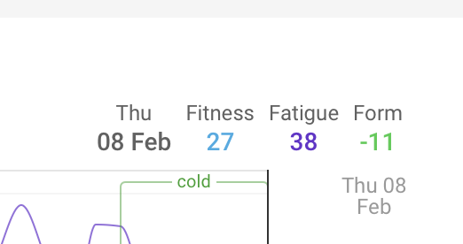
Note the -2 and -3 form discrepancy (presumably some rounding error?).
Also this was the colour thing I was asking about. Is form always green on the watch or is it meant to reflect the zone colour? In this case the watch is green but I’m in the grey zone on the website.
As a side note there was a bit of a delay clicking into the widget before showing next planned workout. Maybe it could sync that data before you press?
You are quite right. I saw no difference after removing it. Dug around further and finally realized that I’d upped my brightness to 40% which of course was the source of the drain. I just happened to do it at the same time as I installed the glance because I was playing around with it. So sorry! Great app.
Taken a look at this. Believe it or not, the widget is actually more accurate than the website.
The widget takes the values for CTL and ATL from the API, and takes one away from the other. The values are provided to 6 decimal places. This results in your form value (to 6 decimal places), which is rounded to present it in the app. It seems like the website does some rounding earlier in the process, so can actually show you the form value incorrect rounded to the wrong digit by 1.
The form colour in the widget follows the same logic as the website… -30% or more form is red, etc. Your form as a percentage is -41%, so is red. However, the thresholds are different if you display the value as absolute… -30 or more in absolute terms makes the form red.
Displaying form as a percentage is recommended (to manage load appropriately) but also the colours don’t really make much sense in absolute terms. -30 may be a huuuggeee deficit if you are not well trained, but a pretty small one if you are very well trained.
So, I am a bit torn with what to do here, and will open it up for debate. Do I simply make it match the same logic as the website, which is actually wrong?
Sorry if I opened a can of worms was just curious why they didn’t align
Numbers aside I’ll read up on absolute vs percentage as if I’m honest I still don’t really understand yet I just know I want the graph somewhere in the green.
(My numbers weren’t actually those either btw but that was because i had some experimental Garmin workouts on todays calendar and it had presumably taken that into account even though I hadn’t completed it. So now I’ve deleted the workout my form is less impressive )
Thanks I’ve read that now, very helpful. Might take a couple of goes to sink in, but seems I’d be better off sticking with absolute values at my level. Presumably you get a feel for it after a while?
You need some time to dial it in. If the number is in the Green but you’re feeling exhausted, something isn’t going right. Equally, if the number says you’re at High risk, but you feel like you could move a mountain.
After some months of training, you will ‘detect’ what range of number of ‘Form’ feels right for you. Then you can start using that range for planning, because you have an idea of what your body can absorb.