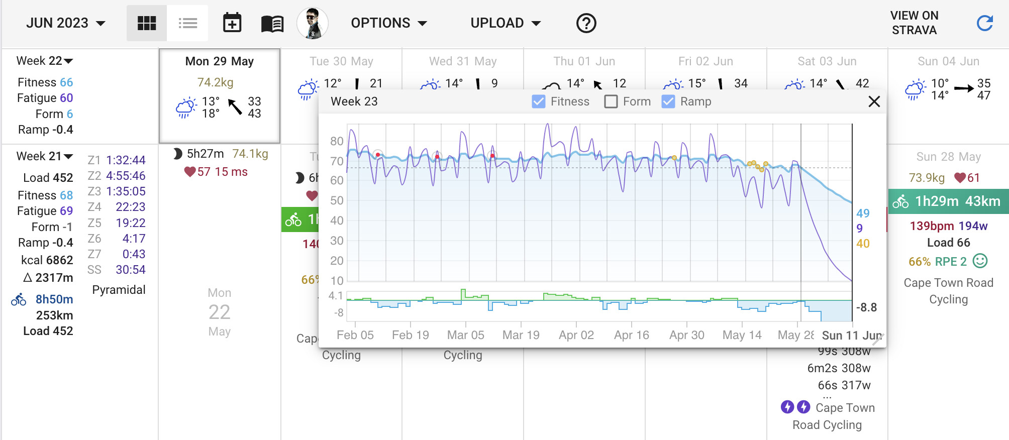
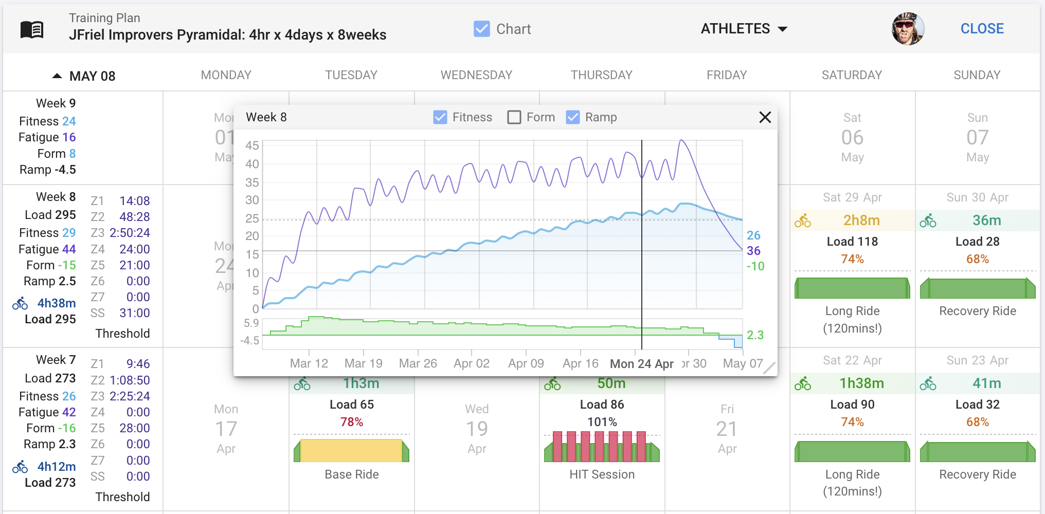
A popup fitness chart can now be displayed on the calendar and training plan views. It makes it easier to see the impact of planning without having to use two browser windows.
Hi @david,
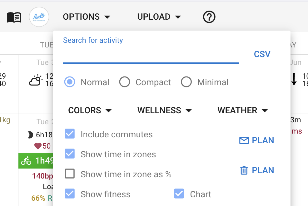
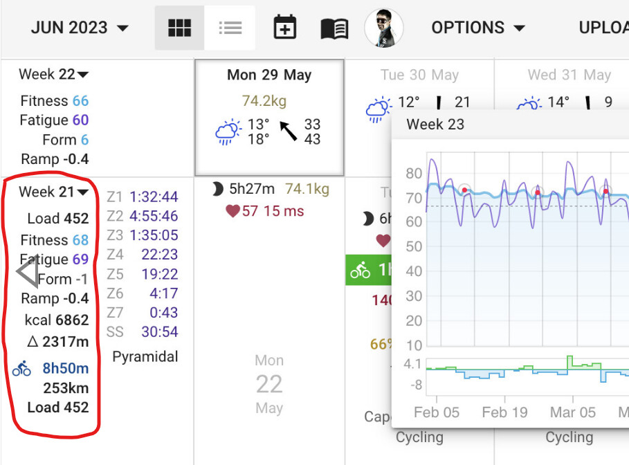
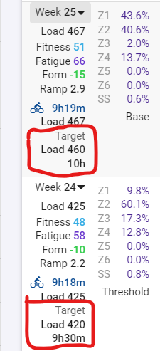
Is it possible to bring in the target load/duration to the training plan view, as it shows on the activities page, please? Makes for easier cross-checking weekly load/duration against the target values.
@david , this is awesome detail-oriented work. Thanks for continuing to reflect on this amazing set of tools you’ve put together for us, and for asking yourself how they can all work together more seamlessly. I hope you find this work sustainable. I can’t wait to see what Intervals looks like in 10 years.
@david Meanwhile, the issue with the ‘fitness chart’ update seems to have been resolved.
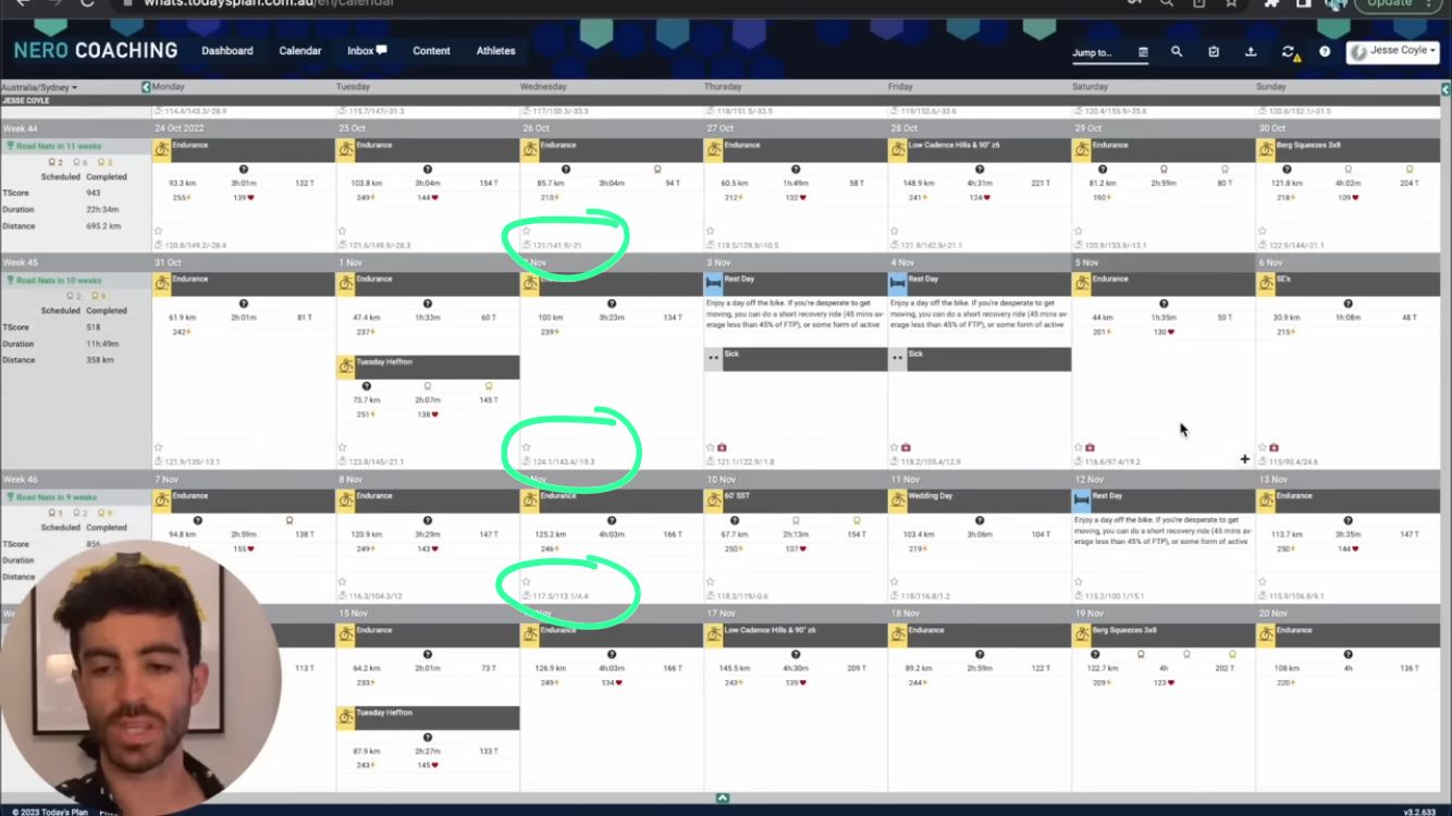
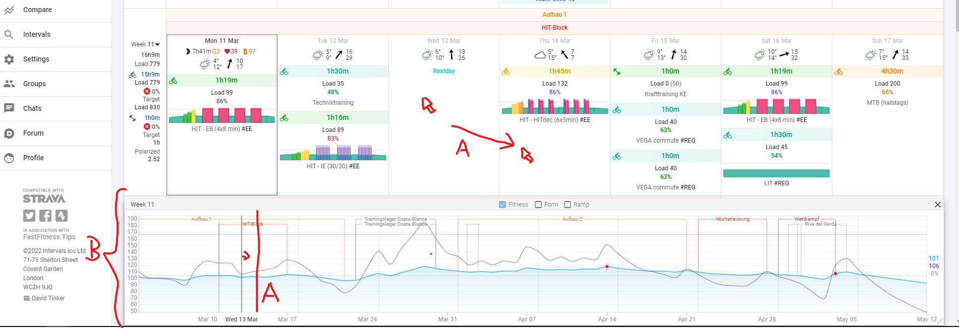
I love the “fitness chart popup”. For me, it’s one of the most crucial features for planning or adjusting the upcoming weeks/days. Occasionally, sessions are moved, deleted, or new ones are added. The chart quickly shows whether the changes fit the plan.
Nevertheless, I have two suggestions for improvement:
A: Marker moves when hovering over the calendar
It would be very helpful if the marker in the chart moved to the day you’re currently hovering the mouse over. This is very useful for planning the next week/days. It allows for a quicker understanding of how different sessions affect the chart. This feature significantly increased the value at Tredict.
B: The popup can be anchored
I can’t imagine planning without the “fitness chart” in the calendar anymore. Currently, I can work with the popup. However, a permanently anchored chart (either at the top or bottom) would integrate better into the calendar’s design. Currently, a part of the calendar is always covered because I insert the chart in full width at the bottom of the calendar.