Delta TSS(30s) for showing where it hurted the most :)

Hello!

I’ve been using this platform for quite a while and I found it absolutely amazing :slight_smile:

Having analyzed many of my workouts I have found that I miss one feature that
would let me know more about HOW did I get to my TSS this time.

I would call it deltaTSS(30s) and it would simply be the value representing
the difference between actual TSS (to this time in workout) and TSS 30 seconds before.
It shows the change of TSS in last 30 seconds.

Please take a look at my Excel graph for easier understanding:

I think it gives a lot of information and lets you find more about
when your workout hurted most in an easy, readable form.

On the bottom you’ll find another graph of showing how
tired you were. It’s a fast aproximation but still could be
implemented in the future.

Best regards!
BN

3 Likes

This will be a great way for me to learn that I should not exert myself running late to the training more than during the actual session :blush:

Thanks. This a good idea. I like the way it shows up the matches so clearly. A 30 second moving average of normalised watts would probably produce something similar.

Further down the line I want to have custom charts on the activity timeline like for fitness so people can figure out these kind of plots and others.

Here I have just plotted a 30s moving average of watts raised the 4th power (the start of the normalised watts calculation). This is basically just putting the power on a log scale I think. It shows up matches quite nicely:

Note that this isn’t live. Screenshot from my MacBook.

I think if I put a power zone based gradient on this it could be a cool and useful matches chart. Its just 30s average power with a log scale for the y-axis.

3 Likes

Thank you for being interested in it :slight_smile:

Your chart meets expectations and shows readable results about where you have done the most work. This can be very useful for analyzing a lost race (with for example too many attacks) and drawing conclusions for the future. Followers of the theory of burned matches will be happy :slight_smile:
I as a supporter of the bucket emptying theory will also see where the water spilled out :wink:

I am looking forward to see this functionality.

Thank you and best regards!
BN

1 Like

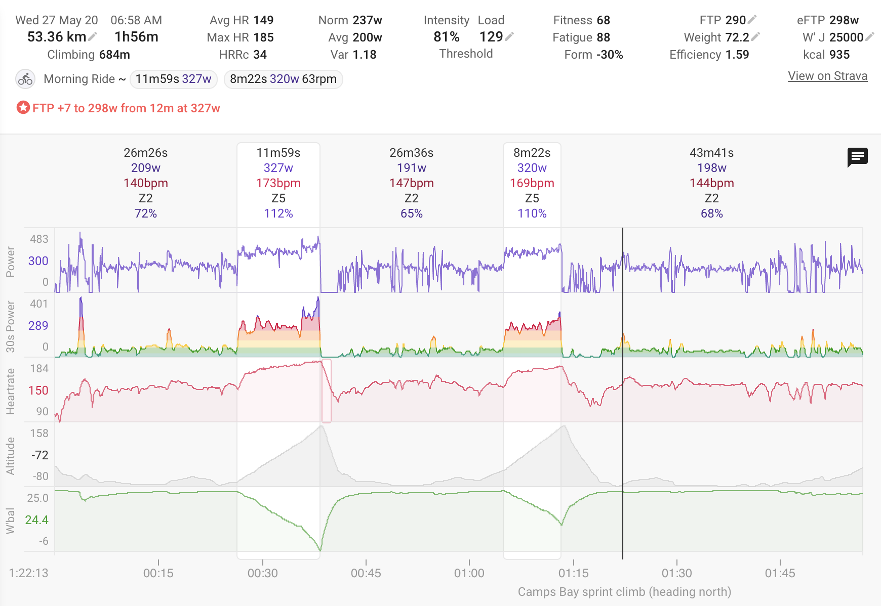
It is live. This is a 30s moving average of power on a log scale coloured according to your power zones. Shows up matches burned quite nicely.

9 Likes

It generally looks great! But one short sprint can spoil a lot :slight_smile:

2 Likes

You need to do more sprints, then it will look ok :slight_smile:

4 Likes

Beautiful! I think would be clearer to label it as “log 30s Power” since there are no axis ticks to highlight the difference between the power plots

Maybe :thinking:

1 Like

shows my matches burnt on the front pulling the team and recovery on the back in between, during last Thursday’s WTRL TTT, nicely.

2 Likes

Tx. I wanted to do that but there isn’t space for the longer label on the “normal” height chart.

It works great!

Autoscaling sometimes makes me confused on constant power workouts
but still the colours let me understand if it was strong or superstrong.

Thanks again for implementation!
Best regards!
BN

1 Like

Andrii_Magalich, david: Actually, the name of the scale is correct: it is “30s power”. Rather, it is that the scale is logarithmic.
There is a difference between plotting log 30s power and plotting 30s power on a log scale, and David has done the latter. So, if anything is changed, it’s the description below, not the name of the scale.

[Just to be really technical about it!]

Very nice. It seems to offer more insight for the real workload of stochastic efforts versus structured/consistent intervals. Just looking at the raw power trace from a race or group ride doesn’t capture this well, especially if it’s surgey

1 Like

@david - thanks for the new chart, I really like the display, which as mentioned above, tracks to hard efforts well (it also dovetails nicely with MPA from Xert).

You mention above that the colours correspond to power zones - I wondered if it is possible to show the power zones elsewhere using the same colours (for example, settings, activity power)? At present, my power zones elsewhere show up in purple only, and having the colours match across pages would be a useful way of eyeballing values etc.

1 Like

I agonised over this. It’s better from a data visualisation angle but not sure for the design. Anyway your post tipped the balance. Its done now!

Thanks @david - that works very well I think

Donation incoming (donations and feature requests working in reverse this time round!)

1 Like

Maybe if the graph had a log scale… it would look better when the activity has sprints? It’s the only bad thing about it.