Hi all! Is there anyway to plot charts for a workout choosing the Y and X axis? For example, HR vs. Power?
Yes you can but you need to build these using Javascript code running on the server and rendered in the web app using Plotly:
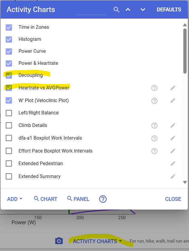
If you go to the activity power, HR, pace or data pages and click the “Charts” button at the bottom you can search for charts other people have made as a starting point. People have created some neat charts:
1 Like
Thanks!
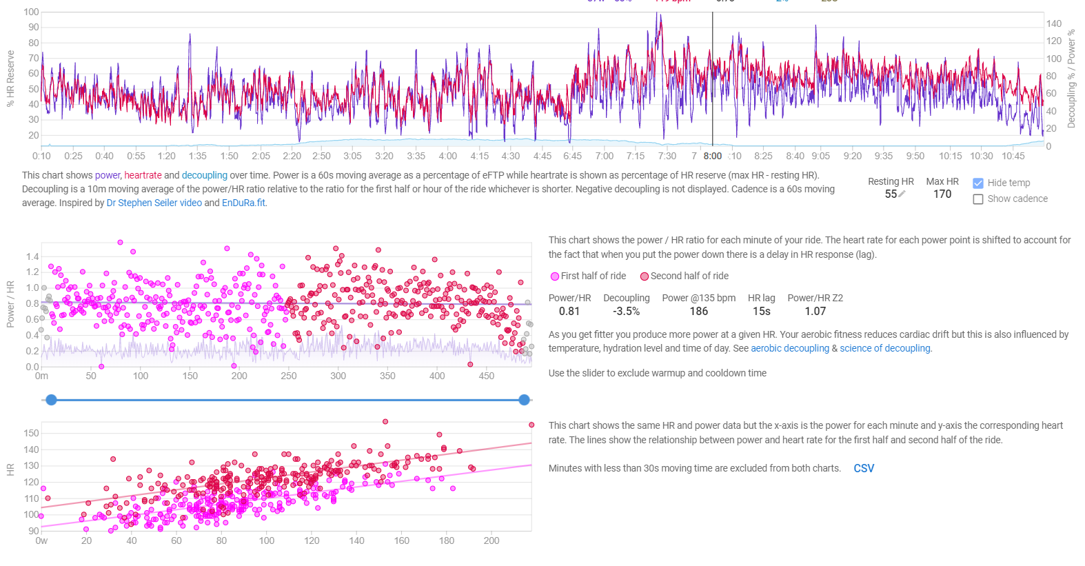
I’ve seen that in all customized charts the horizontal axis is time. I wonder if it’s possible to change this in order to plot HR in the vertical axis as a function of Power in the horizontal axis. This is useful to see the histéresis in HR, which is an indicator of the aerobic capacity.
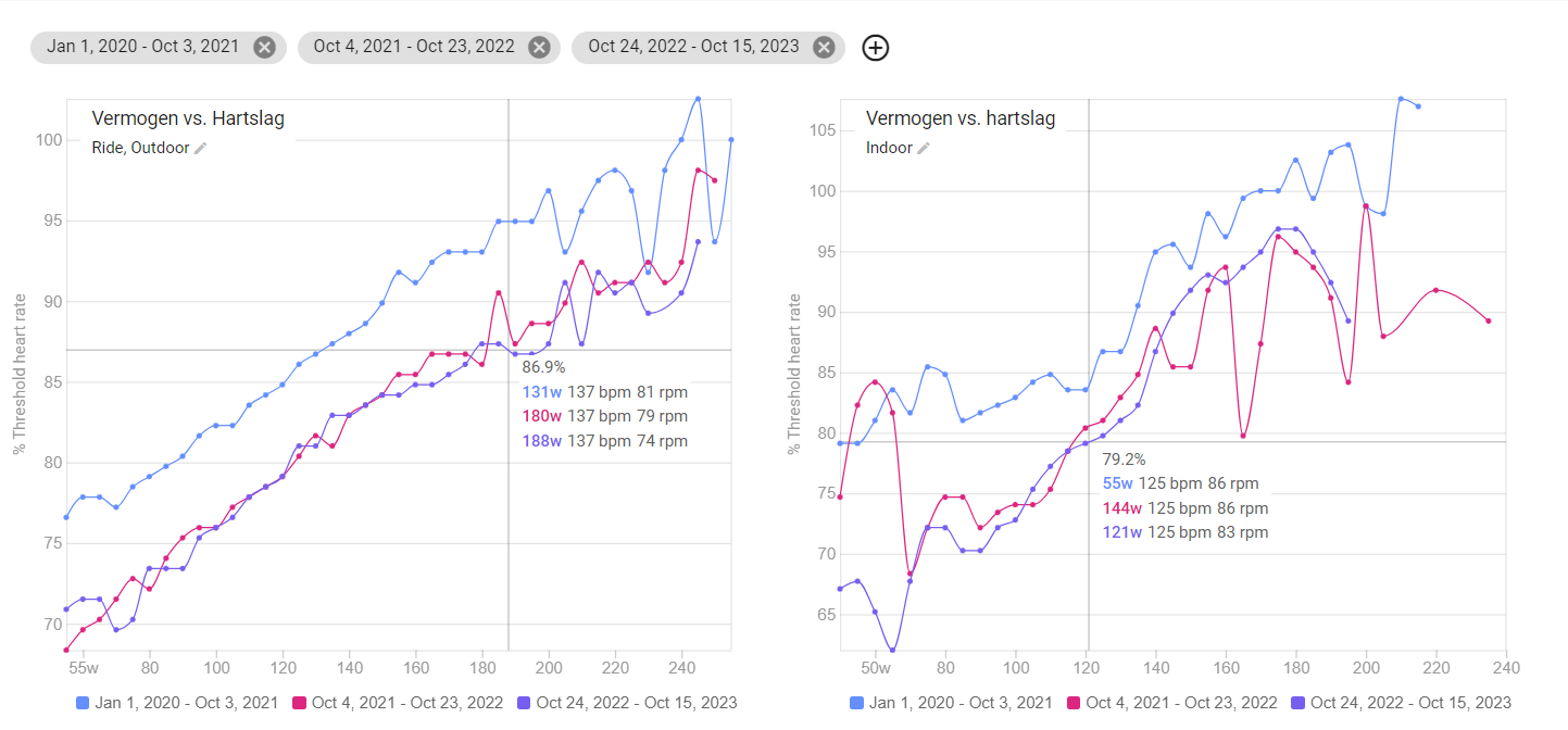
That chart already exists on the Compare page (although, that is a general chart and not activity specific).
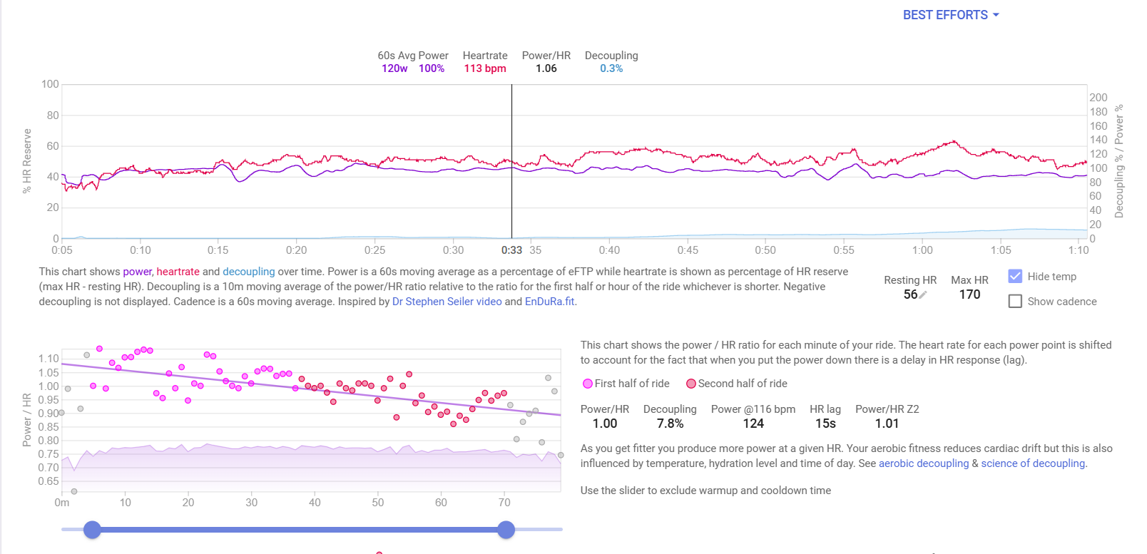
Power vs Heartrate where HR can be chosen as a % of max or Threshold.
Another way of checking Aerobic capacity/Decoupling is available on the activity HR page in Options. There’s Histogram, Power & HR and Decoupling chart.
2 Likes
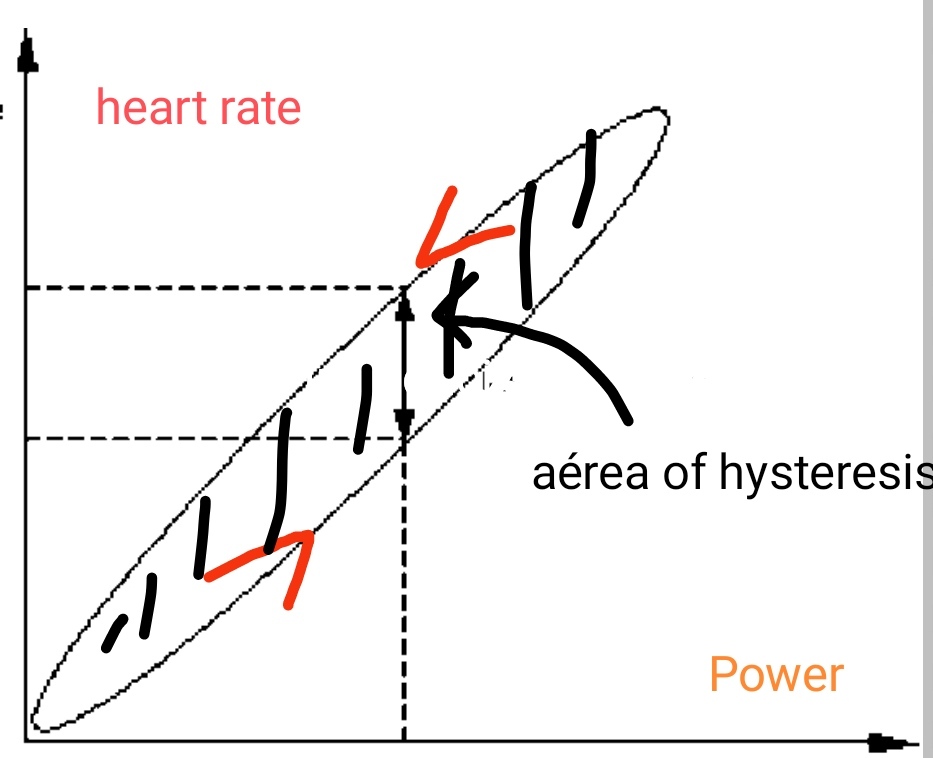
Yes, you are right but the point to see HR vs Power for an activity can be very useful specially for a dedicated test consisting of a power ramp up and down. HR will be higher for the same power when you ramp down than when you ramp up. That’ll give you a hysteresis curve with an area that can be used as an indicator of your aerobic capacity. I find this parameter more useful than decoupling.
1 Like
Haven’t seen this before but I’m always interested when something new comes around. Do you have any source with more info on how to interpret this?
And what’s the recommended speed for the ramp in %ftp/min?
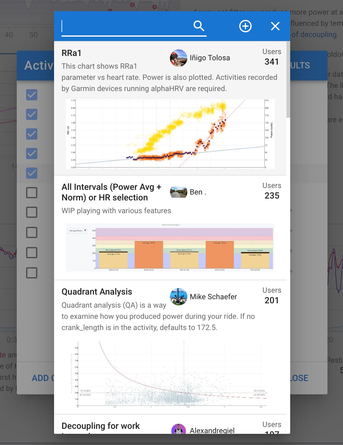
You could definitely build that. You can look at the RRa1 chart to start.
Incorporating hysteresis as a marker is an active subject of research. There’s not a protocol. You may check the following paper
I can’t find any way to customize the charts using javascript. Can someone point me to how to access this capability? I have been trying to get Gemini to walk me through it and am going in circles.
Edit: I actually found a way to add a Plotly plot to an activity. But I am hoping to add a custom chart to the fitness tab. I see a bunch of what look like user added metrics to plot - surely there is a way for me to add one myself???
To add a Custom Chart to the Fitness page, you first need to create the metric that you want to plot. That can be a Custom Activity Field or a Wellness Field.
Plotly scripts are for Activity Charts and can be created on the Activity Tabs, not on the Fitness page.
Search the above mentioned object names here on the forum and you will find what you are looking for.
Thanks, that is the conclusion I came to after some more digging. It seems though if I want to compute something like a readiness metric from the wellness data, I have to pull that data using the API, compute it externally, then push it back. i.e., Scripts can only be used on activity data, not wellness data. Right???
You can only script in activities at the moment. But you could also calculate data from Wellness fields inside of an activity in the activity scripts.
1 Like
Hi,
Is the decoupling chart still available, having trouble locating it and it’s a metric I’m keen on.
many thanks
Philip