Hi everybody! I’ve got a suggestion for better readability of the charts.
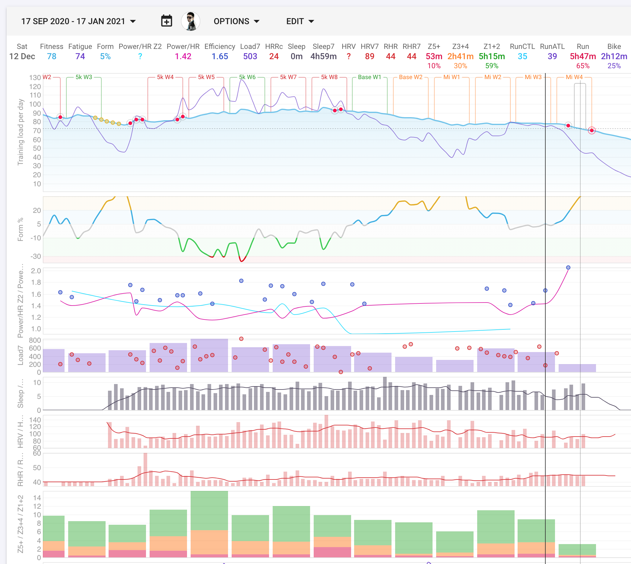
I have many custom charts and I group logically similar quantities together. For example, the plot below the form contains (Power/HR Z2), (Power/HR) and (Efficiency). Turns out it is difficult to remember which one is which.
My suggestion is: we have axis labels for each of the quantities. Let’s color them the same color as the lines/dots/bars