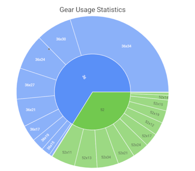
I just created a “Gear Statistics” chart, inspired by the one from di2stats.com. It shows a pie chart with the % of time spent using each gear combination.
I hope you find it useful!
Feel free to give it a try and share your feedback.
Thanks, it’s still a little rough around the edges but I’ll see if I can make it better.
A regular drivetrain has too many gear combinations and produces too many labels.
I need to familiarize a bit more with the plotting library and find ways to improve it…
Thanks for adding this chart, first of all I’m quite new with intervals.icu. I’am trying to set up the Di2 chart you developed. I have added the chart to my dashboard but there isn’t any data in it. Do I need to do something more? My fit file contains the gear history. Thanks for you answer.
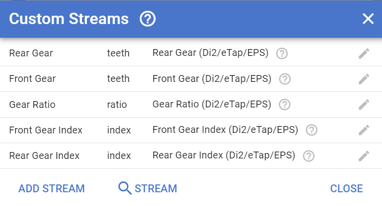
@Fleshi, as @MedTechCD suggests, enable the stream first. I probably did this some time ago and forgot completely about it but I checked and I have the option enabled.
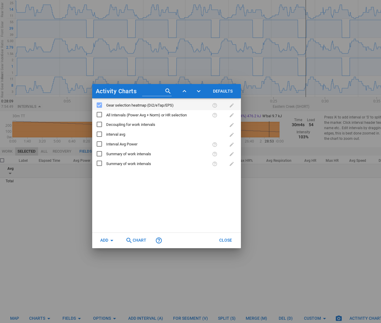
Open an activity, scroll down and click on “charts” menu, “custom streams”, Click on the magnifier and search for the Gear streams by Jonas H.
I have these enabled:
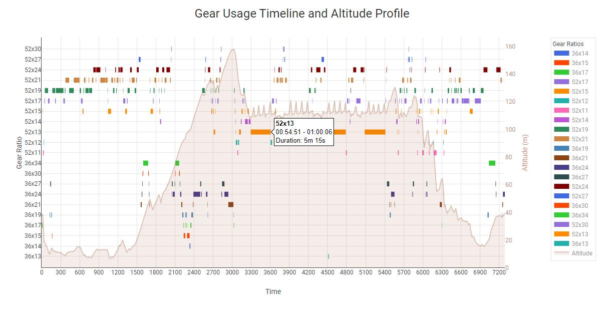
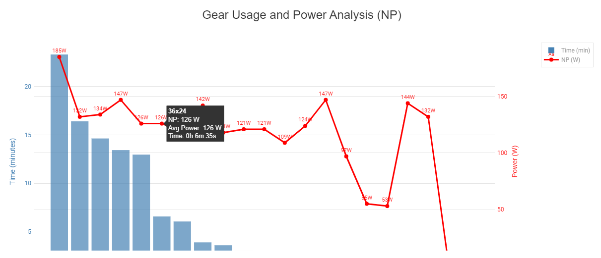
I have created these graphs, I don’t know if they can be interesting or not, one is based on @ariel.popovsky and then I took as a reference the di2stats.com website to make something similar.
I have added all 5 streams which all give interesting graphs in the timeline. But my “Activity Chart” is not rendering. Not empty, but not even rendering.