Under “Compare” I would like to add a graph that displays the Cumulative Training Load but using TSS instead of amount of kms. The idea is that I can compare my TSS as opposed to other years.
Is this possible?
Under “Compare” I would like to add a graph that displays the Cumulative Training Load but using TSS instead of amount of kms. The idea is that I can compare my TSS as opposed to other years.
Is this possible?
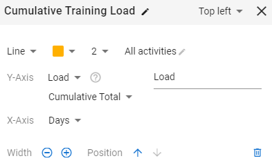
There is already a preconfigured chart under the Add Chart button on the Compare page which will help you with this:
Thanks! Must have overlooked it 
The x-axis is missing the option to see the data in weekly buckets, which is what I need to be able to quickly analyse weekly progress.
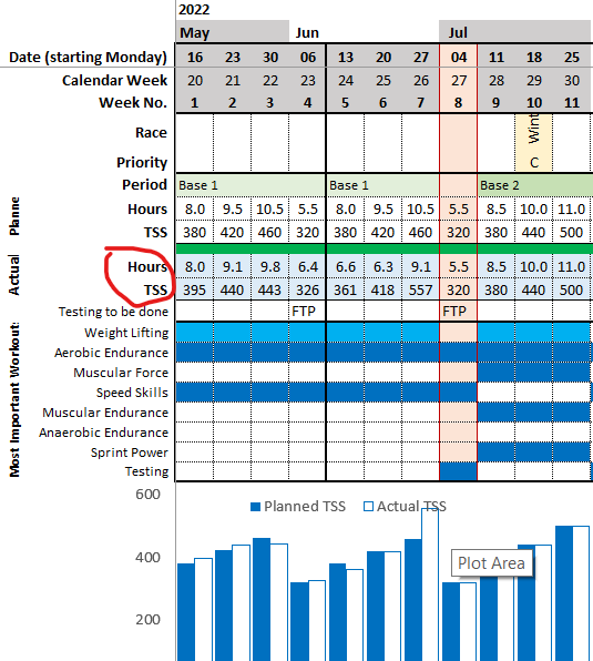
I find it easier to export to Excel (using the API to auto update my spreadsheet), then analyse from there. Here’s an extract of my annual plan with the planned vs actual (hours and TSS).
is it possible to ask You about getting such an Excel table or is it possible to create an annual plan here in APP like Joe Friel shows in his book?
I don’t have permission to share the tables you are referring to in Joe Friel’s book; it’s copyrighted.
The excel file for the ATP is available in the help section.
https://forum.intervals.icu/t/apps-in-excel-a-guide-to-getting-started/20844/16
You can insert the planned TSS per week, based on the values referenced in the book, and the ATP will then work as per my screenshot above.