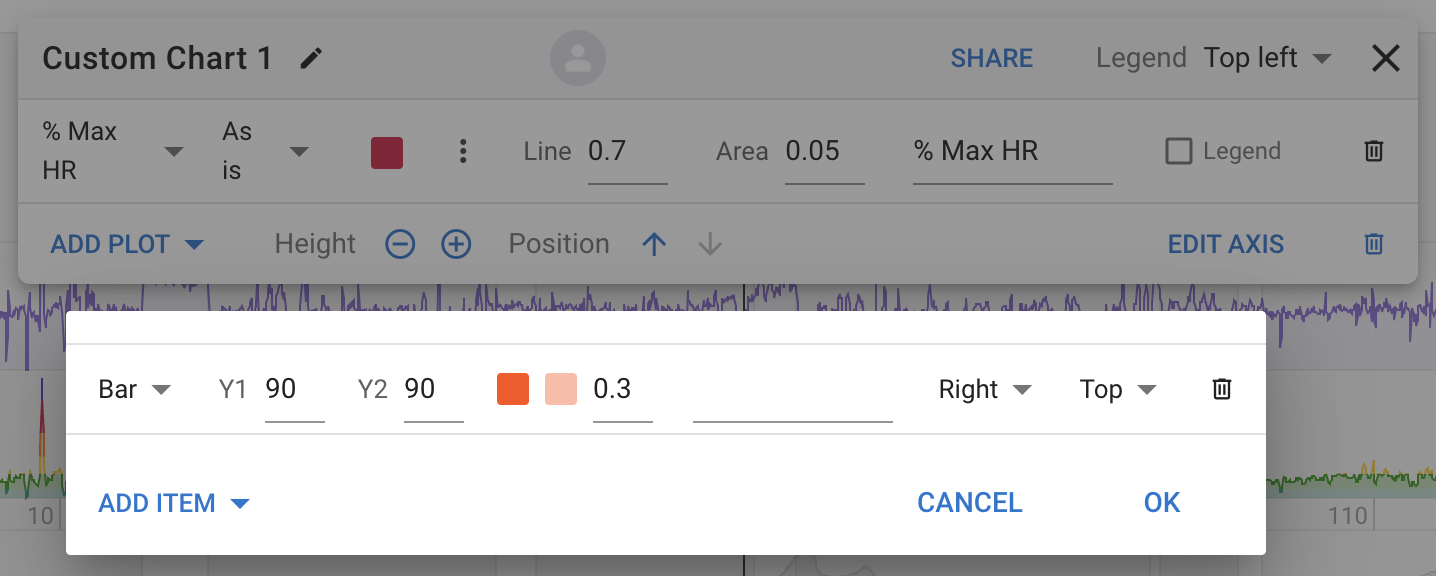
I didn’t see a way to do this wondered if this could be a potential feature. I’d like to have a configurable HR chart with a user-entered threshold value. This would draw a threshold line across the HR graph and highlight values above it. Also in the interval field it would show time at or above the threshold value. Possibly this could be applied to power too but my personal interest at the moment is time above n% of max HR.
Edit: additionally this could be expanded to an upper and lower threshold to give time in specified zone.
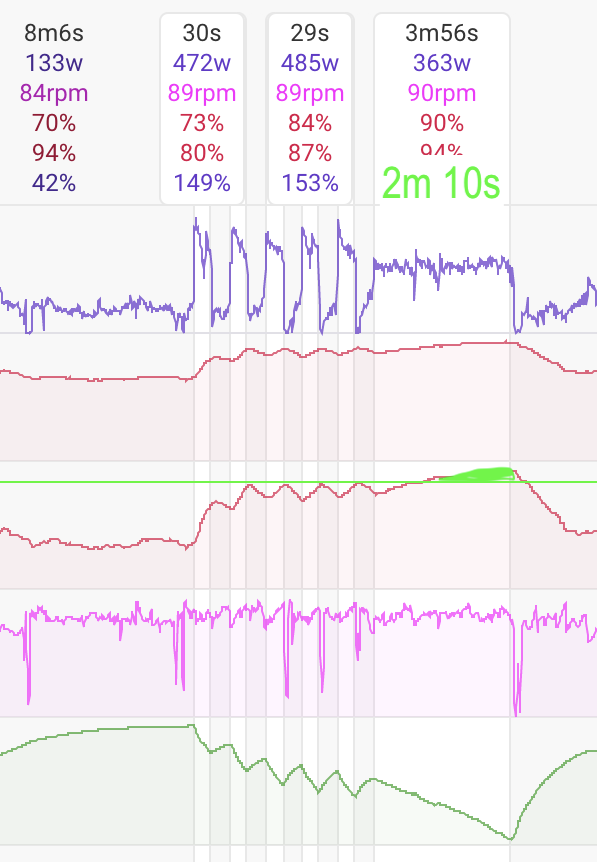
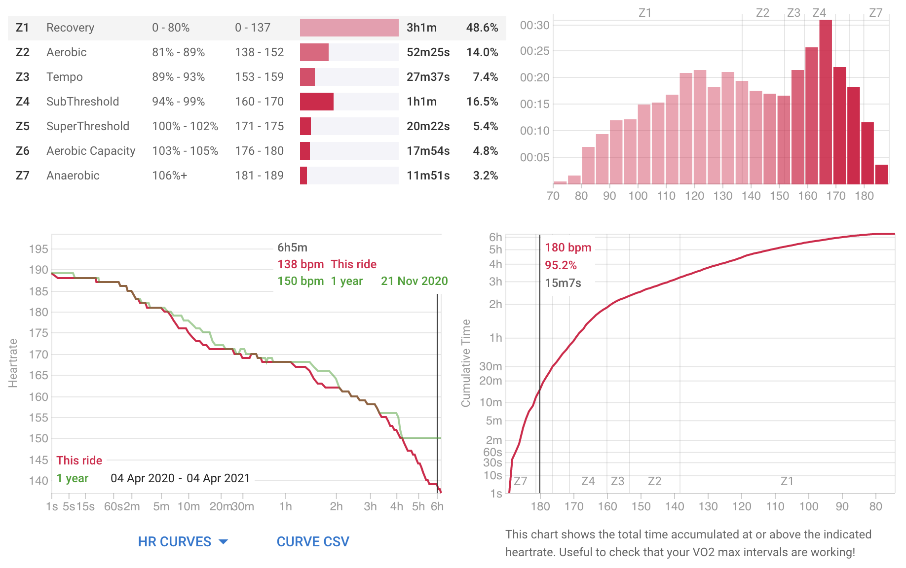
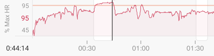
Thats a good idea and now on the list. There is a chart for that for the whole activity on the activity HR page. Here is MVDP in RVV. He spent 15mins above 95% max HR!