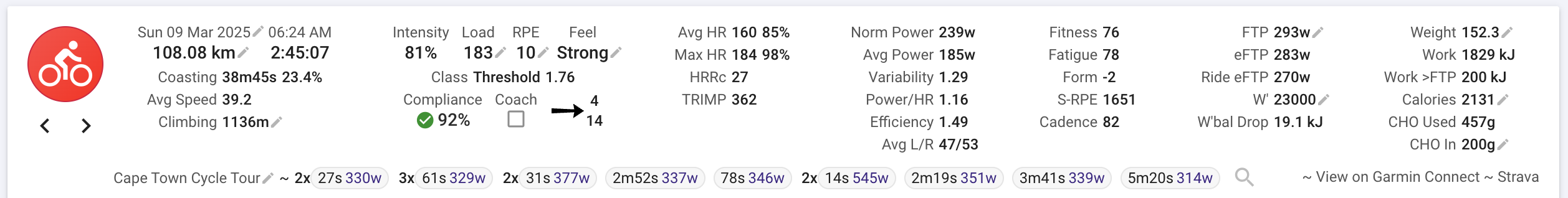
I am halfway done with a new premium feature: Making the fields and layout of the activity summary panel configurable (including custom fields) and shareable.
You will also be able to add multiple panels with different configurations to all of the activity pages. This will help a lot with Intervals.icu on small screens. Also the columns now line up a lot better, especially for non-English languages.
I am going to deploy the first version of this on Friday for users with beta features turned on (look in “Developer Settings” on the /settings page to enable beta features). You can’t edit yet or add new panels but IMO the new default layout is an improvement already, especially on mobile.
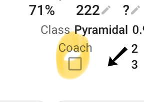
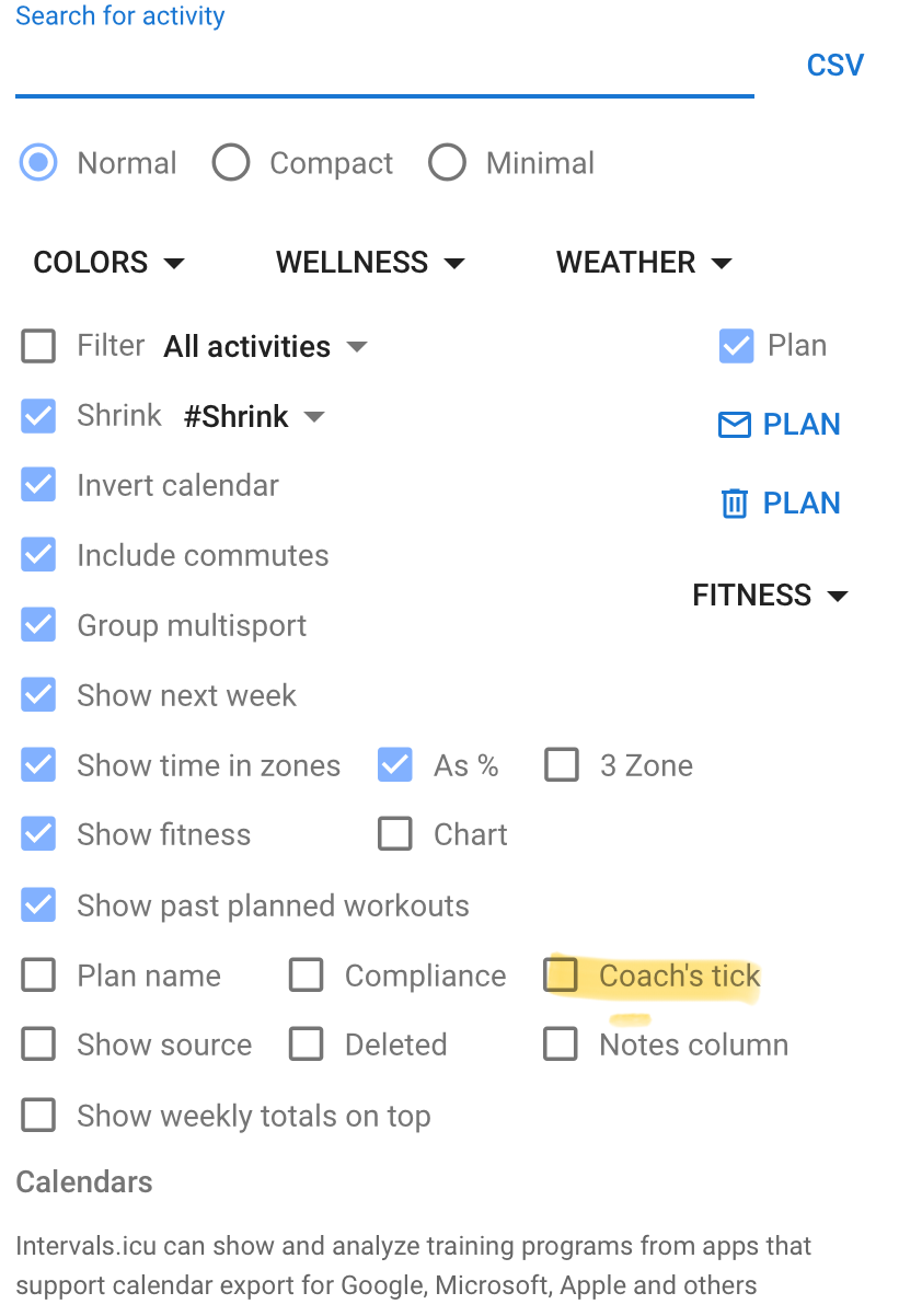
The options apply to the calendar page and not to the activities. Before if you were looking at your own stuff the coach tick would only appear if one of your coaches had selected an option. I decided to leave it on so people could more easily discover the feature. Soon you will be able to edit the layout and delete it if you like
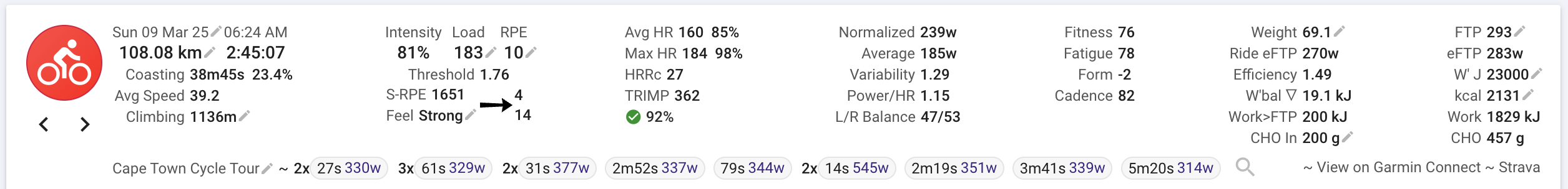
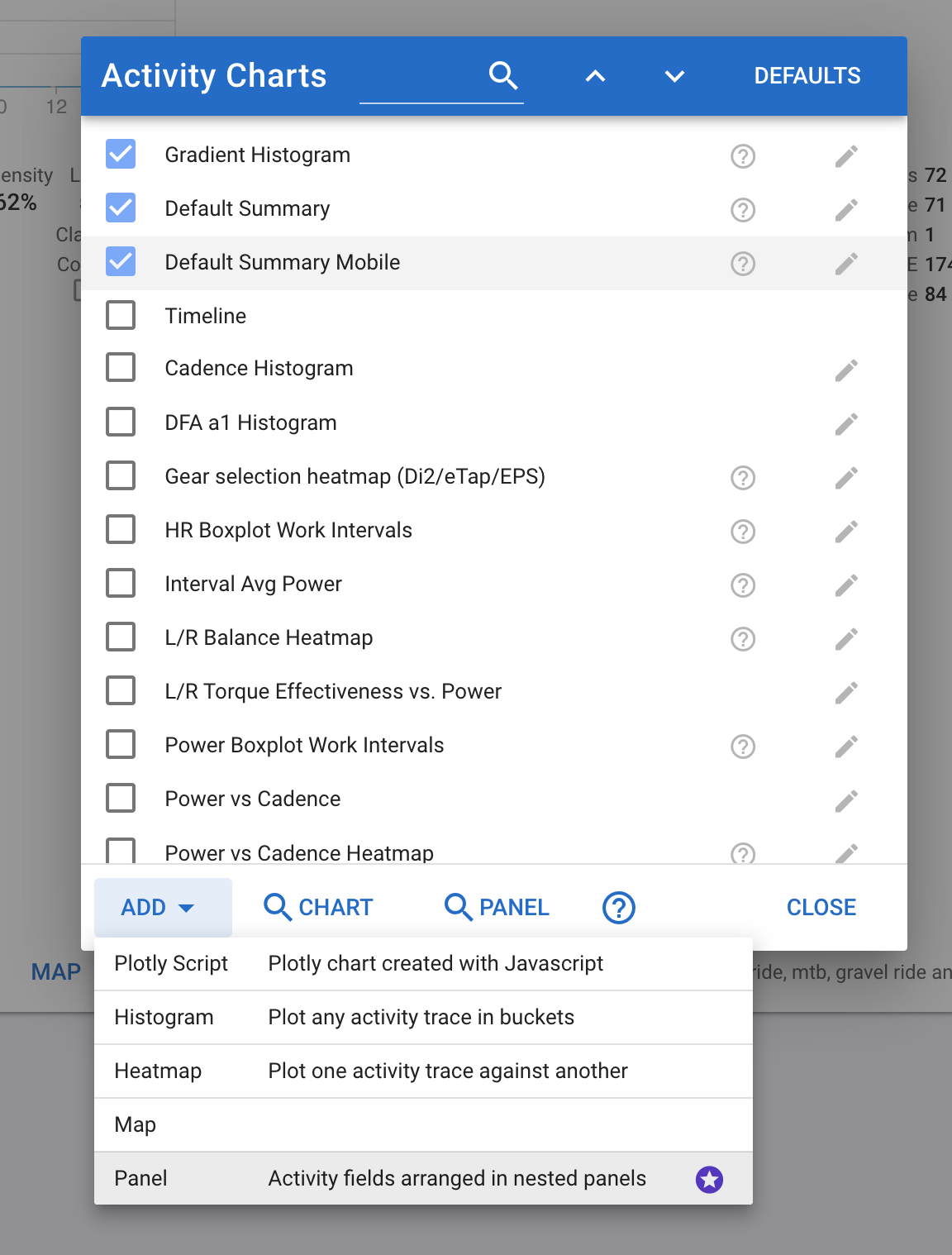
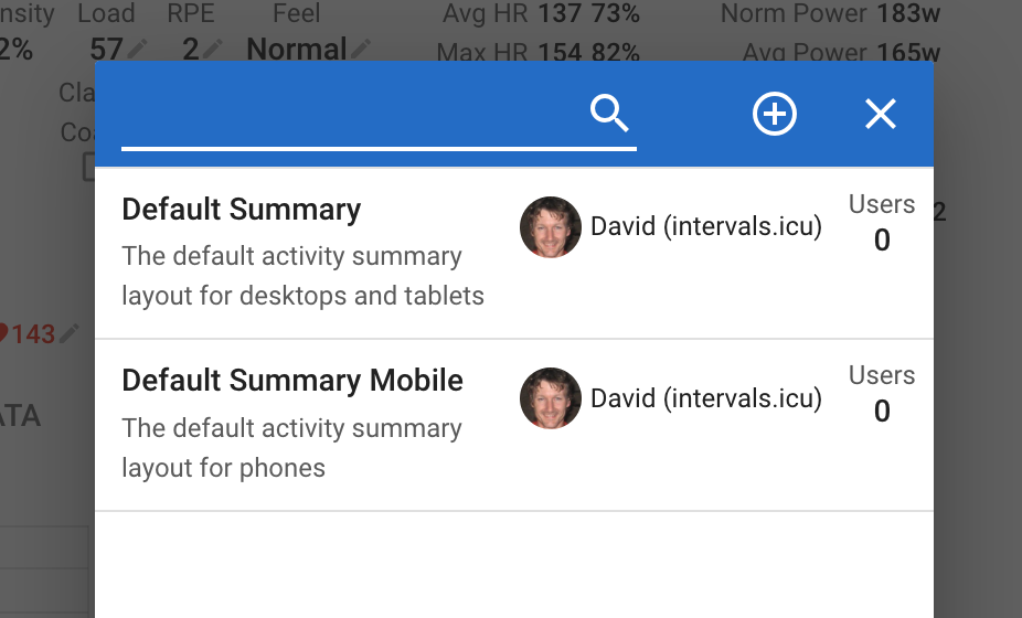
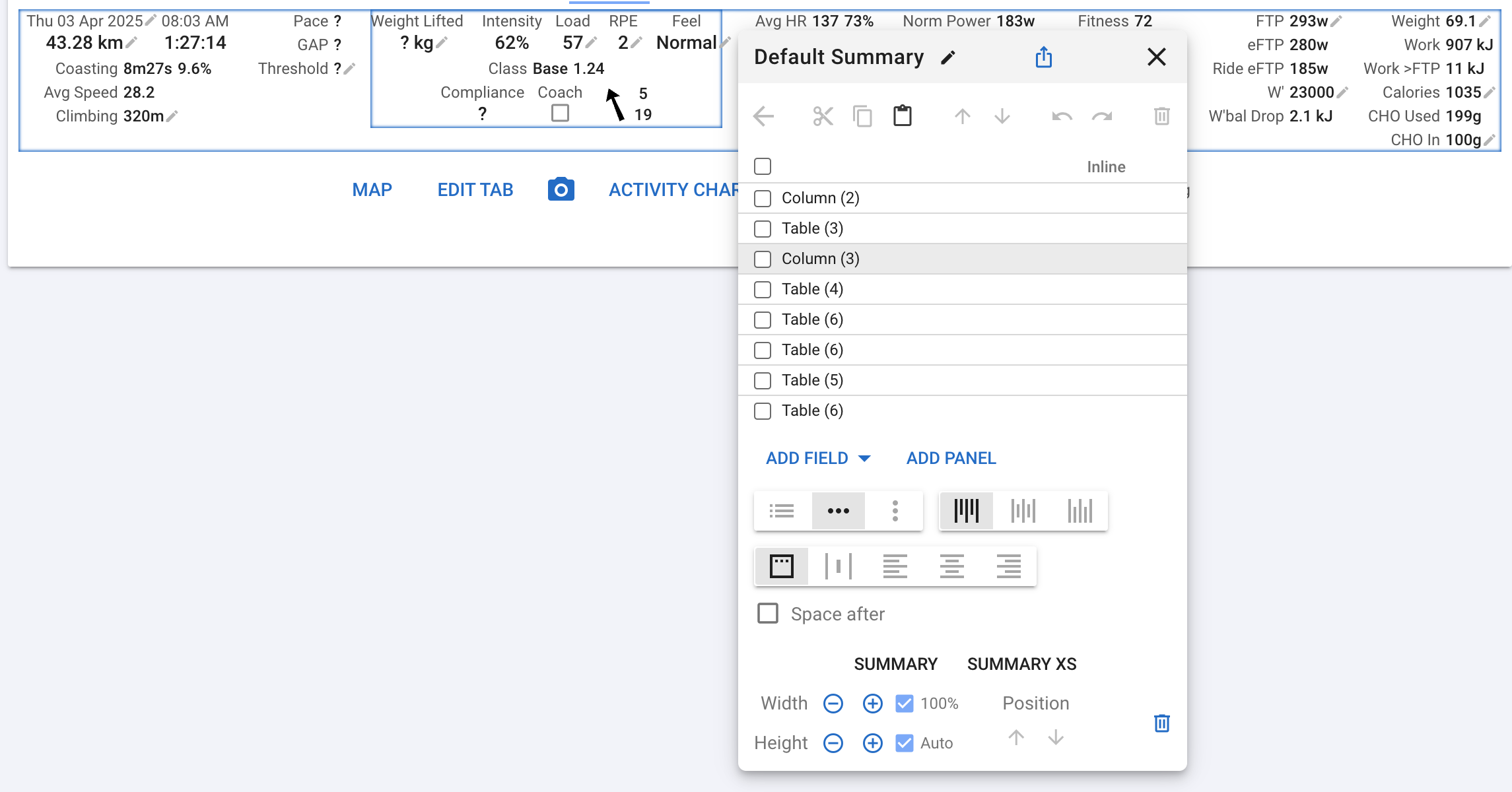
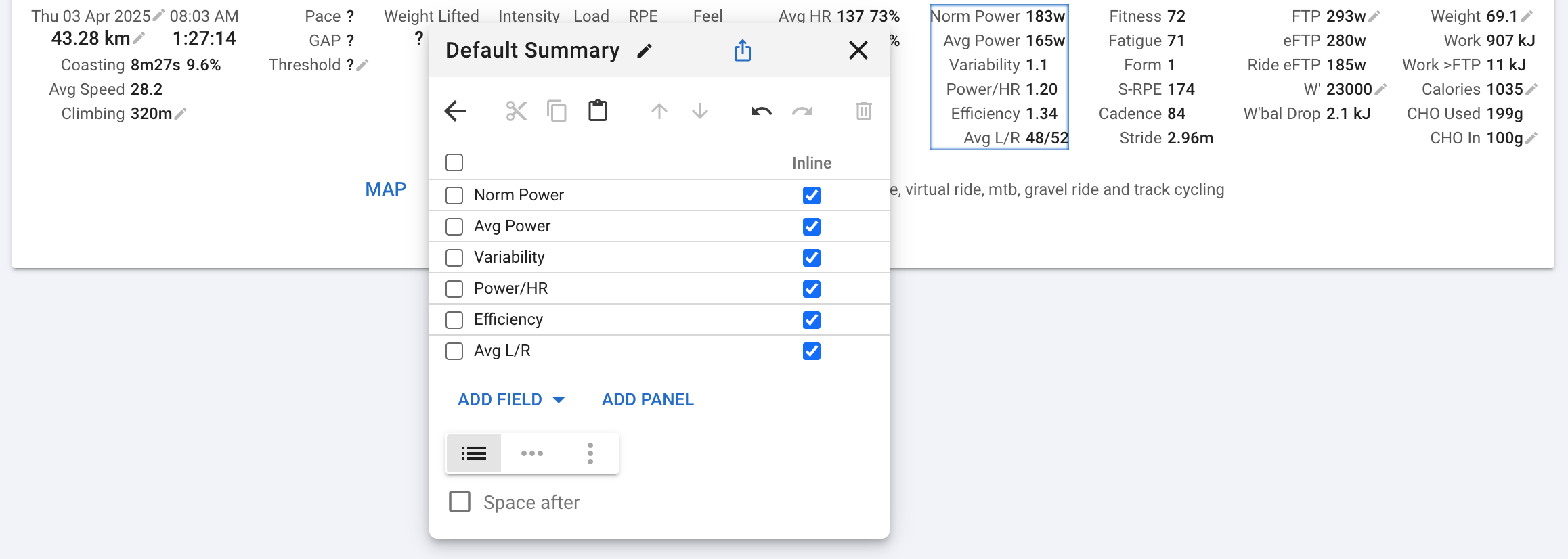
The first version of this is available if you have beta features enabled. You can’t edit the default summary yet but you can create new panels with whatever you like (similar to activity charts). Click “Activity Charts” on any of the activity detail pages:
You can edit existing panels using the edit button next to the panel in the activity charts list. I am going to add icons to better distinguish the panels and charts.
The layout is constructed from panels (layout is table, row or column) containing other panels and fields.
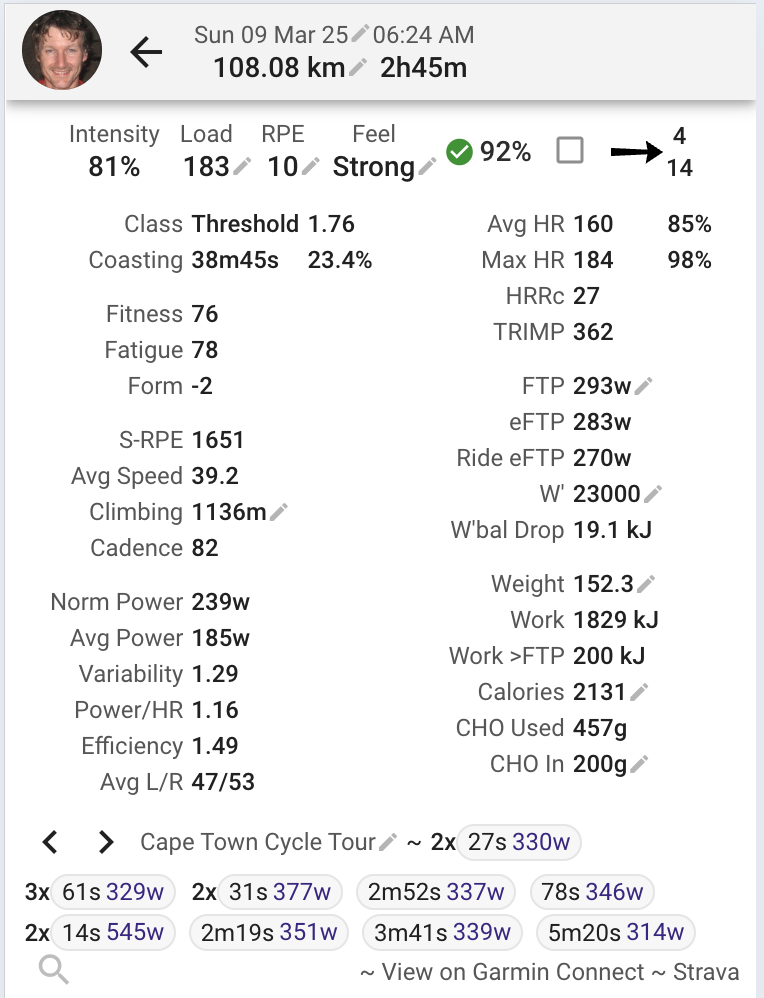
You can select multiple items from those in a panel, move up/down, cut/copy/paste, delete etc… The editor supports undo and redo and saves automatically.
Use the back button (top left of toolbar) to go back (up) to the previous panel.
All fields are displayed while the editor is active. Fields that are not applicable to the selected activity are hidden when the editor is not active (e.g. the pace fields here because this is a ride).
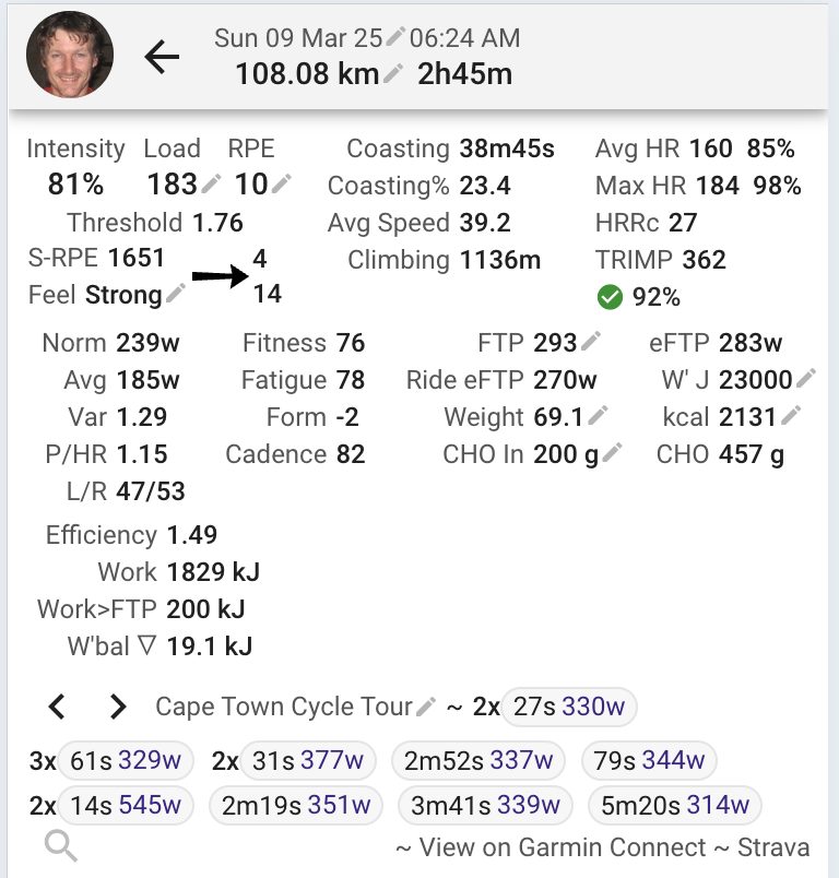
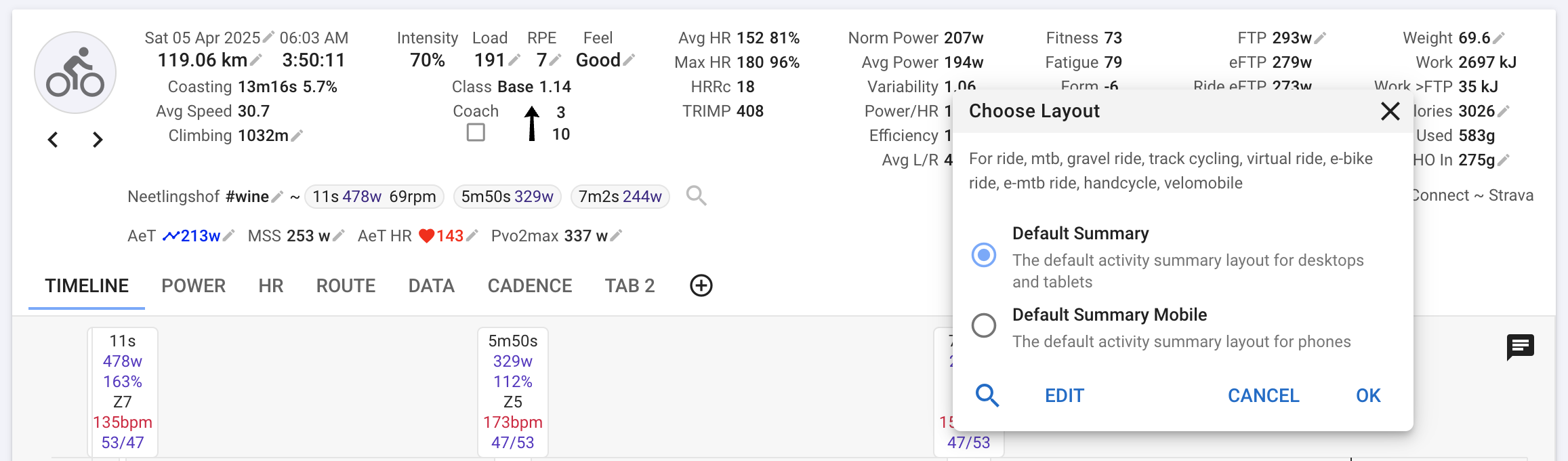
Your custom panels are shared between all tabs and desktop/mobile/tablet but the ones that are enabled are specific to each sport and display size.
That’s not so easy to do. The panels are shared between all devices, you just have to select the layout you want once per device. I made the assumption that you wouldn’t want the same layout on a phone as on a laptop.
It would be nice to have the numerical data on the fields with conditional colors…eg: if AVG HR > 100 red, if AVG HR > 150 Purple, etc…
For all numerical data
Great features, but it’s not working correctly. I removed some fields, and they still appear, misaligned. Some existing fields are displayed as unmarked on the editor, and I can’t remove them.
Could you please post some screenshots. The editor is a little complicated to use especially on the default desktop layout. Also it likely has some bugs.
I had a few bugs at first too. Columns wouldn’t move left and right, and things disappeared at least once when I reloaded the page. But then I started saving my edits using the “share” function, and I didn’t have any more issues.
Once I got used to the editor, it was actually quite easy to use and very functional. Great work, David!