Change activity summary layout

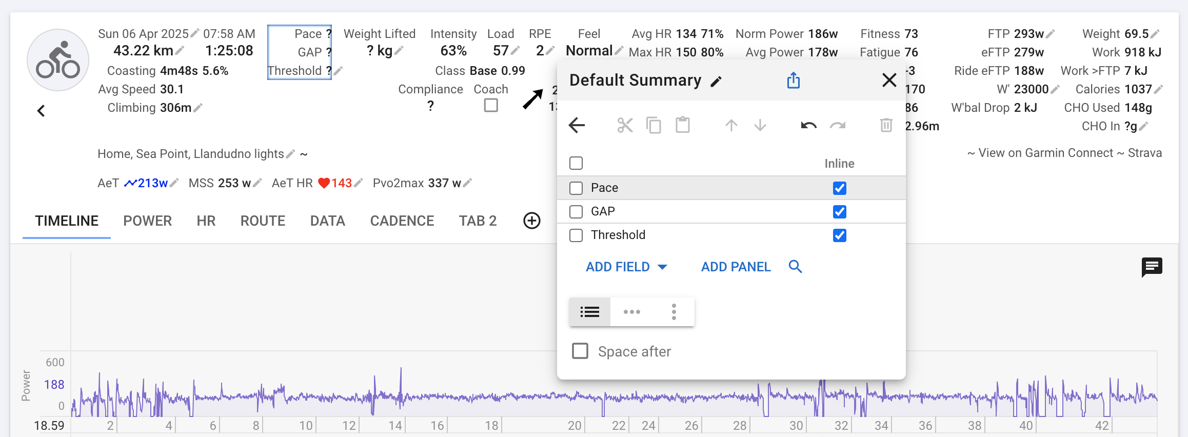
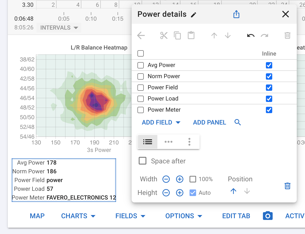
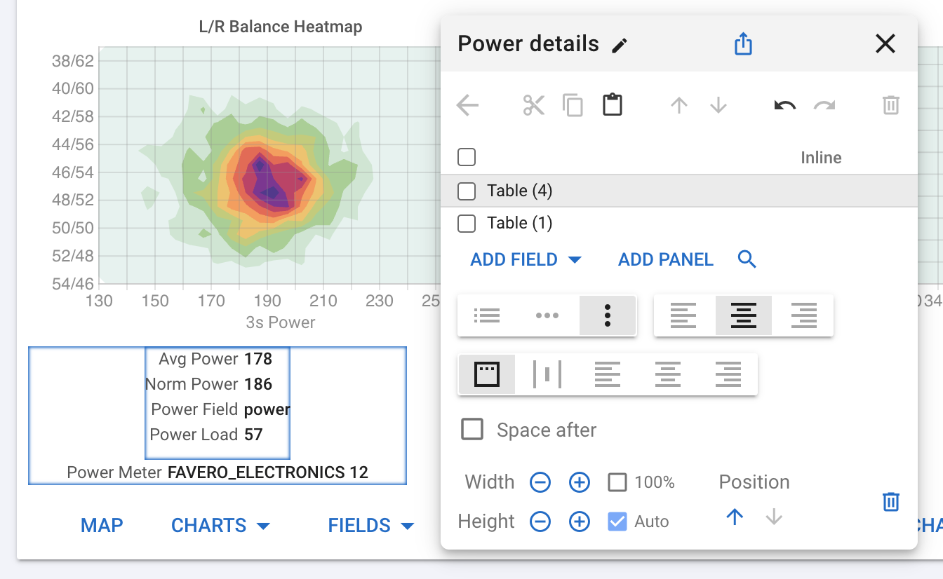
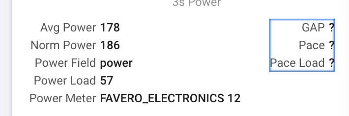
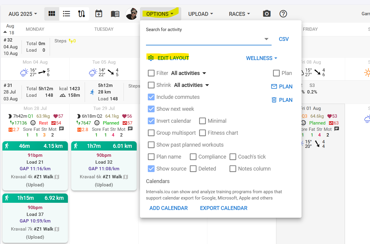
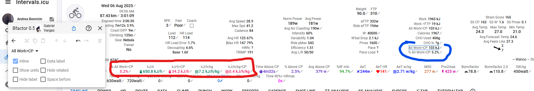
The layout of the activity summary panel is now configurable. You can delete fields you aren’t interested in, add any of almost 150 activity fields as well as your own custom fields. This is a premium feature for supporters (thanks!).

Choose Actions → Edit Summary under the activity timeline chart.

You can choose one of the standard panels, search for panels shared by others and edit the current panel.

If you edit one of the standard panels then you get your own copy. You can easily switch back.

You can also add extra panels to any of the activity tabs. Click the activity charts button:

Then add a new panel or search for panels that others have shared:

You can create simple tables of fields or add nested panels to create more complex layouts.

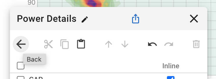
The editor has cut, copy and paste, undo/redo and saves automatically. Click a panel or field on the grid to edit it and use the back button when done:

Use the search button to insert existing panels into this one:

Note that the editor always shows all fields but fields without values are hidden when the editor is closed.

So the pace fields will disappear when looking at a ride etc…

34 Likes

astonishing…
seriously

4 Likes

This is just great!!!

Gives so much possibilities for customization.

3 Likes

G E N I A L !

@david, you are amazing!

3 Likes

Phenomenal, like always. Already edited my summary, piece of cake! Thanks. Happy to be a paying customer!

1 Like

The selected layout on phones is now different between portrait and landscape and the default for landscape is the wider desktop summary.

3 Likes

Brilliant…! Znakomite…! Vynikající…! Excelente…!

Don’t know if it is related to this but the calendar start page on phone in portrait mode was different this morning. The only directly available buttons are Library, Coaching and Options.
I really do miss that ‘Add Entry’ (+) button to quickly add Wellness data. That now requires turning to landscape or clicking the 3 dot menu. I there any way to choose which buttons are displayed on top?

1 Like

I was doing some work there and I noticed that the buttons didn’t fit on quite a few phones so I moved things to the dot dot dot menu.

There really isn’t space for any more buttons. I would need to move “Ask A Coach” to the dot dot dot menu. What do you think?

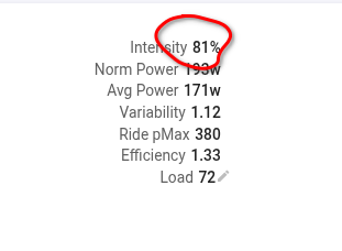
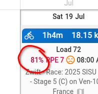
That would be fine for me. But if the majority likes to keep the Coaching button, I can live with it. I already changed my behaviour and tap the wellness section in the morning to add data.

1 Like

Seems like the layout on mobile is reverted to the default after going back to the calendar and opening an activity. Is this a known issue?

That broke with the big library update. Just fixed. Tx.

Ack I broke default activity summary layout selection on desktop. Fixed now :frowning:

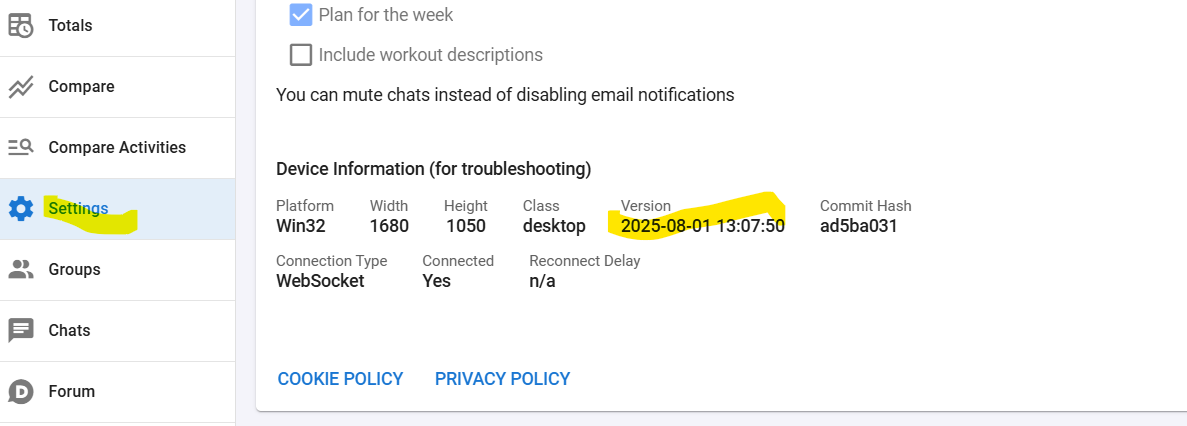
This got fixed for a while but I am still having intermittent issues where an edit won’t be applied unless I apply another edit after that, sort of. So e.g. if I remove a field and refresh, it’s still there, if I remove a field and then another field from a different table, only the first field disappears if that makes sense. (tested on desktop) @david

Is it possible for “Intensity” in the activity summary to be colored (from a color scale), just like the intensity on the calendar?


1 Like

I’ve also noticed that some fields aren’t loaded automatically. For example if I add “Gear” to the summary it doesn’t show up initially, I have to open the popup that lets me edit the gear for it to load and then show up in the summary.

Hi, I’m a paying supporter and very happy to be. But why isn’t that “edit layout” option appearing?

Are you looking in the right place?

And on the most recent version?

Make sure the news announcement tick box (in settings) is active.
Then you will get updates each time they are announced.

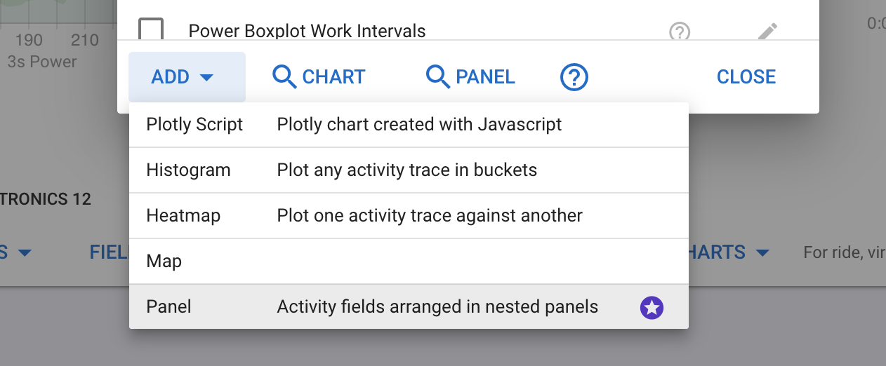
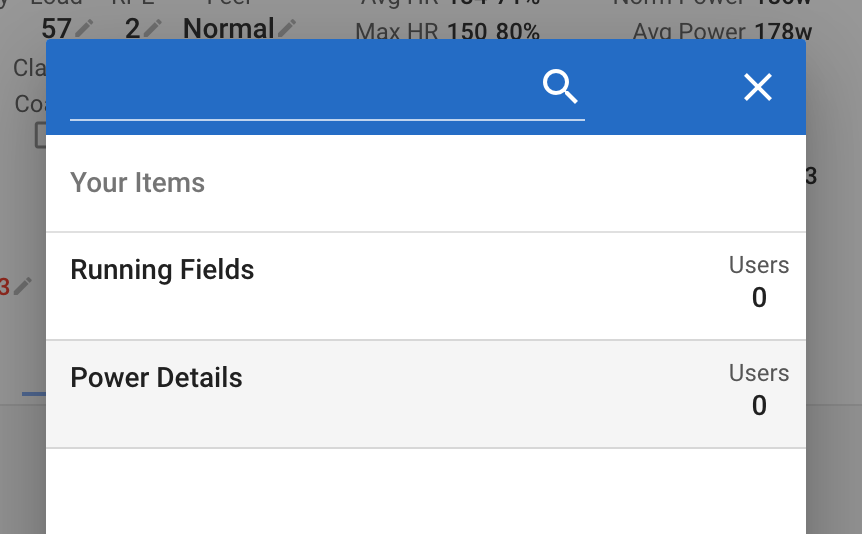
Hello @david , my idea is to add some custom scripts directly to the panel. This way, when I onboard new athletes, I already have everything set up exactly how I want it.
Right now, I’m simply using custom fields like that, but it’s not ideal — it’s much slower to edit every custom field, position, etc.
Adding them to the panel could really be a game changer. I’d also love to have options for custom colors or more editing features.

Even for other metrics, like load or HR load, it would be great to have different color options or more advanced customization — like inserting real tables, for example.
I think this could add real value to the panel and to Intervals in general.

For example, I’d like to have the red-circled fields in the blue positions, but using my custom color settings.