Hi, just come to intervals.icu and getting to understand the metrics but need a little help in understanding how to set the “Compare” menu and understand it.
At present I am looking at Power vs Heart rate.
I put in dates May-Dec and Sep-Dec.
I am getting a red and a blue data lines.
The legend is showing the dates. See the uploaded screenshot.
I had expected the data lines to show HR on one and Power on the other.
Hope somebody can advise me a bit on this.
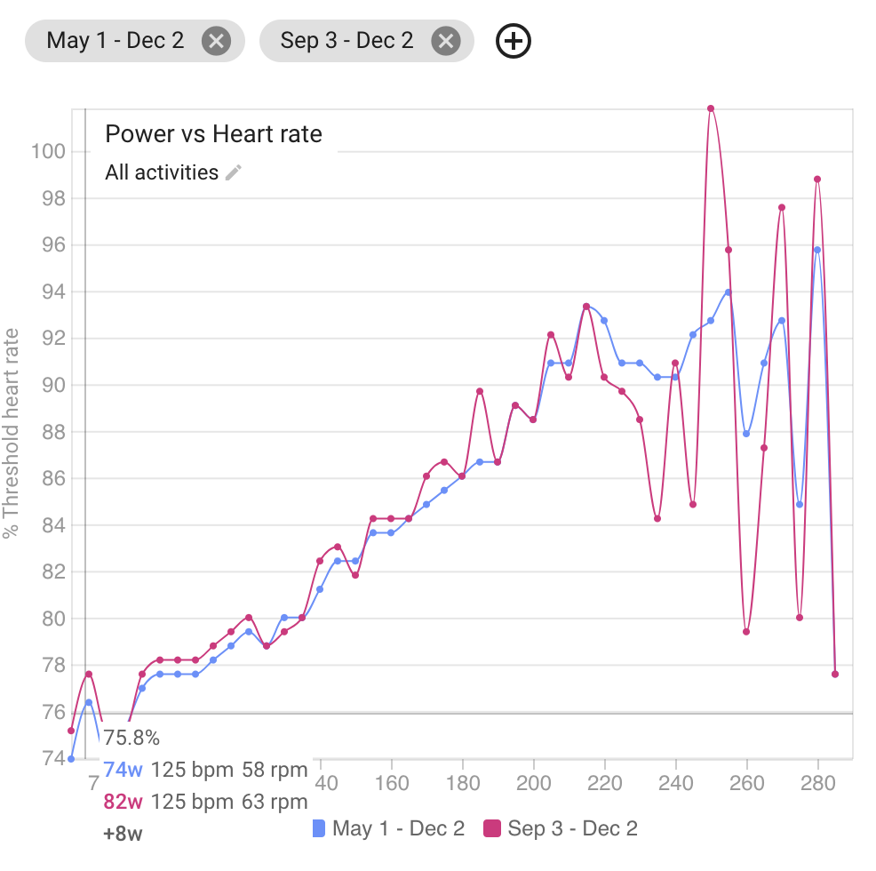
Each line shows the power output for a given % of Threshold HR in your screenshot. This chart is good for assessing increases in aerobic fitness over time. How I use the compare chart to achieve this:
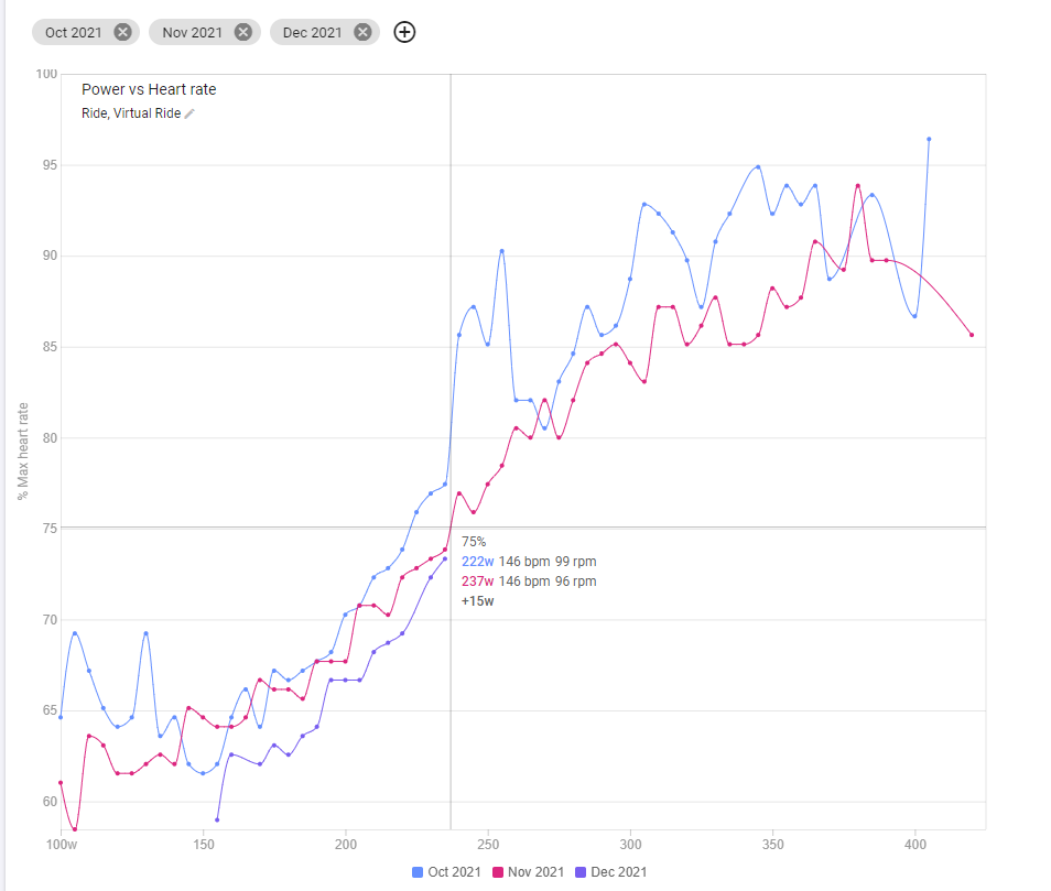
- Change Y axis to be % of MaxHR (rather than % of Threshold)
- Date range to be monthly
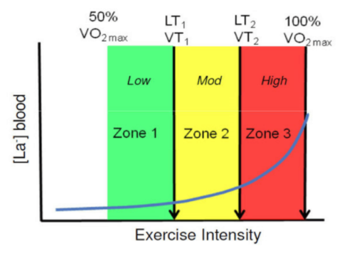
- Track how my power increases over the months at a given % of MaxHR (normally around 75% to align with my LT1 in a 3 zone model)
3 Likes
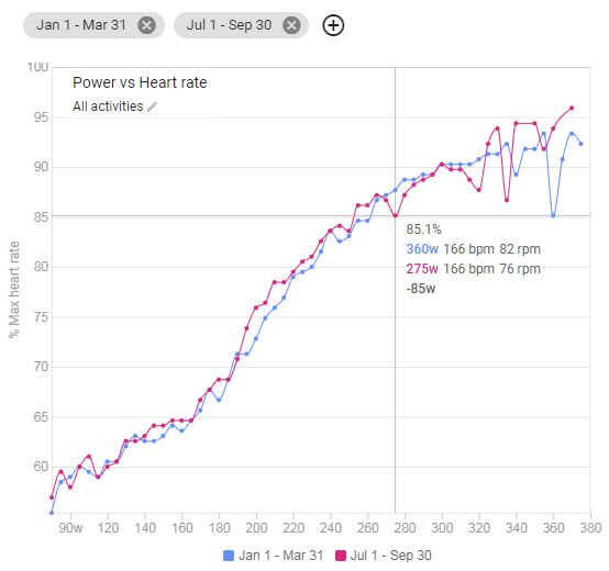
How is this calculated? Over what time period is a certain wattage compared to a certain heart rate?
For example in my case (Q1 to Q3 2021) there is a difference over 85W @85%maxHR, which is not really realistically!?
1 Like
I choose days with the same “workout” or “route” to be able to compare.
1 Like
Thanks Olly, I’ll try doing this 
You may get some weirdness on the graph especially as you approach or go past threshold or when there isn’t a lot of good input data. In your example the cursor is on a dip.
2 Likes
Changing the date range is for all Compare charts, correct?
It would be nice to have date ranges per chart. This would allow easy simultaneous comparison of Power vs HR by year as well as per month.
1 Like
Yep it is a global date range filter for all charts on the compare page. I agree having different date range filter per chart would be very beneficial. It has been raised before and I believe it is on the to do list. David has mentioned before he wants to do lots of work on the compare chart functionality
1 Like
Cheers. Figured it was planned (along with the ability to compare select workouts side-by-side). 
Yes it is. The idea is to have sections and all charts in a section share the same date range etc…
2 Likes