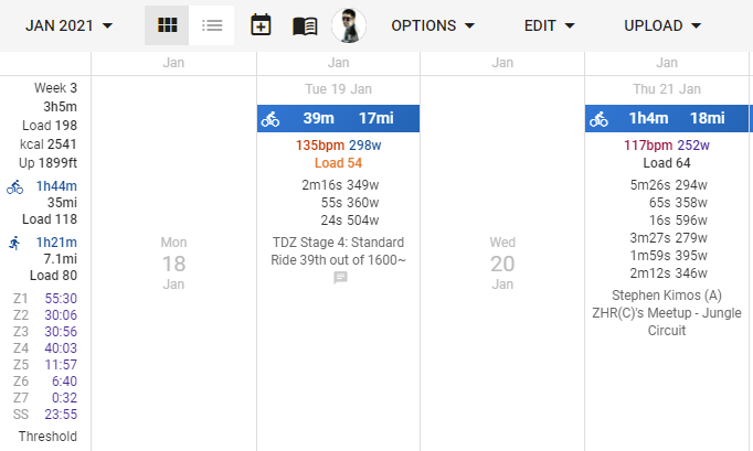
I am loving the website but I am red/green colorblind and sometimes struggle with the home calendar summary page as BPM & Load seem to be red colors, yet are muted for my vision. Unless these are recent changes, I’ve always assumed the only coloring was the wattage, with the others simply being bold.
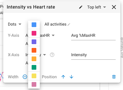
Playing with colors from https://personal.sron.nl/~pault/#sec:qualitative, I wanted to experiment with higher contrast colors.
Here are the RGB values I tested.
<span data-v-28c6e63e="" style="color: rgb(204,51,1);">135bpm</span>
<span data-v-28c6e63e="" style="color: rgb(0,68,136);">298w</span>
<div data-v-28c6e63e="" style=" color: rgb(238,119,51);">Load 54</div>
Here is a sample image below to cross-compare. 19 JAN is modified RGB vs my 21 JAN stock values.
Additional feedback:
Why not auto-refresh when new releases occur? I often open a new session to be prompted to restart. If I don’t have a stale window open, why not apply the update automatically?
The ‘Weekly Summary’ on mobile really confused me. I thought somehow I had a new activity on 25 JAN or a recommended workout, then I realized it was the weekly summary. I think it’d be helped to change the background to show it is a highlight. This could be as simple as giving it a gray background so it can be distinguished from the rest, instead of seeming to be a subset of Monday. Alternatively, it might be ideal to keep it consistent with a square box on the left side with an empty right side, as the full width title for dates gives it an assumption it is a header for the below items. (SAT 23 JAN looks like it is a header for 22-19 JAN) Or simply add a note ‘No activities’