Today I read the description for the Fitness chart:
The blue line shows fitness. The purple line shows fatigue
I am red-green color blind and had no idea there was a special color for fatigue. I would recommend changing this to a color such as orange or magenta.
I reported a similar problem in the past with the activities page which @david provided alternate colors to address. See that thread here: Color Blind Friendly Colors - #7 by William_Forde
Otherwise, I am loving Intervals and I recommend it to all my friends. The new Weather update is brilliant.
2 Likes
david
9 March 2022 19:19
2
I think I will have to make this configurable. Its quite a bit of work though because those fitness colours appear all over Intervals.icu.
1 Like
Understood. It is a minor issue as one is a filled section and the other is a line, but I thought it interesting the desire for a greater contrast.
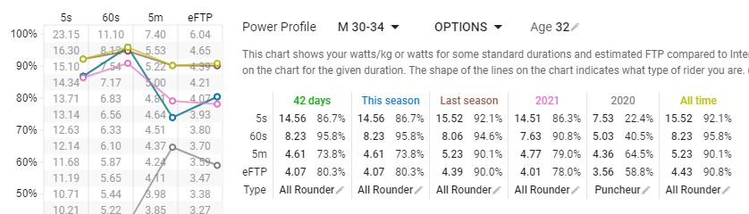
On the Activities page, I do notice the different colors.
Just thought I’d share the thought as I think the Fitness page can be tricky to understand when new to the app.
Thanks for the awesome work.
1 Like
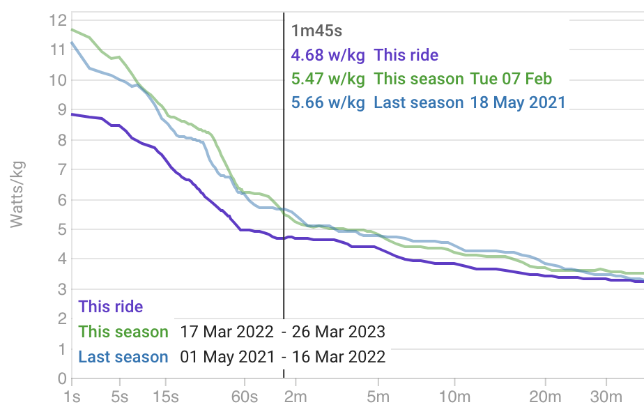
Hi, I am also red-green color blind and I am seriously struggling seeing differences in colors in basically all the graphs:
I would be so grateful if I could choose my own colors in graphs. At this point I need my partner to tell me which color is which
Thank you!
1 Like
david
26 March 2023 13:23
5
How do these look? They are the default colours for the compare chart plots. I think they are supposed to be colour blind friendly:
And can I keep the purple for “this ride” and then use the palette above in order for other traces?
David, I think these will work. Thanks for being so helpful!
david
29 March 2023 15:54
7
I have deployed the updated default colour set. Hopefully it is better.
2 Likes
Thanks a lot, it’s much better experience!