maybe I have not seen it yet but is there any way to plot cadence to power ratio somewhere?
I would like to analyze how my cadence is compare to the power. This would help to identify patterns (e.g too low cadence in high power) and train to improve.
I imagine it is a little similar to power/hr figure.
An alternative to a separate figure would be the possiblity to plot cadence on x-axis and power on y-axis for the ride, season or whatever time line selected.
Thanks. In general yes this is what I am somehow looking for. Generally, I was thinking to keep it more „simple“ putting cadence in rpm on x-axis and power in watt on y-axis.
To calculate AEPF and velocity requires again additional parameter to calculate, whereas rpm and power is already there. I know maybe not 100% in detail but good enough to start with, from my perspective.
Based on this you could set your quadrants on top yourself.
thanks @david that looks great. looking forward to have this view for a given activity in intervals somewhen.
Very interesting is also the discussion about where to start in terms of % of max power to ensure not to blow your knee.
Since you both are obviously in the topic already, is there also meaningful long term view on this? I mean, the view is used for single activity or even intervals within an activity mainly - but does anything like power/hr in z2 make sense here too? (like cadence/power in z2)
@WAlex the charts are there to help make decisions, like most analytic data.
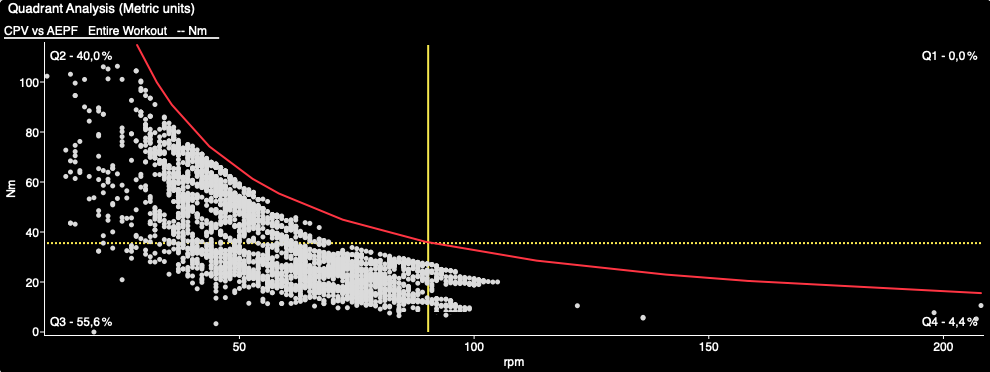
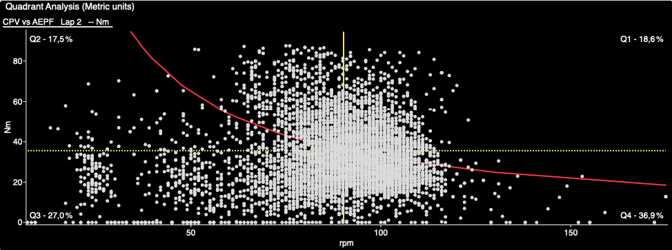
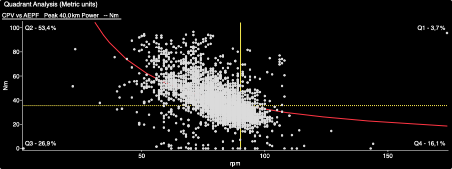
Below are three different charts, each telling a different story.
Hill repeats
Q2 = work: high torque, low cadence
Q3 = recovery: low torque, low cadence
This was before I learnt about low cadence (40-50rpm), high torque (50-70Nm) intervals on hill repeats. I can only update this once me, or my athletes, have completed these type of workouts.
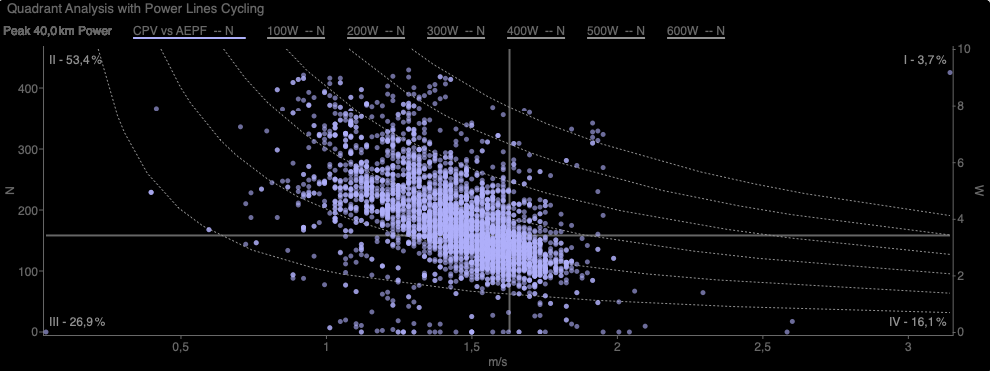
The red line is FTP, so you can also see the amount of time above or below threshold.
The closer the plots are to each other (left to right), the less versatile the rider is, as cadence is dependant on the situation (in a race). Attacks, sprints and surges are generally higher cadences than climbing hills, or riding at a steady pace on flat terrain.
One last chart, some Sweet spot work (4x 8m, with 2m recovery).
The grouping just below threshold, with cadence at varied from 80-90rpm from start to finish of the interval. Recovery was lower cadence, i.e. 60-80rpm
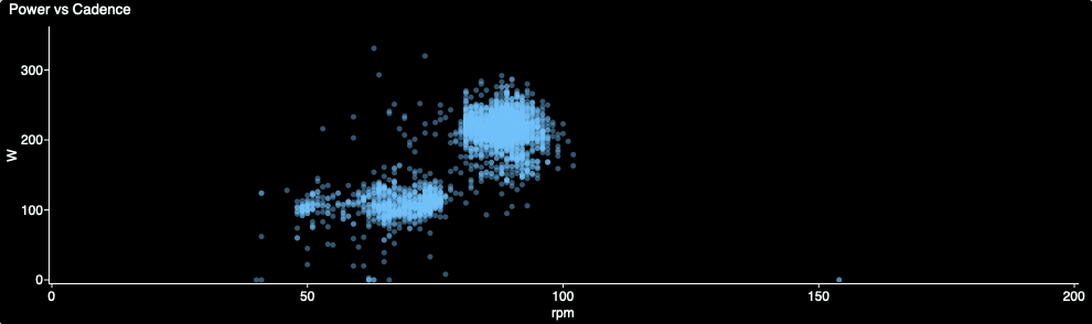
Below is the same graph comparing power and cadence on a sweet spot workout. Same scattered pattern, but little less information. Same data, just easier to interpret using the QA type chart.
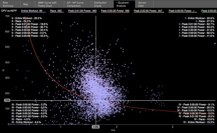
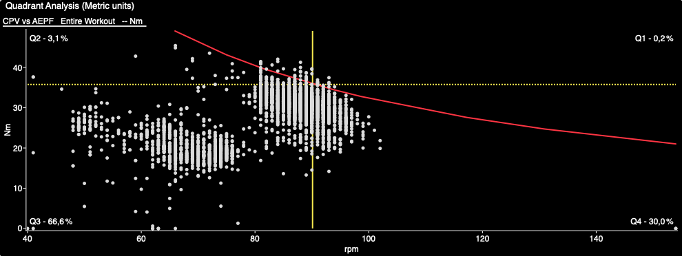
My graph was customised to use Cadence (RPM) and Torque (Nm) for the X- and Y-axis, as it’s easier to relate to those values than circumferential pedal velocity (CPV) and Average Effective Pedal Force (EAPF).
Yes, it has been implemented.
On your activity level, go to the power page
Scroll to bottom, click on charts
Use the finder for quadrant analysis Note: It currently only gives you a summary for the whole ride, and not for a selected section/interval.
Really liking this chart. It is giving me some interesting info even for short track sprint races (I can overlay my gearing selection with rpm capability to get a mental 3D image to help with gear inches selection).
Is there a way to adjust the script so that the Y-axis is Watts and X-axis is rpm?
I’m not sure how to use the CPV values to relate to my training/racing. (and everything else on intervals is watts).
CPV is circumferential pedal velocity, i.e. the speed (m/s) of your cranks/foot/pedal while going around in circles. Power is derived from torque and velocity, while:
torque (Nm) is force * distance.
velocity comes from using cadence and the circumference of rotating crank arm (2*(22/7)*172.5mm or 170mm, or 175mm.
Power is calculated using torque and CPV, and not rpm (at least not in the simplest form)
A crank arm of 170mm has a circumference of 1068mm, while 175mm is 1099mm. Revs * Distance = speed, so 80 (rpm) * 1.099m (175mm cranks) = 87.92m/min, then divide by 60 and you get 1.465333 m/s (the speed on the x-axis).
The quadrant analysis helps you determine how you’re producing power, eg. high velocity-high force (sprinting), or low velocity-high force (going up a steep hill). Also, the density of the plots can tell if you’re prone to using that comfortable “one cadence” for all terrains, or a wider range of cadence. Remember that cadence feeds velocity.
thanks for your patience in explaining that, @Gerald
This is even more fascinating now!
So that i’m clear, if I look at a recent race (Keirin), I see multiple data points at the same CPV which would mean I hit that pedal velocity (for example) 5 times during the race and each dot represents the AEPF at each of those times? Shouldn’t the AEPF be an average of the 5 times I achieved that specific CPV and only show 1 data point?
(Side note, I also have the “Average Power vs Cadence” chart which is interesting but I wish it was MaxPower vs Cadence given the short effort (Keirin is 6 laps (1.5km)…3 of which is racing…750m)
The average effective pedal force (AEPF) is supposed to be the force applied perpendicular to the crank, while resultant force is the total force applied. I’m not sure how that is measured, but it is not the average power that you are asking.
If your device measures per second, then the chart shows a recording of every second of force and velocity. So you could have a number of “similar” same efforts, as a 90-min ride would have 5400 data points, excluding coasting time.
I’m not an expert on the matter, but can read the chart sufficiently well enough to gain insight into training and racing. WKO5 allows zooming in on a section, eg. a climb of 10-mins only, compared to the whole ride (Intervals).
I think I understand now. I was reading “average” at a higher level time duration, not a component of the instantaneous total force applied.
Thanks for explaining. I’ll look at a handful of rides/races and see what I get out of this.
That being said, the chart you posted 2 years ago (!!) is interesting too: