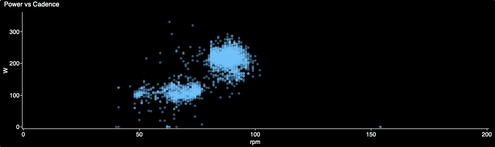
Below is the same graph comparing power and cadence on a sweet spot workout. Same scattered pattern, but little less information. Same data, just easier to interpret using the QA type chart.
My graph was customised to use Cadence (RPM) and Torque (Nm) for the X- and Y-axis, as it’s easier to relate to those values than circumferential pedal velocity (CPV) and Average Effective Pedal Force (EAPF).