I am less than average trying to understand all the data and how to decipher them. If you had to give advice to someone to help them see how their fitness was improving, what would be your top three ways?
Thanks!
I am less than average trying to understand all the data and how to decipher them. If you had to give advice to someone to help them see how their fitness was improving, what would be your top three ways?
Thanks!
My top 3 ways to check for improved fitness:
Race a course that you’ve previously raced.
Time trials (of multiple durations/distances ) on routes that you routinely train on.
Performance modeling.
Lab testing (most interesting way to check, but least representative)
All good ways. I was hoping some data here could maybe show an improving trend
Those data will show an improving trend.
There’s no magic metric that will show improved fitness except for the performance itself. Just pick a metric and follow it over the course of your training and see how it changes.
No need to make things difficult.
If you want to get scientific, you can use your daily tss and those simple time trials I mentioned to model yourself using Bannister’s model.
Here’s a tutorial
There’s a spreadsheet associated with the paper that’s available online that you just need to plug in your numbers and the work is done for you.
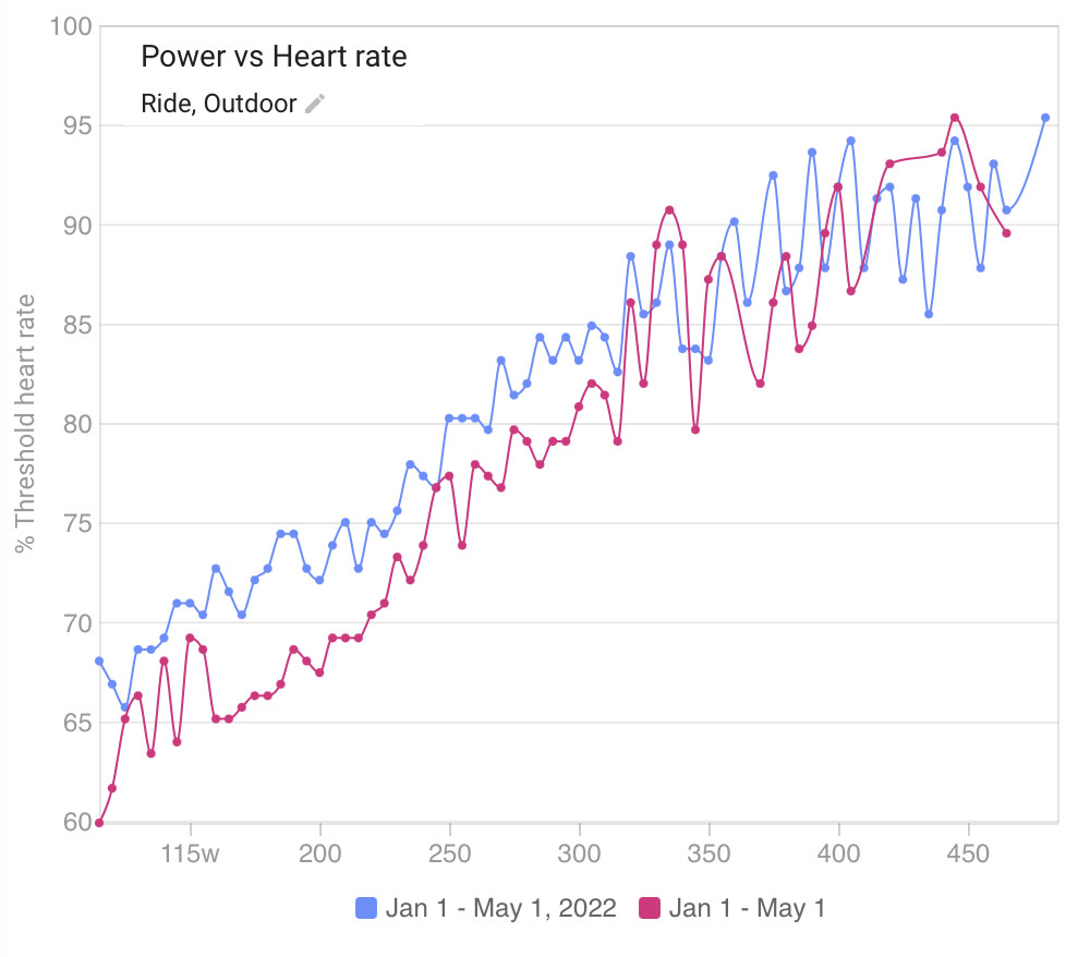
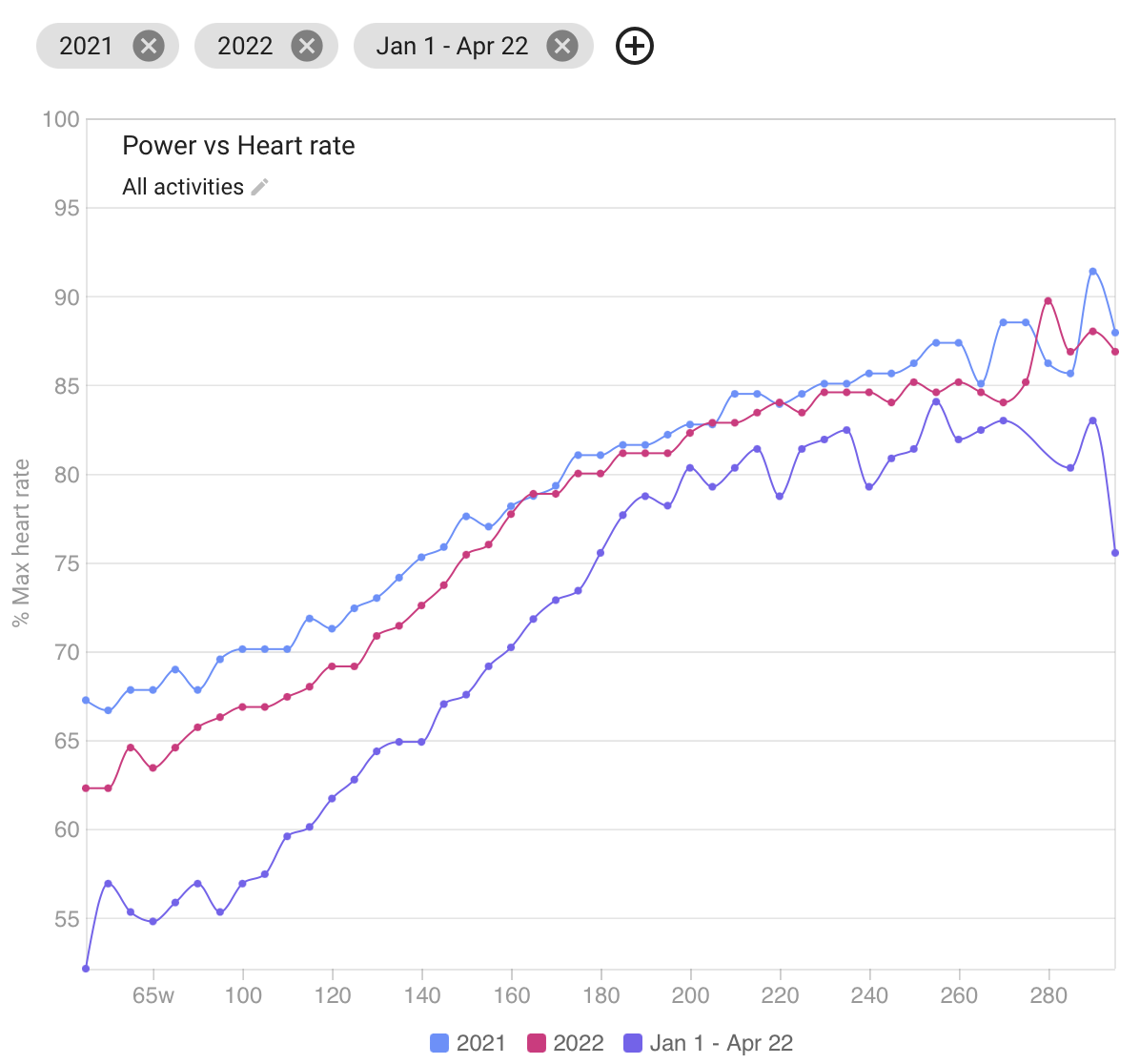
My favourite is the “Power vs HR” chart on the /compare page. Basically more watts for the same heart rate means you are getting fitter.
I also really like the “Power vs HR” chart!
In the “Power vs HR” chart, there should be the possibility to filter activities by name, for example. Or the possibility to compare several activities (after filtering) from a selected time interval. Also, maybe it would be nice to add a trend line on this graph?
Speed, over the same course, is a metric many overlook, or think is too basic. The winner of a race is not the one with the highest average power, but the best average speed.
Find a course, flat, uphill, undulating, etc., where you can repeatedly ride, uninterrupted by traffic and/or traffic lights/stop signs. As you get “fitter” or stronger, you will be able to see the difference if you complete the course in a faster time.
That is an very interesting question and the answer also depends on your specific goals.
In general I would say a sign of improving fitness is the ability to produce a higher power at the same heart rate (or to have lower heart rate for the same power).
To visualize this I really like the Power vs. Heart Rate curve under the Compare tab where you can compare periods in time.
Shifting the curve lower/to the right is better.
I find speed on a given course too variable depending on wind where I am.
Power/hr metrics are most of what I look at. Overall trends as the last few have mentioned. But also decoupling and time to increased decoupling. This works at both zone 2 and zone 3 for me.
Time to exhaustion at threshold is another that I find useful.
I’ve listened to a number of interviews with Olaf Aleksander Bu, and (to me) it seems like he mentions tracking pace/HR as an indicator of improving fitness more often than he mentioned Pwr/HR.
I like these two charts.
I think it’s more accurate than the Power/ HR chart, because the average of a ratio is not the same as the ratio of averages.
Is it possible to add a similar chart as “Power vs HR” for running, i.e. Pace vs HR or GAP vs HR or Speed vs HR? I couldn’t find it, but as a runner without power meter, it would be an interesting way to gauge performance.
I do have that on the todo list.
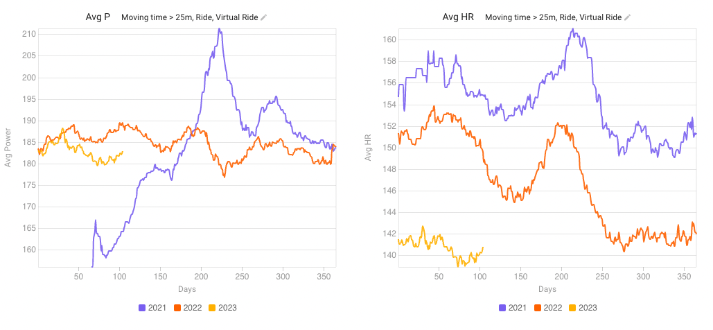
I Iike fitness/fatigue/form graph. By training regularly my fitness increases. Can see when I’m overtraining, when in good form.
I fully concur! Here is my Power vs %HRmax over last 2.5 years (I have it handy since I used it in another thread recently). Nothing better than having a long look at your seasons. Of course, you can configure time periods according to your needs.
this is cool! Need to play with axes!
What service did you use to build this? Is this Intervals?
Yes, in the compare tab, custom chart.
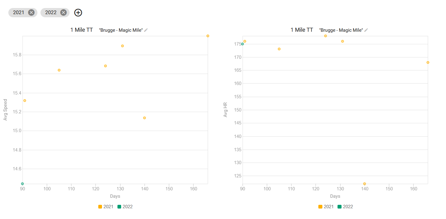
Hi, a bit late, but I just discovered the following to track my performance in running.
The best metric you can get, is not the Fitness you see on the chart but actually a time trail that you do regularly to see if it’s working.
In the past I did some training which required me to do a “Magic Mile”, which is basically a time-trail.
The faster your speed (or the shorter your time) and the lower your HR, the better.
But I had to Crop the exercises first (which I did on the intervals website) to get rid of the warmup and cooldown. So now, all of these trainings only contain the 1.6 km time trail anymore.
What I did in the Compare tab is actually filter the data based on name “Brugge - Magic Mile” to find all of my attempts. And then just plot out the speed and the HR.
This together with the fitness chart should be good enough to show your training is working.