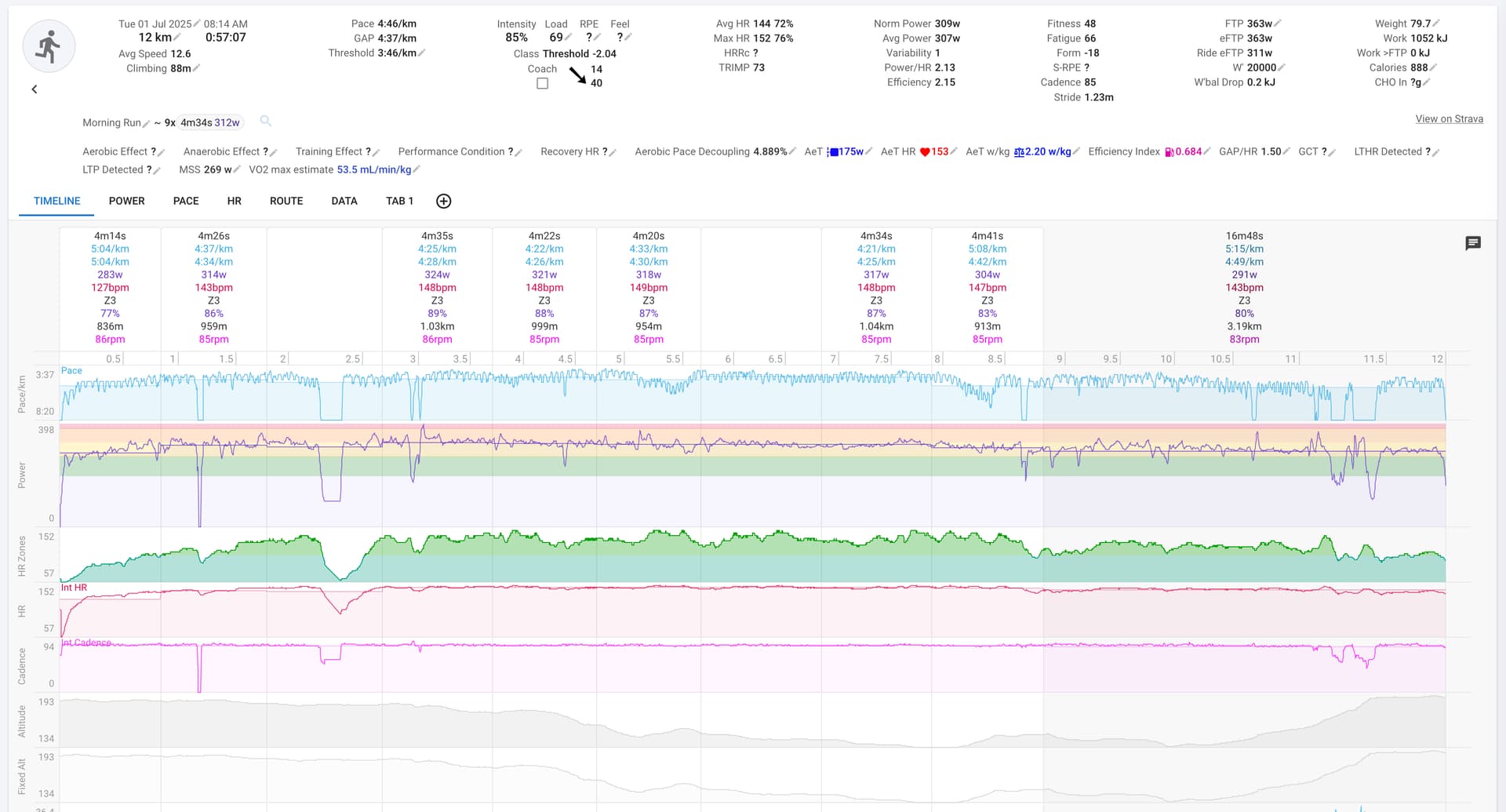
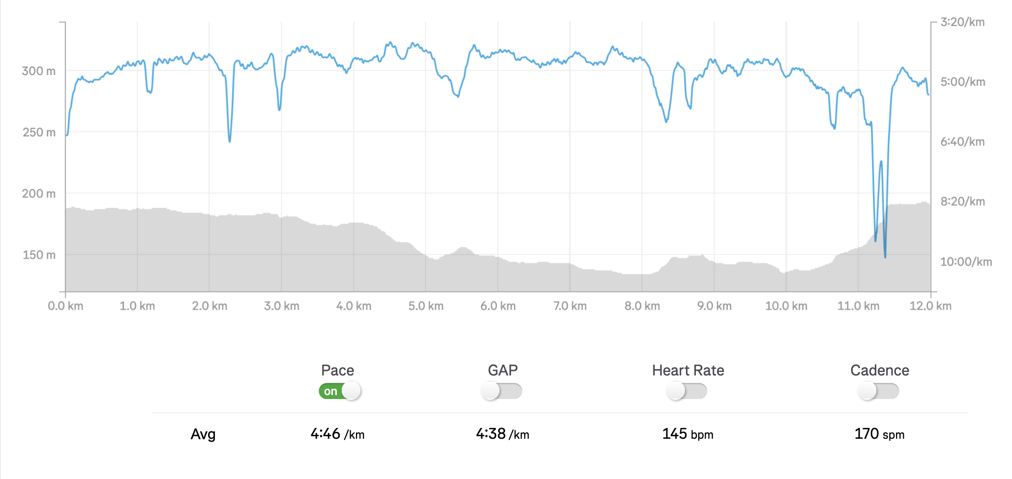
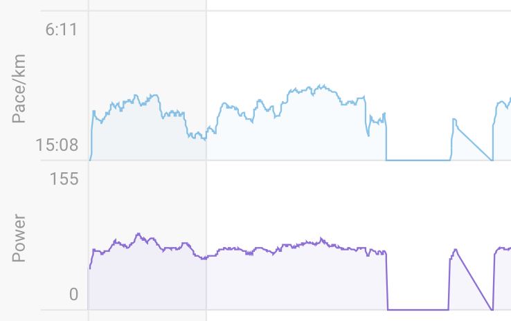
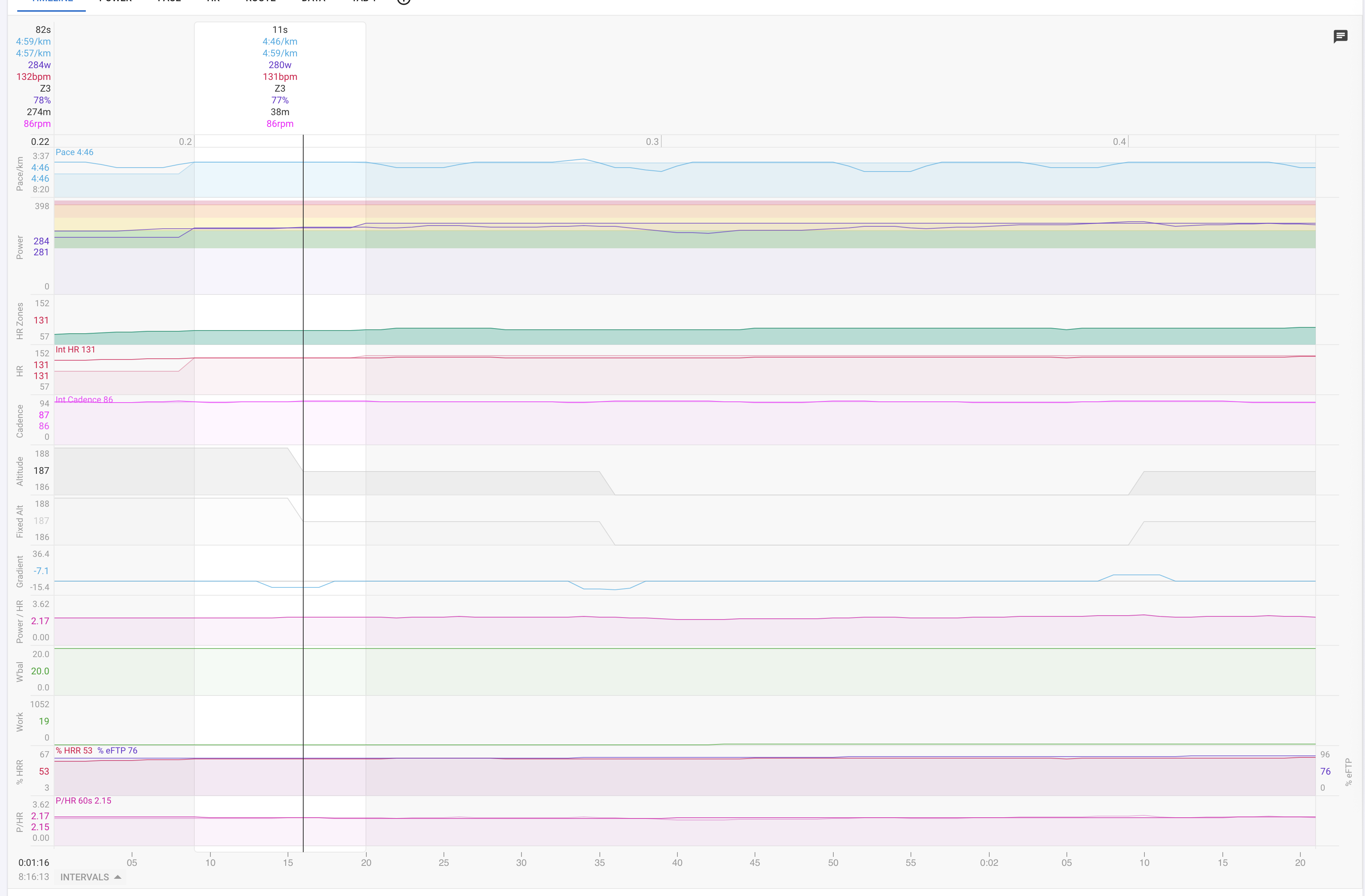
I think this wavy structure was always there with Stryd, but today I noticed that the wave spans from 4:40 to 3:40 pace and that’s too much of a variance for 20m of running. I checked with other apps and the pace look better there, so I thinks it’s something about Intervals. Also notice that power does not exhibit this — and obviously pace and power are closely intertwined for Stryd.
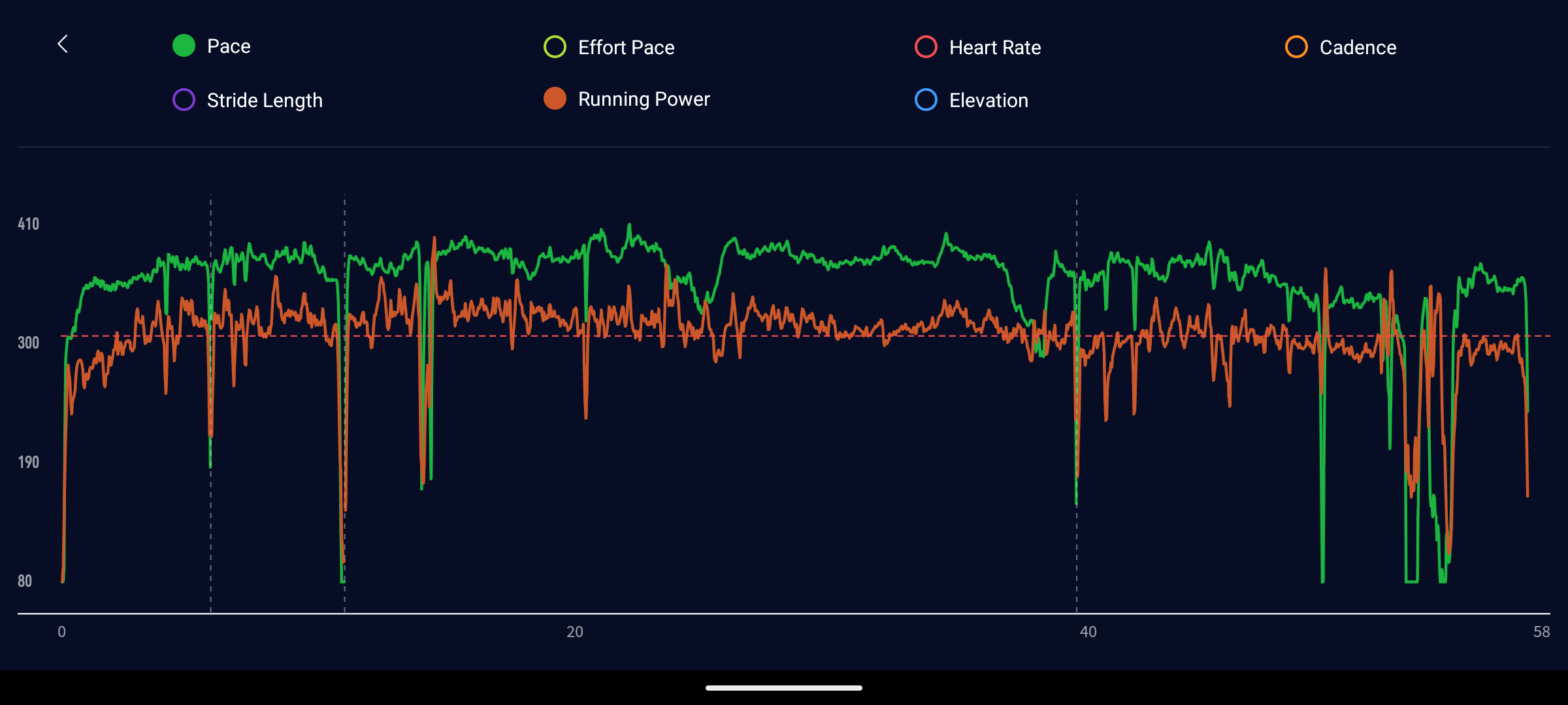
Well, I can’t tell what Stryd and Strava do with the plots, but the level of detail suggests that none are smoothed.
My Intervals plot are also not altered: the blue line is the pace and the blue rectangles behind it show the average interval pace.
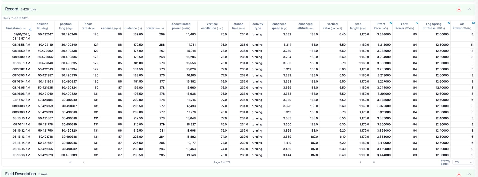
I understand that Stryd’s measurement frequency is much above 1 second. Intervals data editor shows a power value for every second. I never tried to unpack the fit files though
Also, currently I’m using Coros Pace 3, but the same behavior was with Garmin 935. In between I used Polar Vantage M, but it never accepted the footpod pace