One of the most useful/fun things for me to track on Intervals is hitting new power records for the various time intervals. 30s, 60s, 20m, etc. While I’m able to see these best-powers for a set range of dates on the “Power” and Activity tabs, I’d love to see how my “n-minute” best has improved over time. For example, I’d expect that my 5 minute power today is better than it was 12 months ago.
Logically on the back-end I’d think it’d be something like “max power up until this date” (which would be an ever-increasing number) or “max power in the last n-days” (which could go up or down based on fitness & efforts).
I know you can already do this on the Activity tab, so maybe this already exists. Appreciate your guidance.
As always, amazing product. Thank you David!
1 Like
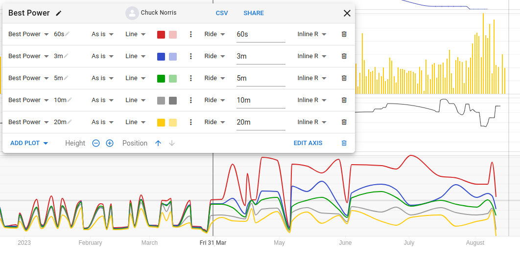
You can do that on the Fitness tab. Look in the shared charts for something with ‘Best’ in the title and adapt to your own wishes. Here’s a quick example:
3 Likes
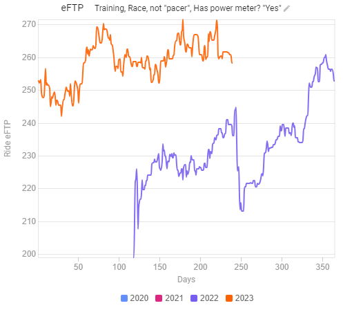
This is good but honestly it’s really hard to compare it to previous periods in this view. I have to find what “looks” like the highest point and scroll my eyes to the left to see about where I was in the last year. I think the Compare tab would visualize this much cleaner. This eFTP view (Compare tab) shows pretty quickly that I’m having stronger rides than last year, whereas this similar 20 minute view (Fitness tab) is more difficult to read.
Was just looking for similar myself (I’d like to see my 5’ bests as a trend in the compare tab vs on the fitness charts) and looked around. This was the only post I saw but doesn’t appear to have the magical post saying “I implemented this” (yet?) 
I’m registering my interest though - would be very useful to compare best efforts for specific time intervals, as I attempt to work on a couple personal power curve weaknesses with focus.
Cheers
1 Like
Just adding a +1 here, disappointing to find out I can’t graph any w/kg data on the compare tab!
1 Like