Hi everyone,
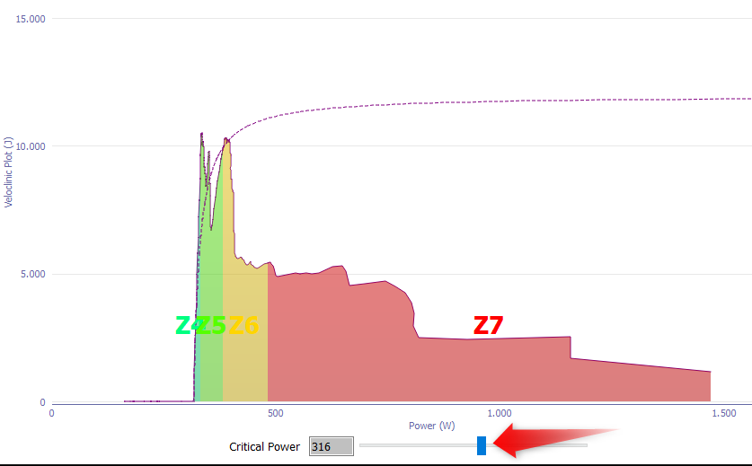
since the Veloclinic page seems to be down… can someone point me to an explanation of this? i.e. the blue and black lines stand for… how to interpret the session, etc.
Searched the web, found nothing good.
Thanks!
Riccardo
Hi everyone,
since the Veloclinic page seems to be down… can someone point me to an explanation of this? i.e. the blue and black lines stand for… how to interpret the session, etc.
Searched the web, found nothing good.
Thanks!
Riccardo
Here’s a video by Mark from Golden Cheetah

And the page can be found on the Wayback Machine
Thank you! Fantastic.
Riccardo
Yeah I know ;-). The slider in GC allows easy visualisation to pinpoint CP.
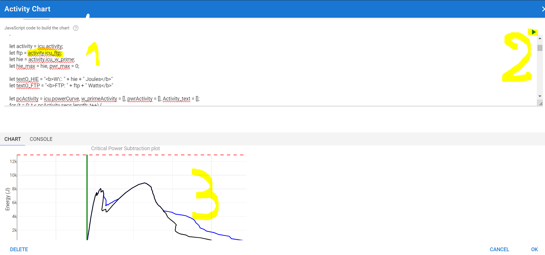
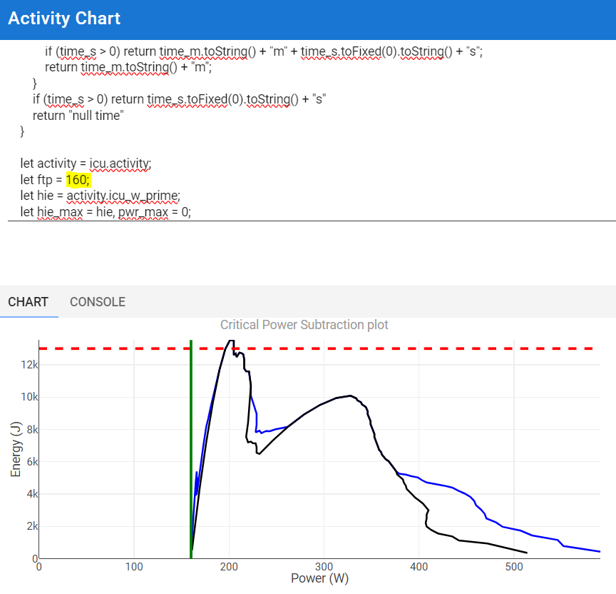
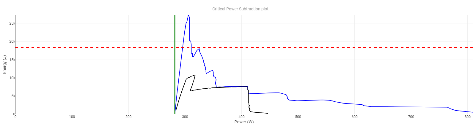
You can do it in the custom chart in Intervals too but it’s not so user-friendly. Set the FTP value which you have in mind and then run the script from the custom chart setup dialog.
Someone with enough JavaScript knowledge can probably add a slider for the FTP value. I’m not there yet, still very much a beginner in JS ![]()
WOW, nice! Didn’t think about it.
OT: I’m struggling to understand what W’ I have now: either I estimate it too low or too high. What do you think about W’ evaluation methods?
Thanks!
It’s not an easy thing. It’s reproducible in similar conditions, but it can be totally different in other conditions. Depleting W’ in one effort returns very different results compared to depleting it in several consecutive efforts with rest in between. Do a search on the forum, it has been discussed several times.
Thanks. I agree. And also think FTP / CP is a very day-to-day variable number…
Thanks again.