I’ve posted about this before, but still find myself confused. The answer might be “don’t sweat the small stuff”, but I’m also interested in understanding the big picture, and tracking my fitness over time.
As I understand it, as I get fitter, my HR for a given power should go down as shown on the power vs heart rate chart. I understand that HR for e.g. 5 minutes at a given power will be lower than for say 20 minutes at the same power, but I assume that the power vs HR chart is comparing like for like.
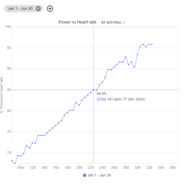
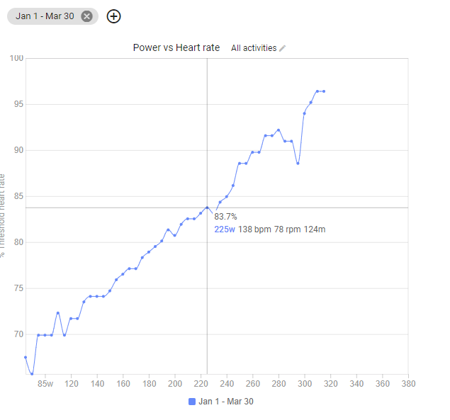
For a while, I’ve suspected that the chart isn’t actually showing my progress. I fiddled around with this today and find that if I select two overlapping periods (to show one chart for Jan 1 - Mar 30 this year; and the other for Jan 1 - Jun 30) then the second, more inclusive chart, doesn’t seem to show the same lower heart rates that are shown in the first quarter.
For example, my best power vs heart rate for Jan 1 to June 30 at 225 watts was 141 bpm
So I’m wondering why the 6 month chart doesn’t show that “better” figure, given that the 6 month chart should include the period in which I recorded that “better figure” in the first 3 months of the year.
As I said, I realise that this chart is intended to compare trends over time, and that’s what I’ve been trying to use it for, but the data doesn’t seem quite right to me, which is why I’ve narrowed it down to just one trend line across overlapping date periods.
Can anyone tell me how I’m misinterpreting the data, or whether there’s a bug in what it’s showing me?
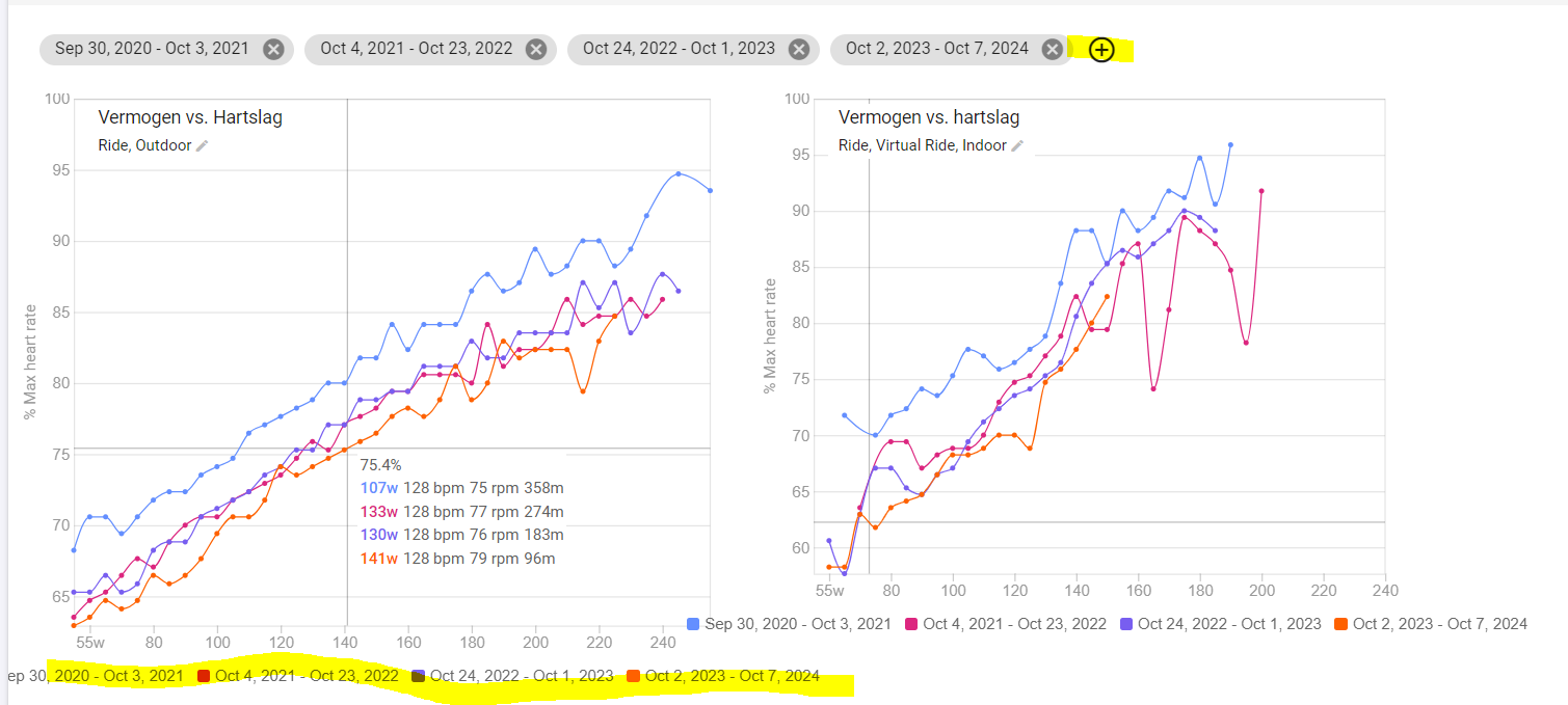
Just create 2 non overlapping periods to visualize longer term changes.
If you have multiple years of data, compare seasons or periods per season. If you just started, compare months.
When the resulting plot for the more recent period is more to the right and/or the bottom, it means that you improved your pwr/hr value.
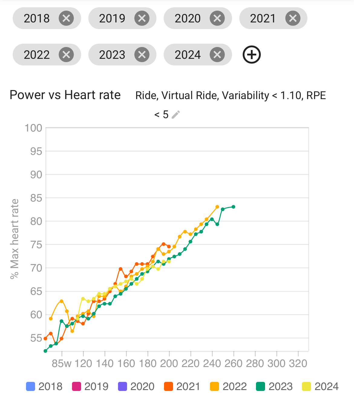
Here’s an example for 4 seasons from 2021 to 2024.
@TopCat First, this is not a chart of the best Pwr:HR values that you’ve recorded. It’s the average. So, for the chosen period, add together all the times you did 120w [for example] and find the average HR during those times. Repeat for 125w, 130 w, etc.
Second, there are tricks to understanding Pwr:HR trends. There is, indeed, undeerstood to be a trend, such that as you improve your fitness, Pwr:HR rises. In this case, however, we’re taking Pwr:HR as a measure of fitness.
But other things affect Pwr:HR. One is your general health and training status. If you over train, HR is slow to respond to high intensity riding. If you are ill, perhaps with an inflammation, HR might be higher than normal. If you have other sources of stress, your Pwr:HR might be higher or lower than usual. And so on. So you do need to make sure that in the two periods that you are comparing, your general health, outside stressors and training load were much the same.
Brilliant thank you both. I just hadn’t appreciated that it was a chart of averages not bests. It makes sense now, and also that there are a few other factors affecting HR anyway. Many thanks!
It looks like your power vs. heart rate chart isn’t reflecting expected progress, likely due to data aggregation, fatigue, or how the platform processes best efforts. Some platforms smooth or average data, which may explain why your 6-month chart doesn’t show the lower HR seen in the 3-month period.
Factors like accumulated fatigue, hydration, and wearable device accuracy also impact HR readings. Optical wrist sensors can be less reliable than chest straps, affecting consistency. To validate your data, check if you can export raw numbers, compare HR monitors, and verify platform settings. If the issue persists, it could be a software limitation or bug.
i realize, i cant “build” my graph like “Custom” , i need to pickup the pre-made graphs and setup! I dont know if someone already talking about this , but its possible change the colors?
I think the most obvious contributor to the trend you’re seeing is temperature. Assuming you live in the northern hemisphere, you (like me) will see a relative decrease in performance compared to average heart rate as you approach mid-summer. This used to confuse me just as well because it seemed like my performance didn’t improve as the training season progressed. The moment I realized this was happening was when I started added summer trail runs to get into the shade and avoid sunburn. Because of the softer terrain, I’d typically expect a 10-20% decrease in power/pace (as calculated by Garmin). Surprisingly, I was able to maintain the same zone-2 pace on a soft, shady trail as when I was running in the sun on a hard surface. I reanalyzed the data I had, separating sets by ambient temperature, and ultimately arrived at the following conclusion: don’t sweat the small stuff
Thanks Ben, that makes sense in terms of understanding physiologically why it might be happening. I’m still a bit flummoxed, though, by the way that the chart represents this data, but ultimately, it’s a very small thing that I’ve decided not to worry about!