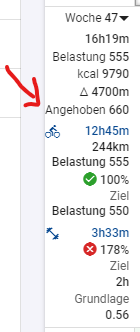
I often use the UI in German, where ‘Load’ is translated to ‘Aufwand.’ Due to the length, the “weekly totals” look messy. There should always be a small gap on the left side, and this gap should be added to the longest line.
If the “weekly totals” are displayed “on top,” there seems to be a leftover translation.
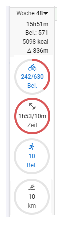
In general, the “weekly totals” appear a bit confusing. I prefer the overview in the ‘popup window.’ Is it possible to have a similar, clear view in the “weekly totals,” rather than the current confusing multiple lines?
Currently the size of that left panel is fixed and it is difficult to make it bigger because the calendar days won’t have enough space on smaller displays. The problem words are “Angehoben”, “Blastung” and “Steigerung” which are too long. Are there shorter words that could be used?
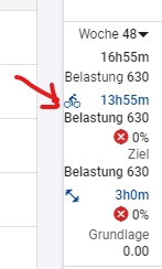
I have fixed that missing “Load” translation (will deploy later).
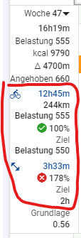
For your fixed-size left panel in the UI, dealing with the space constraints due to the long words “Angehoben”, “Blastung”, and “Steigerung”, here are some solutions:
“Angehoben”: Use “Angeh.” as a shorter form.
“Blastung”: Use “Bel.” as a shorter alternative.
“Steigerung”: Shorten this to “Steig.”
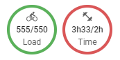
Does anything speak against a more attractive display (circular diagrams from the overview) of the “weekly loads”? The graphics are already available for the overview and would also fit well in terms of size in the left panel. The only thing missing would be the planned load.
The kcal should be positioned on the right since it is a unit.
After designations like “Belastung” or “Bel.”, a colon (“:”) should follow.