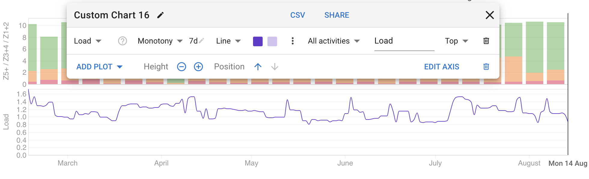
Would be possible to add how to track training monotony? Should be easy as it is just training load average / STDV…
“Training monotony is a measure of day-to-day training variability during a training week (7). McGuigan and Foster (12) referred to monotony as the variability of training for the training period. It is calculated by dividing the mean session TL by the standard deviation of the TL over a 1-week period. If the TL is equally high on each day of the week, the training monotony value will be high. Alternatively, if high and low load training days are interspersed throughout the training week, a moderate or low training monotony score will be derived.”
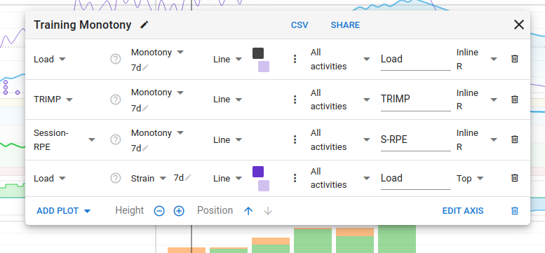
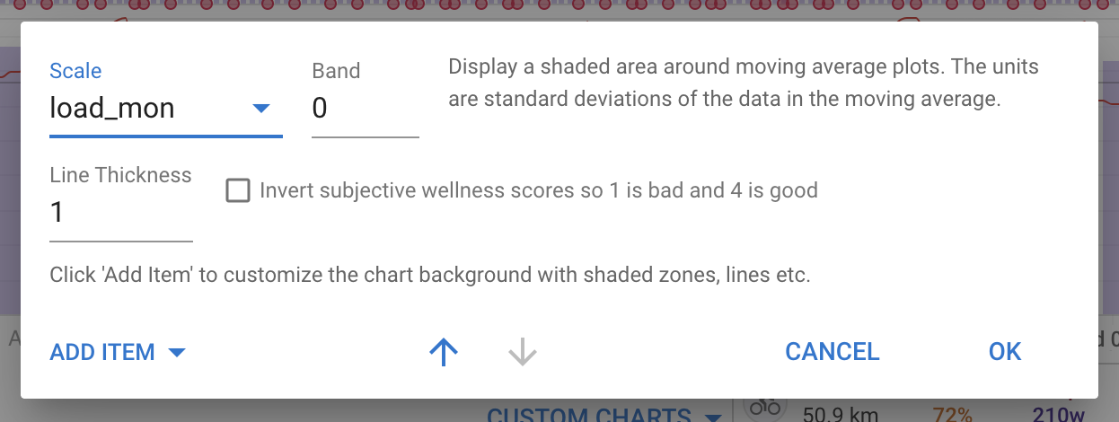
Yes you can. Click the dot dot dot menu next to the colour swatches and enter something other than load for the scale. That will cause it to get its own axis on the right hand side:
I was also about to make post like the above when messing with a Training Monotony plot but I stumbled on a forum post where this fix was mentioned. I don’t think it’s immediately obvious that the “Scale” input field refers to sharing a Y-axis. Especially when there are many buttons and menus to click on.
Obviously this isn’t something that’s broken, but just a design detail that could maybe be improved about the custom chart workflow.
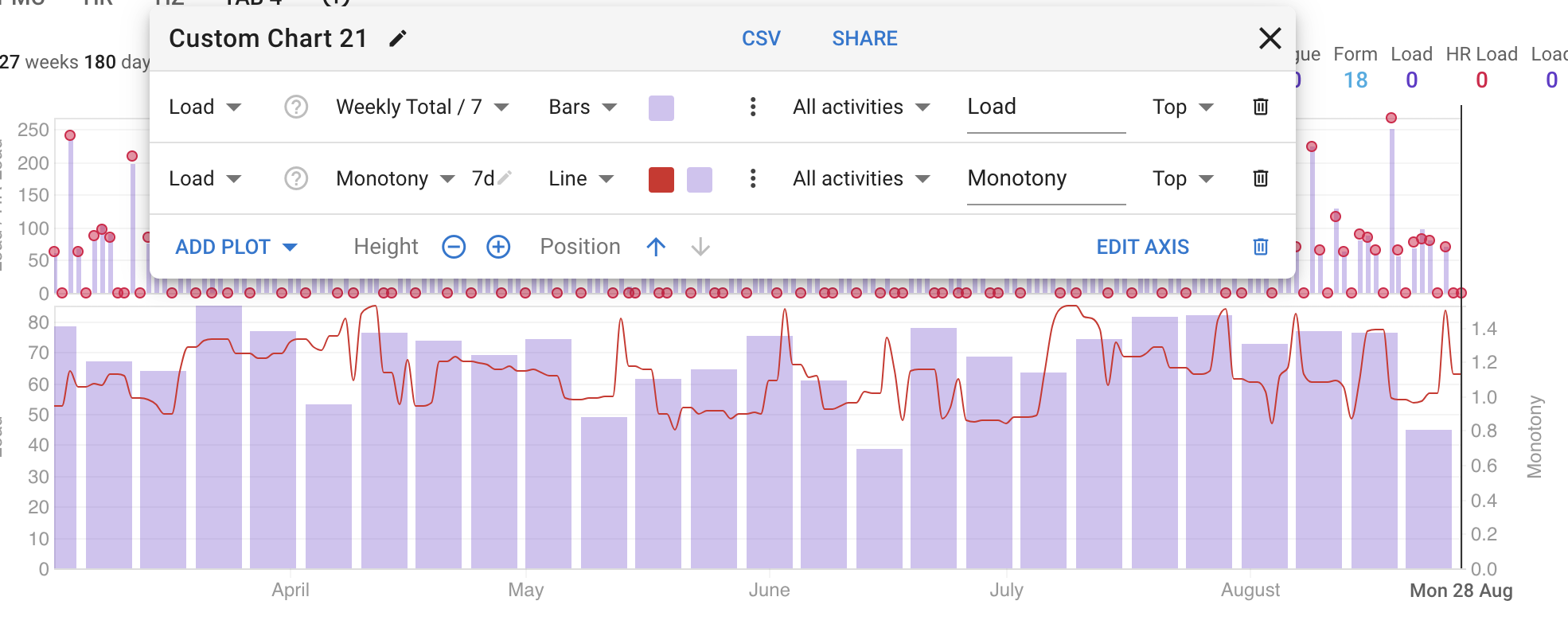
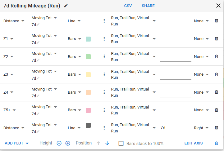
Another example is how (as far as I can tell), the left Y-axis is defined by the first plot. That sometimes leads to requiring dummy/phantom plots to set the axis accordingly if you want the plot to come after others (so it appears on top):
Tx. I have changed the label to be “Scale/Axis” (will deploy later). You are correct that the first plot gets the left axis. The next plot with a different scale/axis gets the right axis. Other plots after that can have different scales but they do not get an axis.