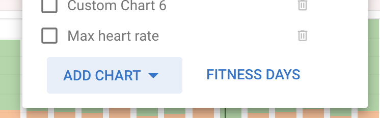
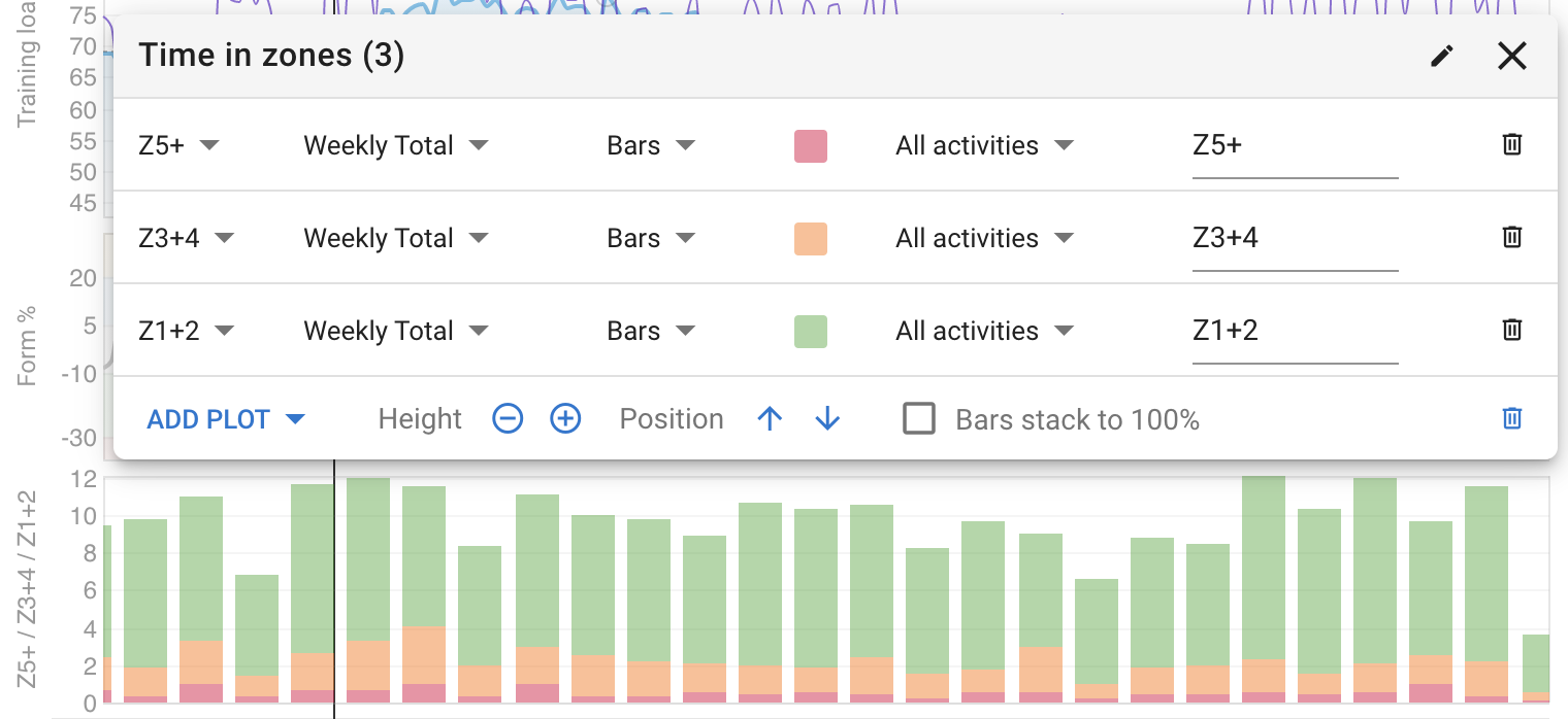
You can do that already (unless I have misunderstood). On the /fitness page click “Options” and “Add chart”, then choose “Time in zones”. That gives you a 3 zone chart. You can edit that chart to change the zones or add a new “Custom chart” and choose which zones to show.
Wow this really is impressive David, i’m very new here, learning to to read the charts and to know what I want, and if I don’t put myself off turbo training with the Vo2 intervals (I came close today) then I think i’m going to ‘subscribe’
hi david how are you , sorry for “revive” this topic.
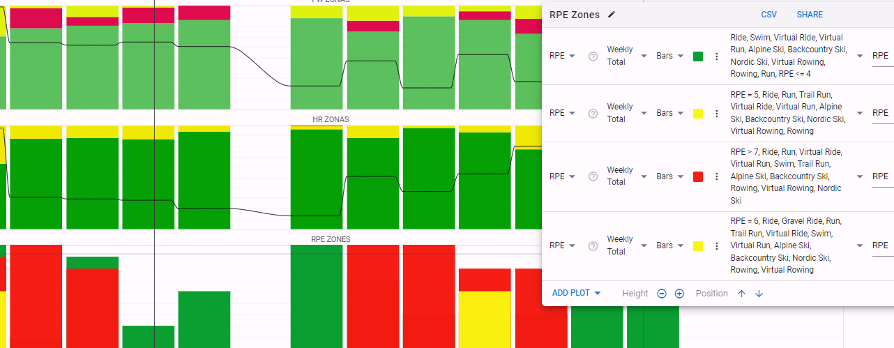
My charts for Power and for HR , i can stack to 100% and all good. I tried the same for RPE, maybe i´m doing something wrong , i cant stack, and coluumns seems off - for context most of my trainings in the week is RPE 2-3 and 4, and i classify all trainings; i´m doing something wrong, or its correct?
i tried create a chart
RPE <=4 Green
RPE =5 Yellow
RPE = 6 Yellow
RPE >= 7 - Red
“Weekly totals”
Looks maybe the Red always cover the other colors. You can tell what i missing? Thanks for patience.