It is giving results but I only just set it up, so can’t give you any idea on how ‘good’ it is.
I would recommend to use the AlphaHRV IQ field on your Garmin, because the respiration rate from AlphaHRV is far superior to the default one from Garmin.
I’ll take a dive in it the next couple of days to see if anything usable is coming out.
1 Like
Kubios is measuring breathing rate during morning HRV measurement.
I have almost 4 years of data and removing outliers on both sides result in a long term range of 9 - 18 breaths pm.
The average of those 4 years of data is 14 brpm.
BRmax from activity results, measured with AlphaHRV gives 48 brpm in my case.
1 Like
First add these per sports category you want to track it
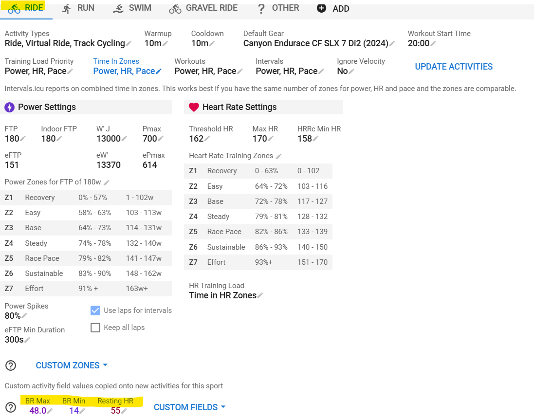
Then ‘Reprocess’ existing activities with ‘Keep existing laps’, then refresh the page
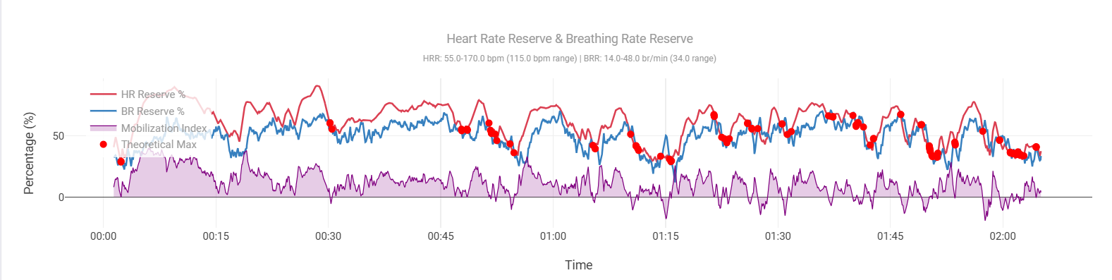
This one is from a challenging Gravel ride where I unfortunately crashed after ~2hr and ended up with a dislocated collarbone needing surgery next Tuesday ![]() . It will take 3 - 6 months to fully recover
. It will take 3 - 6 months to fully recover ![]()
4 Likes
Ack, sorry to hear that!
Get better soon!
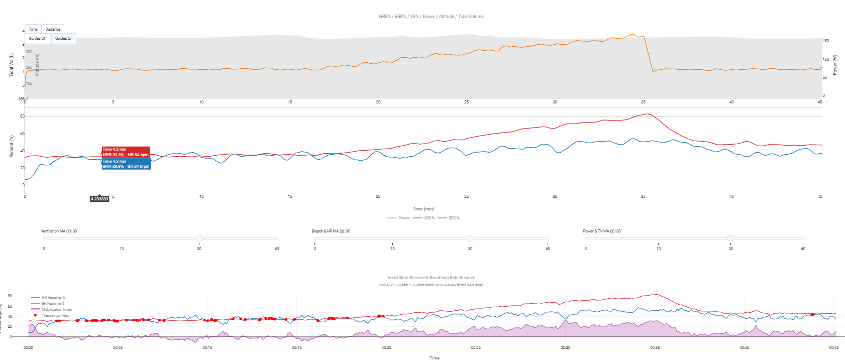
I have seen a few traces with multiple points of convergence of BRR and HRR - so far it is not giving me a great deal of confidence in what Seiler has suggested. That said, there’s a lot of subjectivity when it comes to min and max.
I’m reading up on the matter and trying to understand how and what.
What I came across already and should probably be accounted for:
- La Rf détectée par le Tymewear souffre d’une latence d’environ 6 à 7 secondes. In English: Tymewear Breathing rate suffers from a 6 - 7 sec latency
- I know from a met-cart lab test that the AlphaHRV breathing rate has an even higher latency. More around 25sec.
These latencies can impact the convergence by quit a bit.
Given my injury, I have time now to further educate myself, so will probably come back with more later this week.
2 Likes
Keep me updated. I can easily add an offset to the BRR values on the chart if necessary.
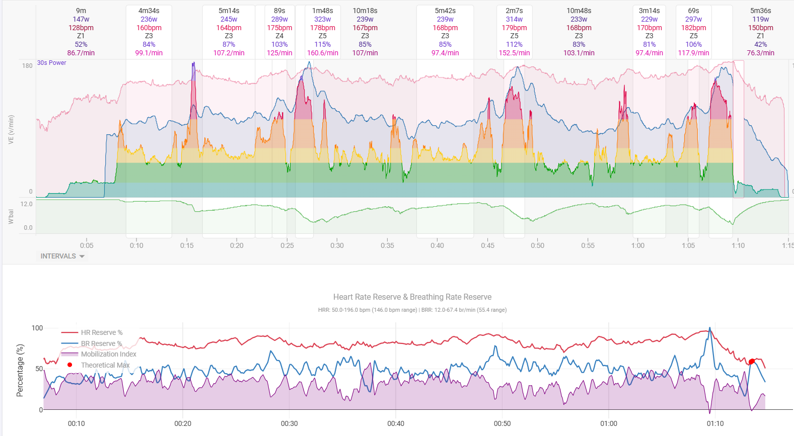
Here’s another of mine from a TPV race this evening.
@MedTechCD First of all: Have a good and speedy, painless recovery!
@MedTechCD @James_Eastwood_Socks How do you get the bottom Graphics implemented in the Graph - I have been trying to get a similar view, but actually am failing. I was able to implement the custom Activity fields - but in my case they appear as ventilatory thresholds, not as Custom fields. Do I have the wrong fields - and how do I “pimp” my graph?
Thanks in advance for your help!
I’d love to say I’m a whizz with javascript but actually I just got my mate Claude to do it.
2 Likes
I wish I had a Claude!
Ok, I’ve had some time today to re-adress this. Listened to the FastTalk PODCAST again and here’s an excerpt:
Dr. Stephen Seiler 1:03:55
I’ve introduced this metric. We just call it the mobilization index. And all it is, is the percentage of the breathing rate reserve that’s being used at any given moment divided by the percentage of the heart rate reserve. And initially that may be 50% and then it ends up being 100%, or a ratio of one. And when you get close to one, you’re cooked. It shows that you’re cooked often at a heart rate that’s not indicative of being cooked. Your heartrate is not at max. You’re at 90% or you’re at 87% but your breathing frequency is so high, relative to heartrate, that it tells us this person is glycogen depleted, fatigued, doing everything they can to achieve that oxygen consumption and even though it looks like they should have more to give, they don’t have more to give.
There’s not fundamentally anything wrong with your approach of %HRR minus %BRR but if things go further based on what Seiler is saying here, we better use it in the same way in Intervals and make that %BRR/%HRR.
What’s a bit more disturbing in your chart version is that it accentuates these values without taking the level of effort in account. Wouldn’t it be better to only display the red dots when for example the %BRR is over ~75-80%? Or do I maybe simply have incorrect values for BRmax? Certainly possible because I haven’t done an all-out effort for a long time…
I also added this chart (but I don’t have Tv and Ve because I don’t have TymeWear strap)
And I like the idea of setting the ‘Guides’ at 80 and 90 %. It does need manual config or modification to get the BRmin/BRmax/HRr/HRmax. I modified with the solution you are using. The configurable smoothing is nice to. Comparison of a submax step-test below.
Interesting. I took it as when % of BR max meets % HR max, but indeed I could have got that completely wrong (and just got lucky as it seems to ‘work’ most of the time).
I’m too tired right now to think about how it will render with a division, but will test it asap.
Edit: actually aren’t they the same thing? If they divide to a factor of 1, that’s the same as the lines meeting?
Also, it doesn’t make sense to restrict the red dots to when BRR is above a certain percentage… because the critical point that Seiler is making is that the two points meet even when only doing endurance, and it could take 5/6 hours to get to that point. That’s the secret sauce.
Fwiw, I’ve noticed that the first 10-15 minutes of pretty much any activity is basically throw away data, which I guess makes sense as systems get primed. Suunto also ignore the first 10 minutes of any activity for ZoneSense. Maybe I could hide red dots for that period.
Yes, it is. It’s just a different representation. I’d prefer to follow what the ‘inventor’ is doing to avoid confusion later on.
I don’t think this is doing something different… just a different way of presenting the same data. If you had a single score (by doing a division) you would lose sight of one of the values rising whilst the other drops…
That said, it’s very easy to chart both options.
Sure, the only difference is that a subtraction evolves around 0 and has pos and neg values, while a division evolves around 1.
I get the Memory Limit Exceeded error with this chart. Short & long activities. I have the custom fields set up. Any ideas?