What do you think about it?
You can see a horizontal sweet spot bar on the “time in zones” chart already. This would just be duplicating that bar?
Hello @david
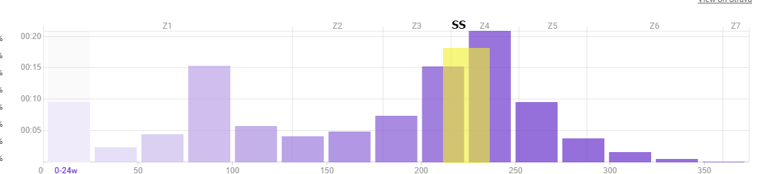
I saw on the activity pace the weekly time in zones. But so you can see SS is set to 88-97% but i have in settings the SS 88-94%. The other zones also not equal with the zones in settings.
Example my Anaerobic Cap is set between 138-250% FTP but on the activity pace is see the standard 120-150%.
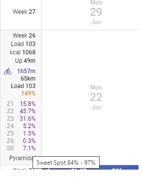
I guess so.
Gotto say: I quite like Wojciech’s idea.
Tx. I have fixed this. It was just the tooltip text that was wrong, not the zone times etc… If your zones changed during the week then the percentages from the most recent activity are used for the tooltip.
1 Like