Hi, I really like the interface design of Intervals, as most of the pages are very easily understandable and present the data very clearly.
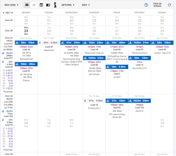
My one “issue”: Often when I pull up the activities view it takes me a bit of searching/parsing everything on screen before I can locate the activity on the date I was looking for.
So I would like to suggest one change: make the date of completed activities more visible, to avoid confusion stemming from false association of activities and the date in large font of “inactive days” in the row above them.
This is what it looks like now:
This is my suggestion: don’t fade out the date for active days, leave it black:
PS: I noticed that this issue somewhat vanishes when “Show weekly totals on top” is activated.

