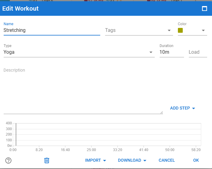
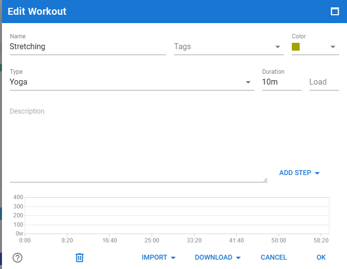
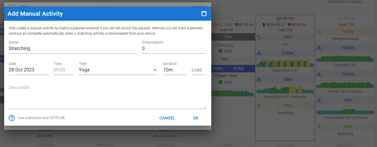
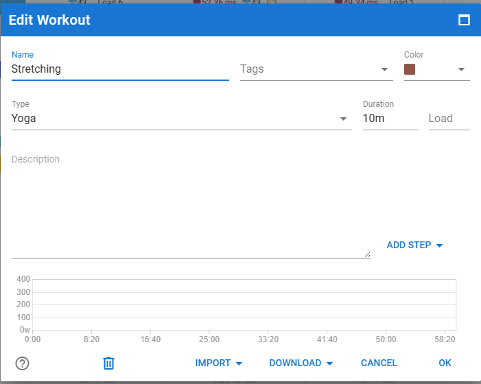
Perhaps I don’t understand how this is supposed to work, but I am trying to plan out non-cycling workouts, e.g. Stretching. I have created a 10 min stretching workout of type Yoga which I drag onto each day for the rest of the week. It obviously doesn’t have any associated interval workout.
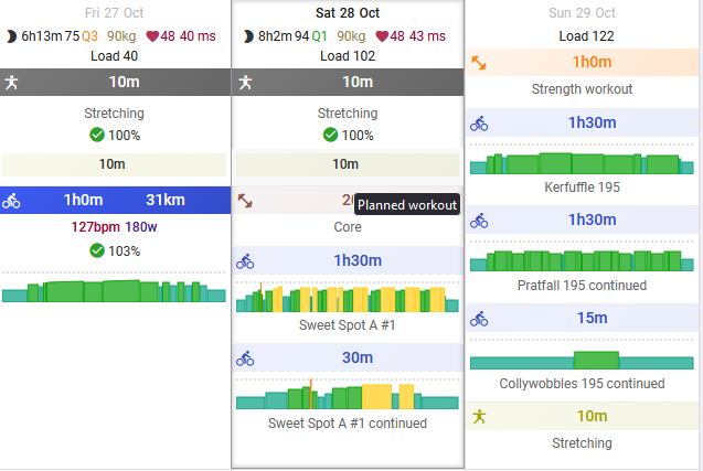
When I mark it as “done” the light coloured planned workout is still visible under the darker completed workout. Is that by design? I would have assumed the planned lighter colour bar would have disappeared?
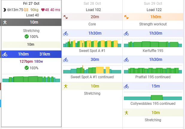
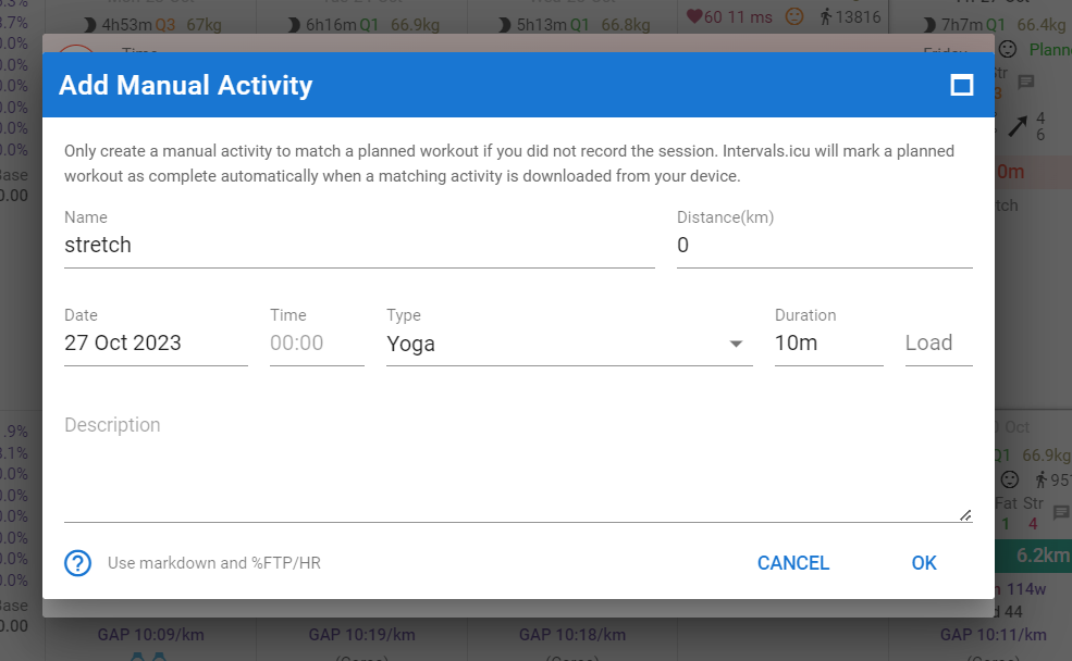
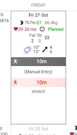
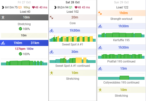
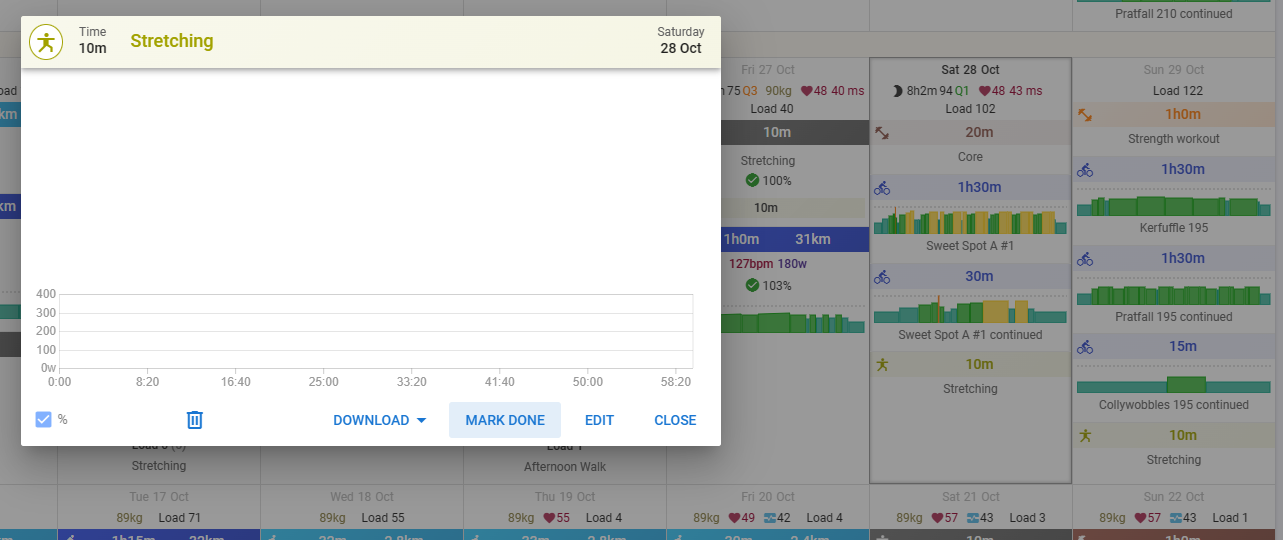
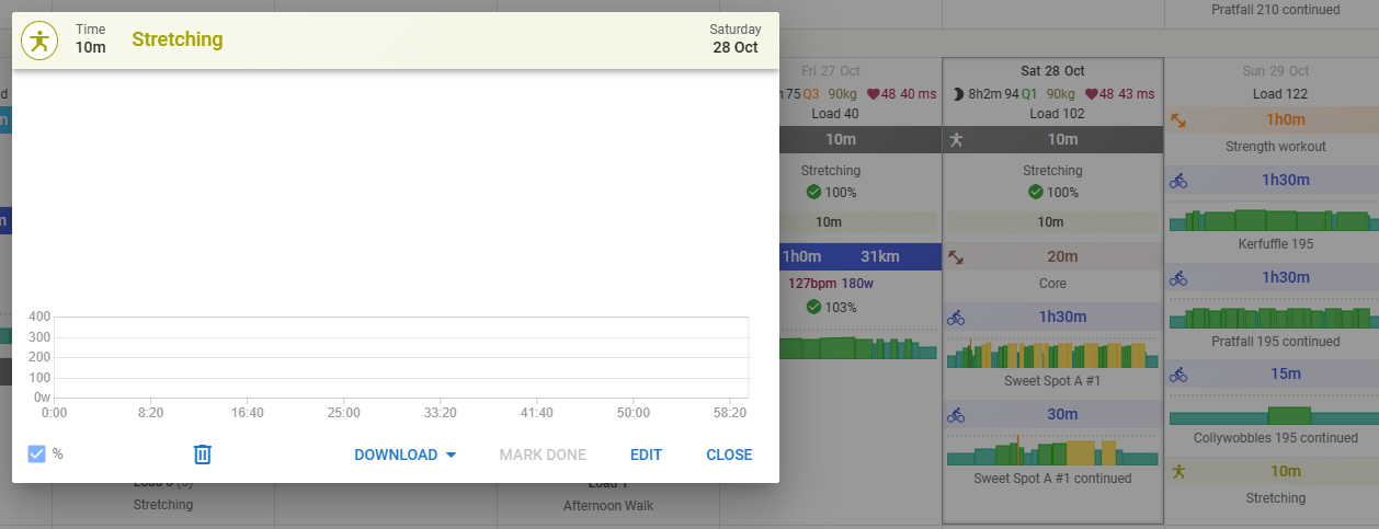
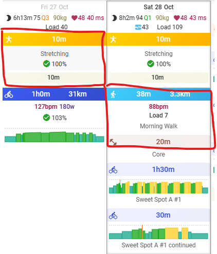
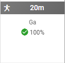
In the screenshot below I have dragged it onto 3 days, and set Friday to done. The light coloured planned workout is still visible with 10m written in it. I can go and delete it, and the completed one stays, which is what I would prefer visually, as the lighter coloured workout looks like I still haven’t completed it. Am I not using this correctly?
None of the type of workouts I’m describing pair (I have a Core and Strength one that behave the same) and dragging them on top of each other doesn’t do anything, the workouts just bounce off each other
I’m sure I’m doing something different to you, as in your screenshot above, you have an icon in light coloured planned workout and I don’t. I suspect what I am talking about is a deliberate design choice. Anyway, this is my full process, so we’re all on the same page.
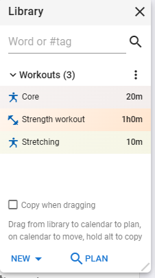
I created a Stretching workout in the workout library
of type Yoga (and the same happens for the other 2 in the screen shot, one is Weight training type and the other is Yoga again)
Ok. I just find that visually very confusing using the same colour as the planned item. As I look across my plan, if I see a light coloured bar, I just assume it’s a planned item and I have to look harder to see that it’s not something I haven’t done. (I do realise there is the completion indicator).
Visually, these 2 blocks both indicate to me I have something left to do
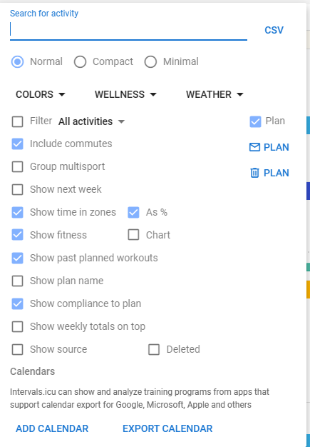
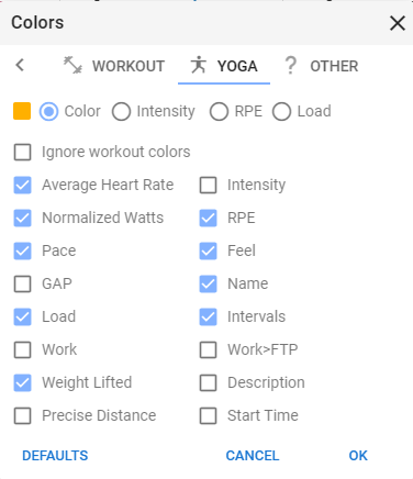
There’s a way to choose what color represents what sports I think. I just use whatever is the default and never bothered to change as I mostly 99% do 1 sport.
Yeah. I see the “Colors” option in your screenshot
It’s not the colours per se, it’s the fact that the planned activity is still visible after I complete it (albeit in a slightly altered form) and still happens to be in a visually similar format.
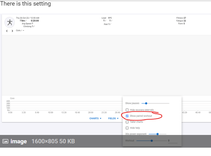
The light block underneath the stretching workout is actualy the visualization of what was planned exactly like the block underneath your cycling workout. But since there is no change in intensity, it looks like a flat out light coloured bar…
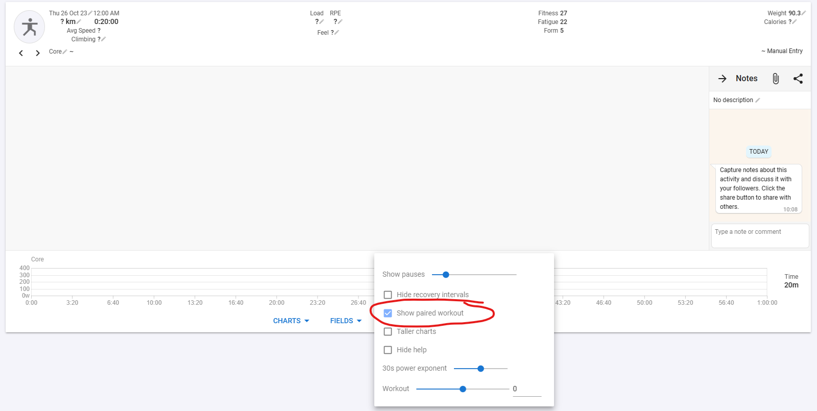
The show past planned workouts, will visually remove planned workouts in the past that have not been done. The planned workouts for today and future remain visible.
This setting on the other hand is a way to make the planned workout visible under your finished activity. That is always nice because you can easily see if you followed the planned one.
Yeah, after all the other replies, I now understand (or I think I do) what is going on, even if I don’t like the visuals.
On your other point, I wouldn’t remove past planned workouts that were not done, as I then can’t see if I missed them, to assess how I went during the week.
Yeah I had played around with the colours and honestly that is part of my problem. Since I was just playing around with colours and I didn’t really get the difference between and workout and a completed activity, and because intervals.icu is so customisable, I ended up with different colours for the same type of workout.
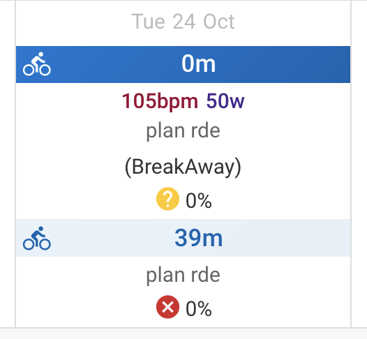
E.g I set the workout colour here for stretching to a brown.
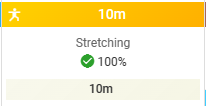
so when I completed the workout, there was that discrepancy, visually, that has been bugging me. Also, when you update the colour of the workouts, it doesn’t flow to ones already on the calendar.
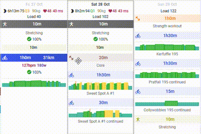
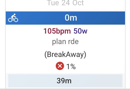
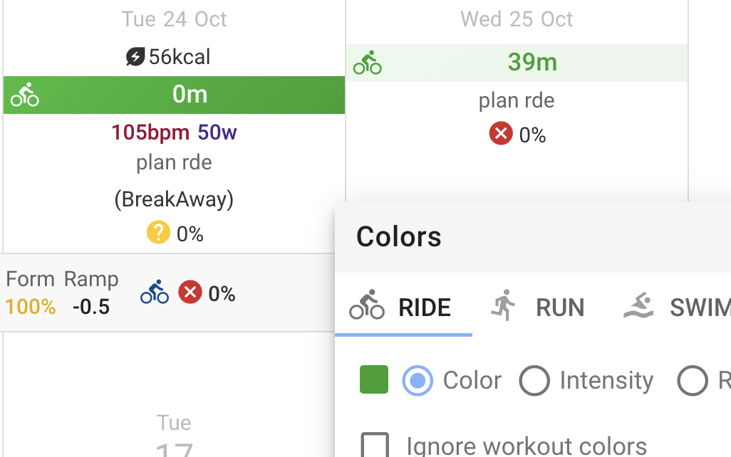
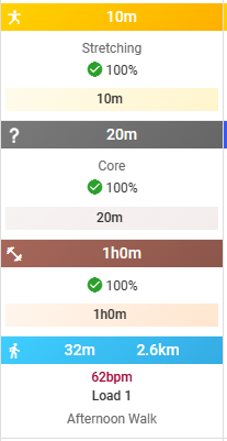
I now have them synced, so earlier in the calendar I have this
But now I have this
That’s much more visually coherent and a lot easier to understand when I scan through the calendar.