Hi,
Didn’t find a better category where to place this question and didn’t find a q&a category.
I’m trying to get the same chart for hr zones in running like I’ve use in riding, but I don’t know how.
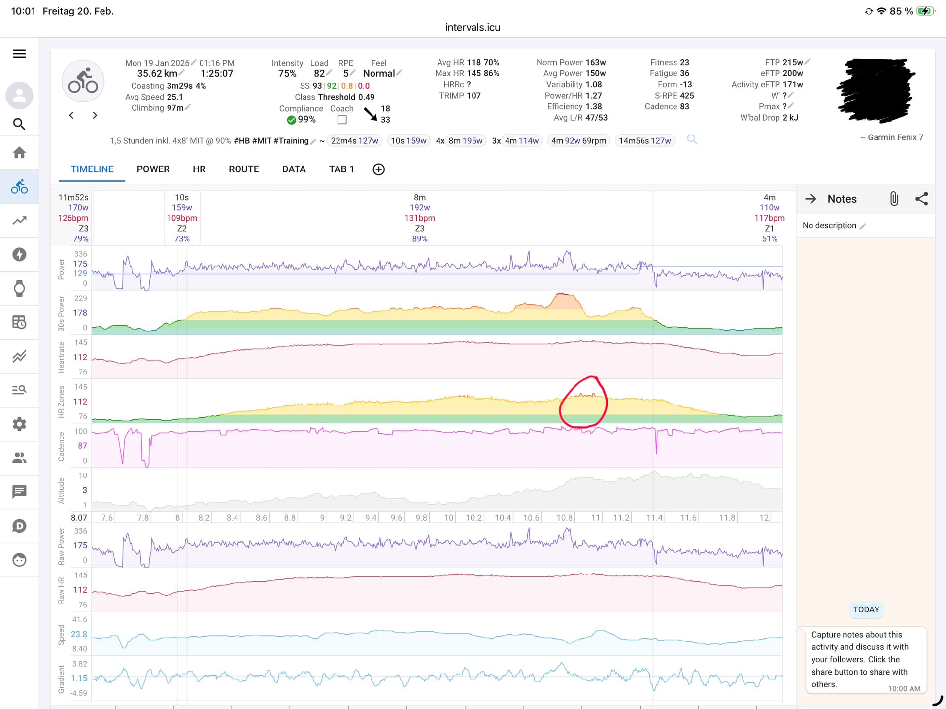
In a riding activity I’ve a chart for hr zones which shows the zone with color green, yellow, orange and so on. See the screenshot below where I’ve marked with the red circle what I mean.
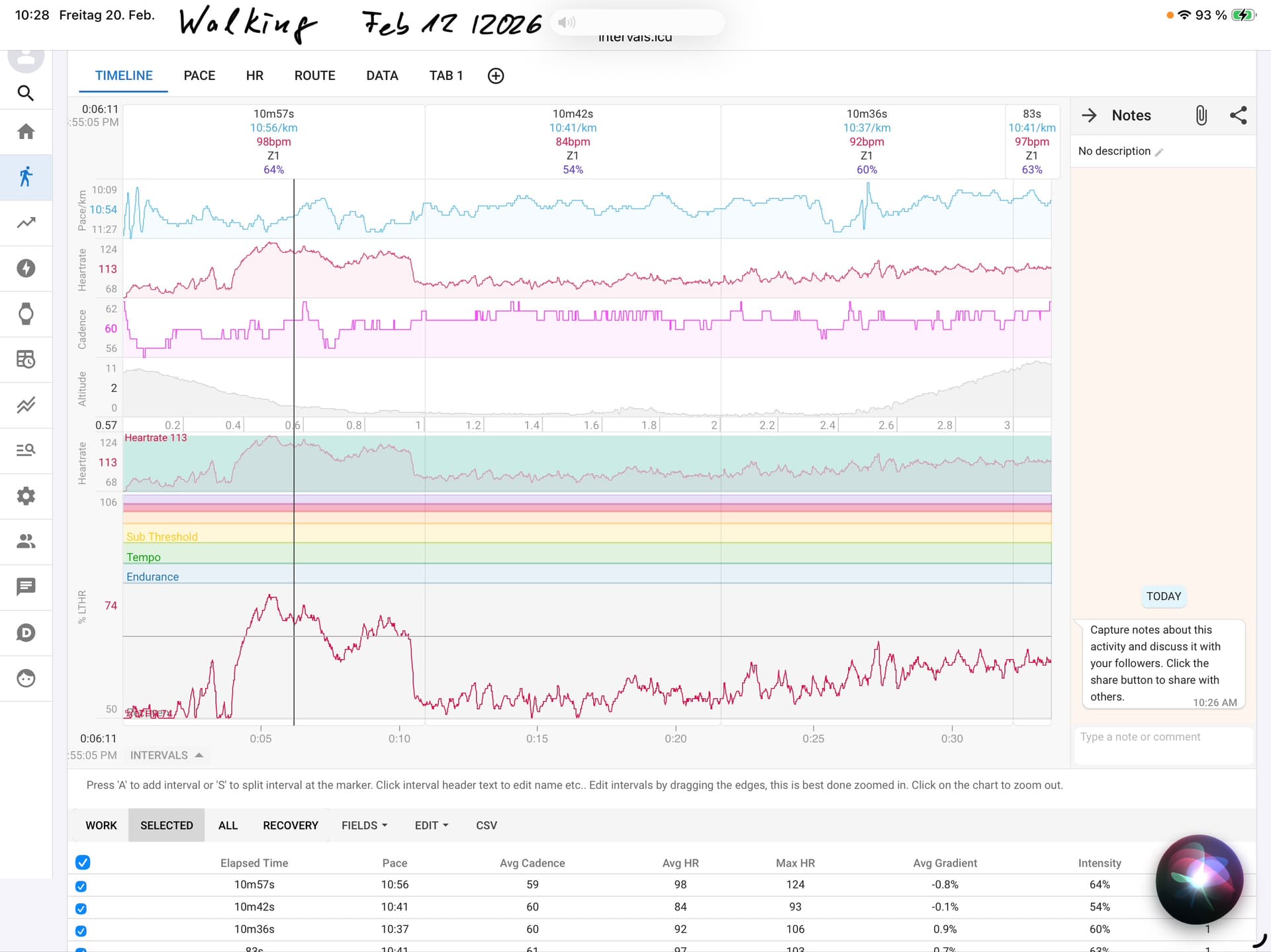
In my walking activities It looks like this: Example from 12. February
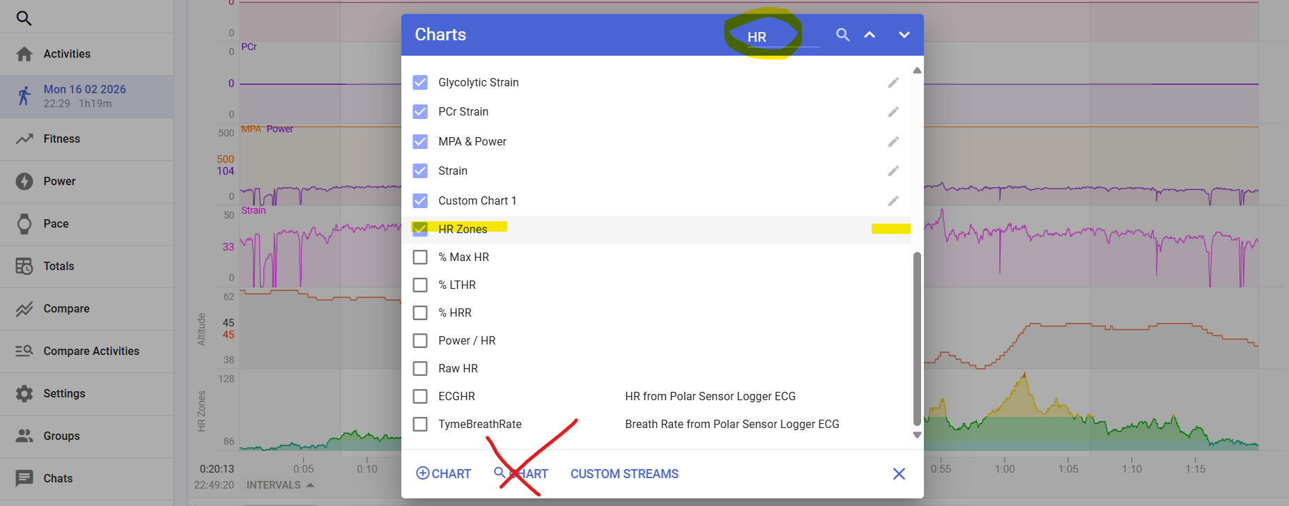
I’ve selected the following charts:

How can I I get a HR Zone Chart like in Riding?
Today I’ve added Walking activities to the spot Typ “Run” and adjust the HR Zones so that they are identical to “Ride”.
And now I did update the activities and I looks like this:
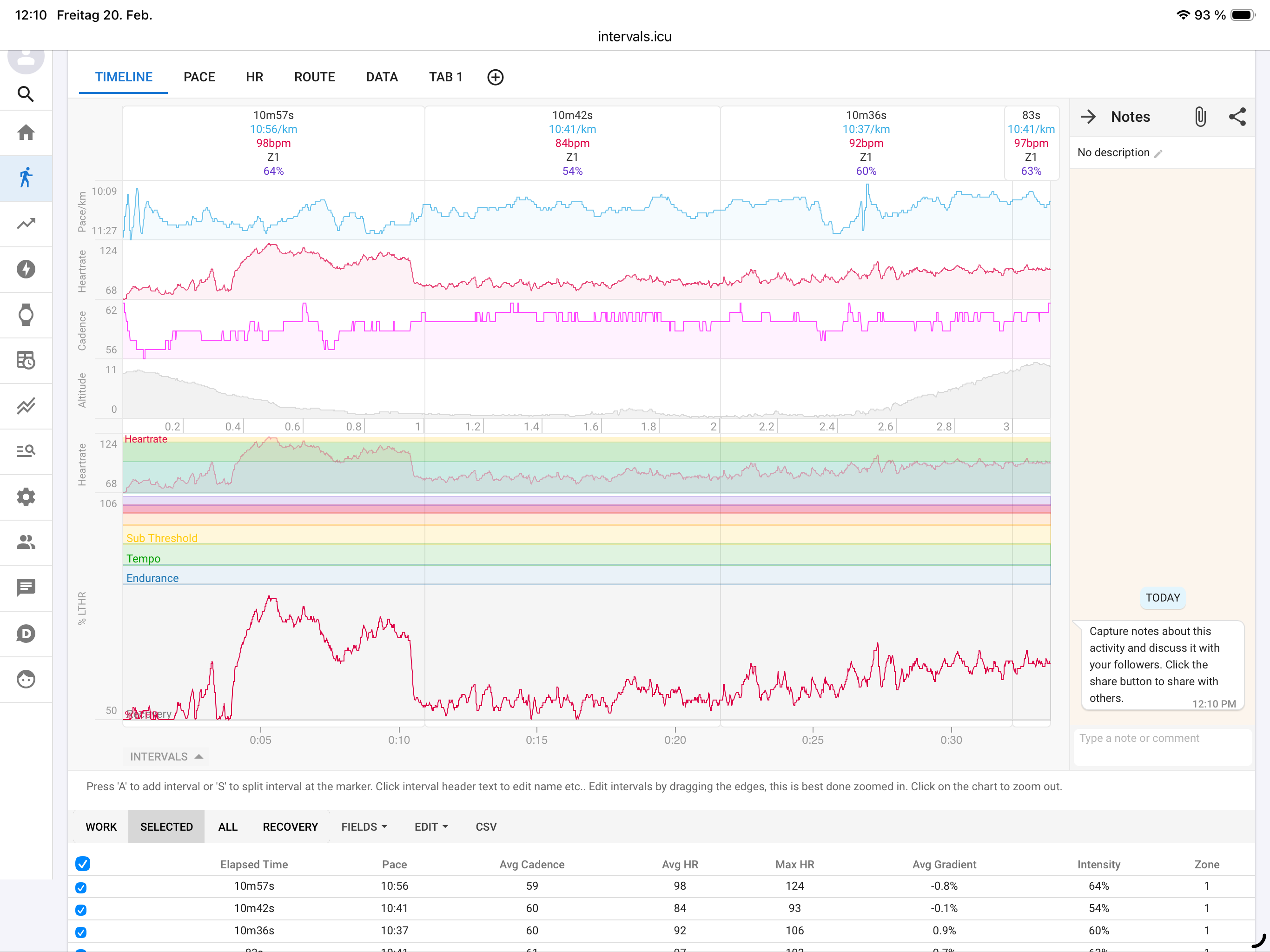
Any idea how to get the same look for HR Zones in Run/Walk like in Ride?