Hi,
In order to more easily observe the heart rate zones, how can I display a less compressed view of the y-axis?

Thank you.
Best,
Hi,
In order to more easily observe the heart rate zones, how can I display a less compressed view of the y-axis?
Thank you.
Best,
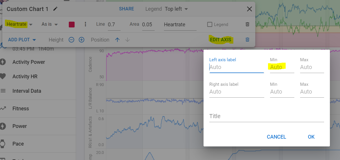
Make your own Heartrate chart by clicking on Add Chart - + Chart. Select Heartrate as plot and adjust the axis as you like (set min and/or max).
Thank you @MedTechCD ![]()
![]()
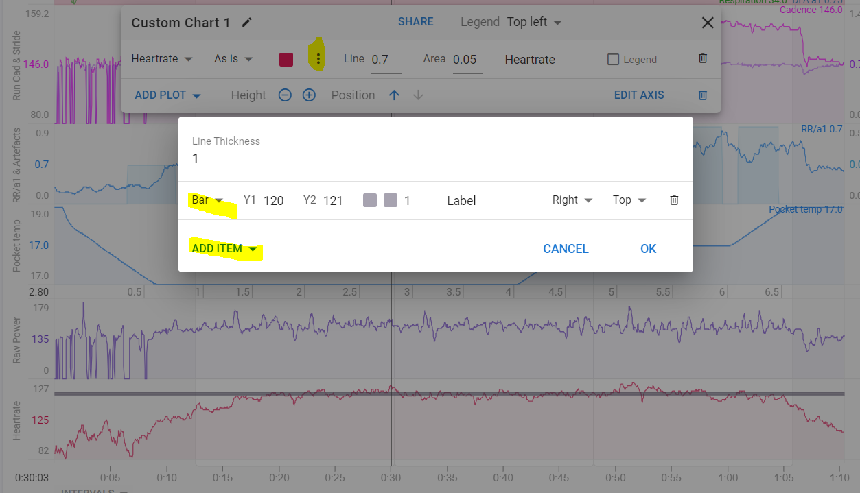
I recently did this too, but there was one other thing I wanted that I couldn’t figure out. Is there any way to also add some grid lines to the graph so it’s easier to tell when I cross 150, etc?