Multiple graphs/charts in the Compare display use the same color codes. That is, for a given tab all plots have the same defined “periods” and these should have the same colors in all plots – but they don’t:
![]()
Thanks. I am pretty sure I didn’t, but they (most of them) are there for many many years…
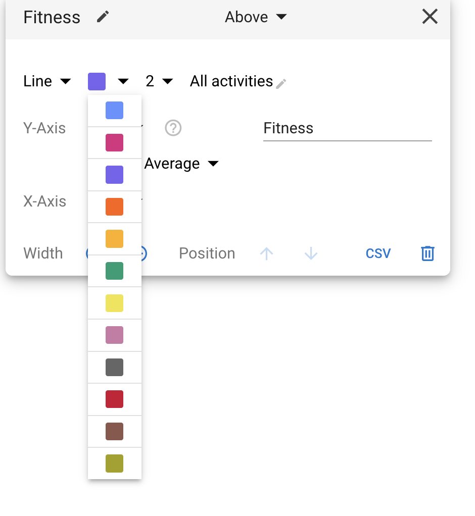
However, this is the solution to the problem – besides the fact that I cannot do it for the “Power vs Heart rate” one… For now I changed all others to resemble the color scheme of “Power vs Heart rate”, but that’s unfortunate because this yields light yellow for 2026, which is barely visible on white background …
That graph has more issues anyway:-o