This is really minor and maybe silly but I think it would make the graphs more illustrative on what actually happened during the activity.
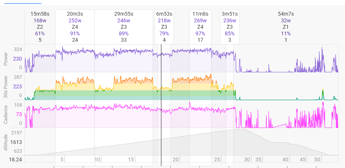
Let me give you an example. My ride from today:
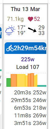
I’ve done 3x20 minutes intervals on this one. It’s clear from 30 seconds avg power graph. It seems the calendar graph “misses the scale” so to speak and missed what really happened during the ride. Thinking about it, it’s probably not only about 30 seconds power but more about scale 30 seconds graph is in.
The calendar shows your average values of the intervals.
If you delete all intervals, and for example create those 3x20‘ intervals, you will se these in your calendar.
Thanks @R2Tom , I was hoping the graph is created by just taking average power values at various points. I find the algorithm creating intervals not working very well for me. It basically never finds actual intervals and the boundaries seem kind of random to me.
Is there a way to create them from a script? It would be a fun project for me.
Did you use your device lap button?
Did you follow a structured workout?
If so, re-analyse with the ´Use laps´ option and you will have perfect intervals.
I’ve used structured workout on this ride. Unforunately Wahoo Roam has a bug that it doesn’t mark laps on the first and the last interval (it does for those in the middle). I will just add very short intervals to planned workouts on both ends to solve that issue. Thank you.
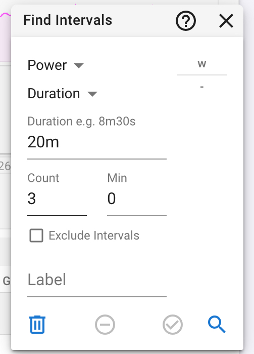
Or use the Find Intervals Option. It is a really quick way to get those intervals, if you don’t press lap buttons.
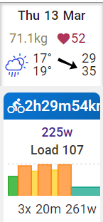
Thank you, that kinda works. I experimented on few workouts and noticed that if I just use it to find the longest intervals (say 3 in the sample ride above) then the graph looks very good even though the rest wasn’t found (10m easier periods for example). I’ve got the best results by requesting to find 3 20 minutes intervals and leaving the rest. It looks like this now: