I use Intervals.icu most of the time on my smartphone. Most pages work pretty well, bit they are not optimised for mobile as you are well aware. I use intervals.icu as a browser app, and that works pretty well. The new MS Chromium edge browser is fast and reliable. Im not sure how others feel but it would be great to have some focus on interface.
Tx a stack for Patreon support! I was considering tackling the “small screen” problem next actually. Just knocking off some smaller things on the todo list.
What phone do you use? Also portrait or landscape mode? Currently I try to get screens to layout on an 800px wide screen which is landscape mode on my iPhone 8+.
Please note that there are also many Android devices (such as Samsung) that have wider than 800px wide like 1080px.
Also, going just web was a good choice since it’s easier to maintain.
Using landscape mode is better than portrait on my device (Samsung s10e). There was some text overlapping in portrait mode.
I’ve noticed some performance issues when loading too much data. Maybe use some defaults when loading on phone. Hopefully I’ll have some time to make a list with things that work and don’t work (I do QA as a job )
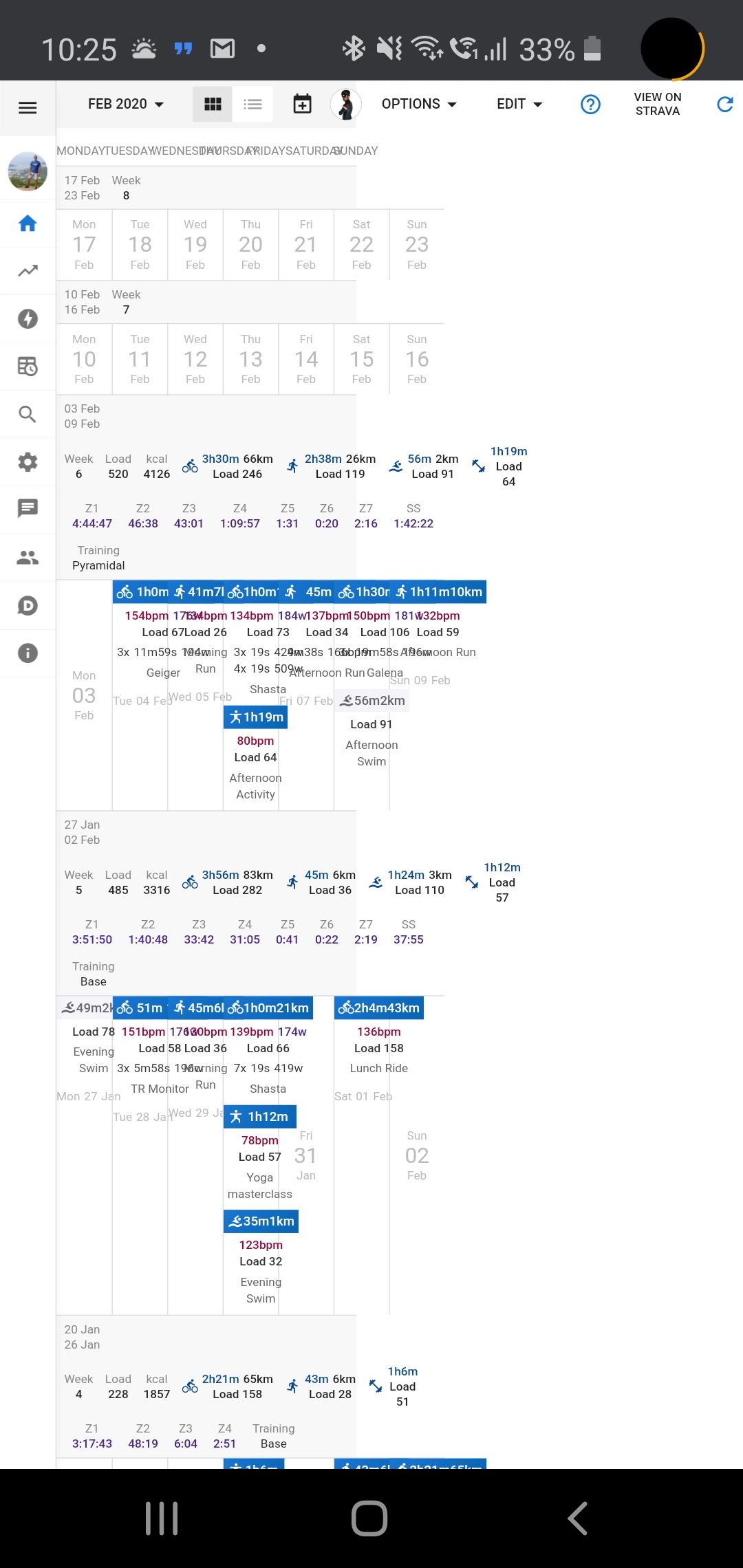
Hmm that screenshot has some big issues. The toolbar at the top is ok but the cal is all squashed up. Thats Intervals.icu not getting along with your mobile browser. Harder to fix than just making stuff fit in the width.
 )
)