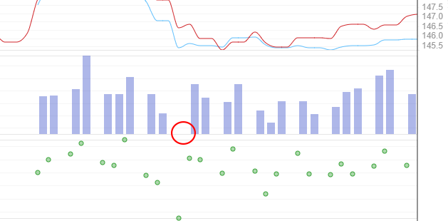
Hi, sometimes the lowest data point in the bar graphs can become hidden as if there’s no data there at all because the y-axis’s range is defined by the lowest and highest values on the dot instead of slightly above or below these values.
For example here I’ve drawn a circle around where a bar should be but isn’t because it’s the smallest value:
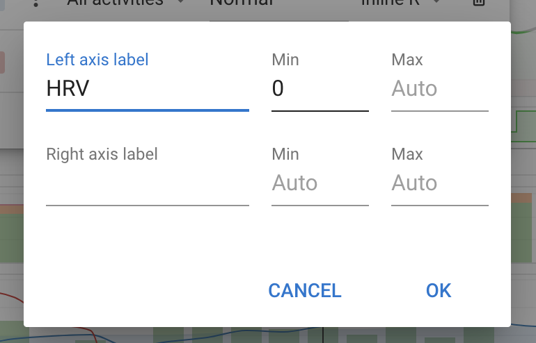
The bar is missing because it has the same value as the minimum for the data set (35ms). You can change the minimum for the scale using the “Edit Axis” button: