I have two very simple suggestions for adjustments to the Power Balance plot to make it more intuitive.
For clarity, this is the plot I am talking about:
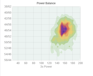
My suggestions:
- Flip the X and Y axis (and, if relevant, revert the new X axis), so that left/right balance is actually left/right on the chart.
- Adjust the balance (new X) axis scaling so that 50/50 is always in the middle (the outer limits of the axis can be adjusted as needed, but keep it centered on 50/50).
All in all, these adjustments should make the chart more immediately understantable, since there is a clear spacial mapping between the plot and the actual left/right.