I’ve seen Intervals grow and develop over the years at a staggering pace and would like to thank David and all the contributers over the years for all there afford.
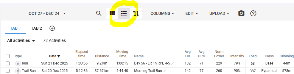
But there’s one thing I miss. The graph’s we can get and configure are great and give so much information at a glance, however some data is better organized and viewed in a simple table/sheet format.
So I would rely like to see the option to configure tables, where you could summerize weeks/months/years.
For example a table where the rows are the weeks and the colums are filled with time, distance, time h2, avg HR and so on, just the values you configure.
It would be even better if you could give a min/max value for the colums by which the data gets colored (red/green) for meeting the given value.
This way you could see in a glance where in the past you met your targets and where not.
This table could be placed in the Totals-tab where it would add detailed info over the given period.
Thanks, and for now happy holidays and a very sportif newyear.