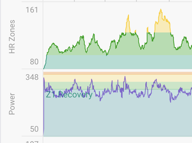
For runs, the “HR Zones” chart is pretty, while the “Power Zones” chart is ugly. Please render power zones chart the same way as HR zones – a white background area chart, with horizontal bands of colour to show changing zones.
For runs, the “HR Zones” chart is pretty, while the “Power Zones” chart is ugly. Please render power zones chart the same way as HR zones – a white background area chart, with horizontal bands of colour to show changing zones.
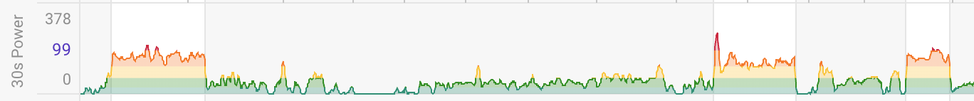
You could use the 30s power chart which has the same colouring