Hey guys,
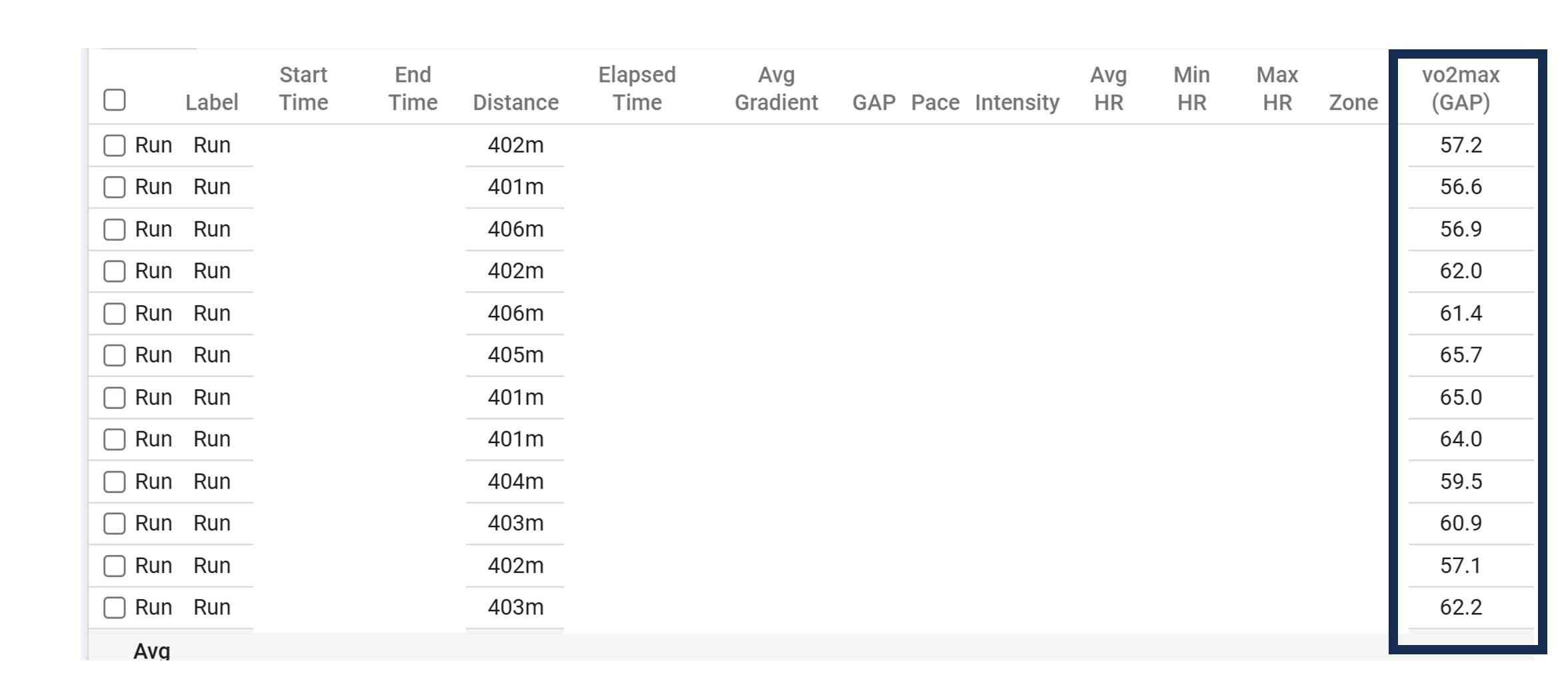
I am not exactly sure how to interpret the following data field in the interval overview in the activities section. What does this number tell me? Should I take it at face value or should I rather make sure that this number increases over time for the same workout and not really have an eye on its absolute value? Rather its trend? Because the vo2max given in the column is way off compared to the number my Garmin (Epix 2 + HRM Pro+) gives me.
Values are from today’s 12x400m intervals.
Any clarification is highly appreciated.
Cheers,
A
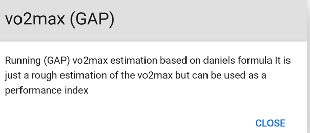
The explanation here is pretty much all it is. It’s a rough estimation (downstream from other metrics) that can be used to compare interval efforts within and across sessions.
I always think about the NFL’s “passer rating” when I come across numbers like this. You can win the Super Bowl with a bad one, and not even make playoffs with a good one. It’s a figure that doesn’t tell you the full story, but it’s useful in a quick, glanceable way.
If it’s convenient to you to use the figure as a performance index, go for it. Just remember to keep it apples-to-apples. It’s not comparable to Garmin’s general VO2 max figure, AFAIK.
Great answer, thanks for your reply! I’ll just take it as a performance index and watch it’s trend over time, hopefully up-trend 
Cheers.
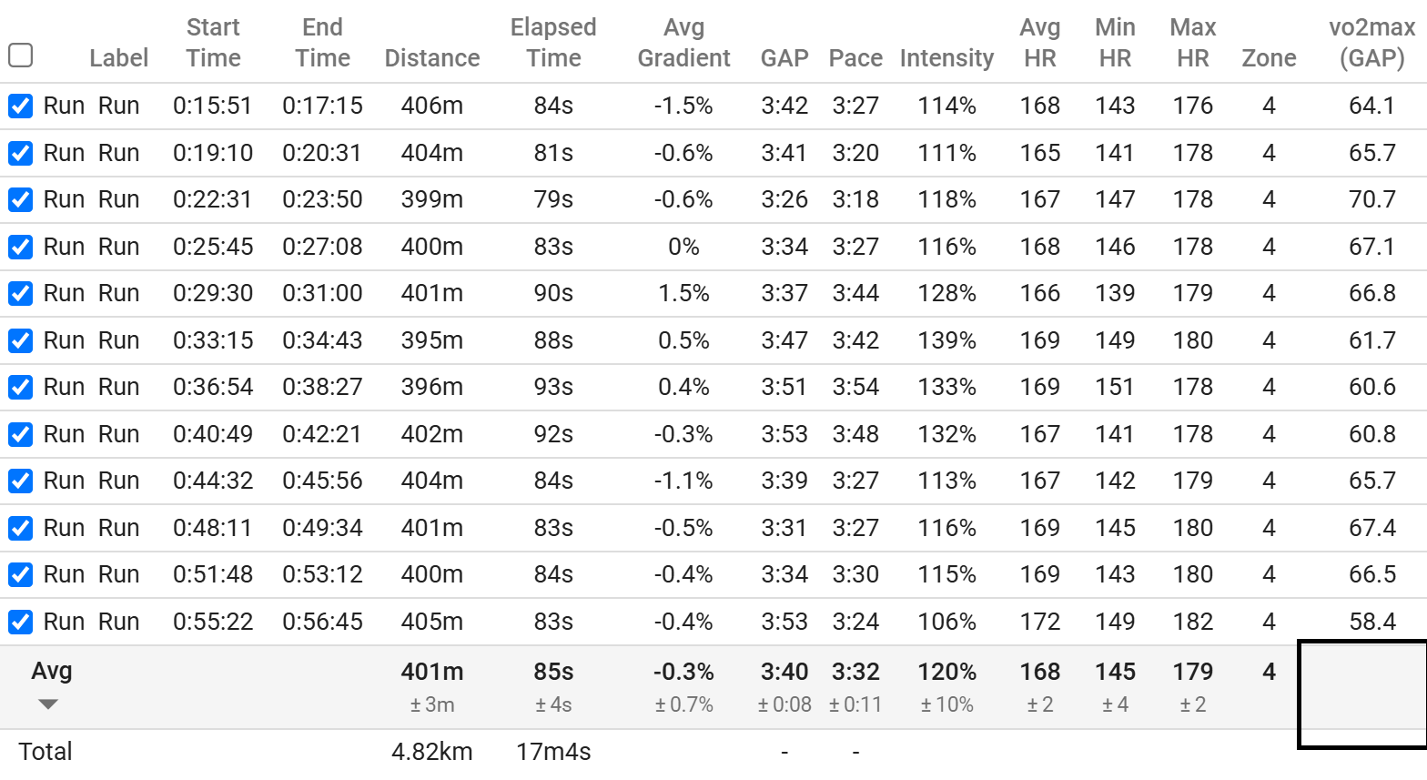
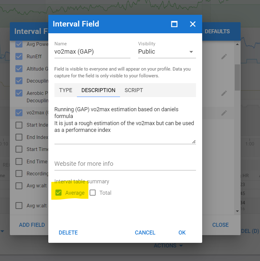
Hey @david. Could you also add the possibility to average the VO2max column? As discussed above, I’d like to use it as an additional metric to gauge if my overall training and the different sessions I do move my fitness into the right direction. And its a bit tedious to calculate the avg using a calculator/Excel/etc.
The same problem occurs in the compare activities section, see following screenshot:
And if it’s not too much of a hassle, it would be great if you could add this number to the possible (custom) charts. I couldn’t find a way to make it work, but maybe I am just not capable enough thus far using the programme.
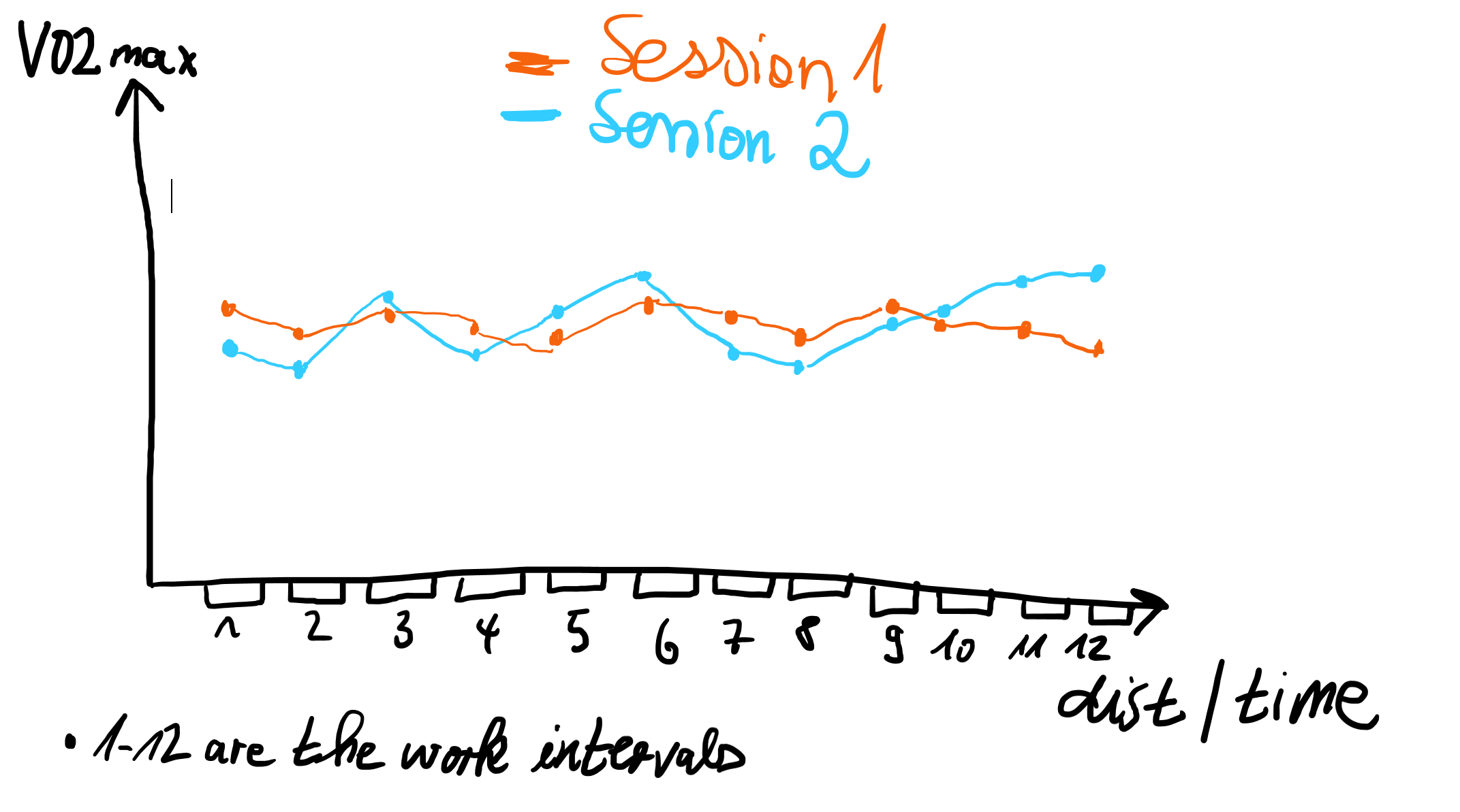
I assume that this number somehow aggregates the effort over the entire interval into one number, but it would be great if one could plot this data point for every interval and then possibly connect the dots by straight lines. It would simplify the visual comparison of the effort per interval across sessions (compare activities screen) and might be helpful in figuring out trends and problems in the workout (analysed together with all the other data).
Would be awesome. Thanks @david and have a great one!
Edit: I have only figured out a custom VO2max chart in the fitness tab, but that’s not what I want to analyse. I want to analyse the intervals of single sessions (and possibly multiple sessions of the same type in compare activities) in the light of this value, hence the averaging and the plotting would be helpful!
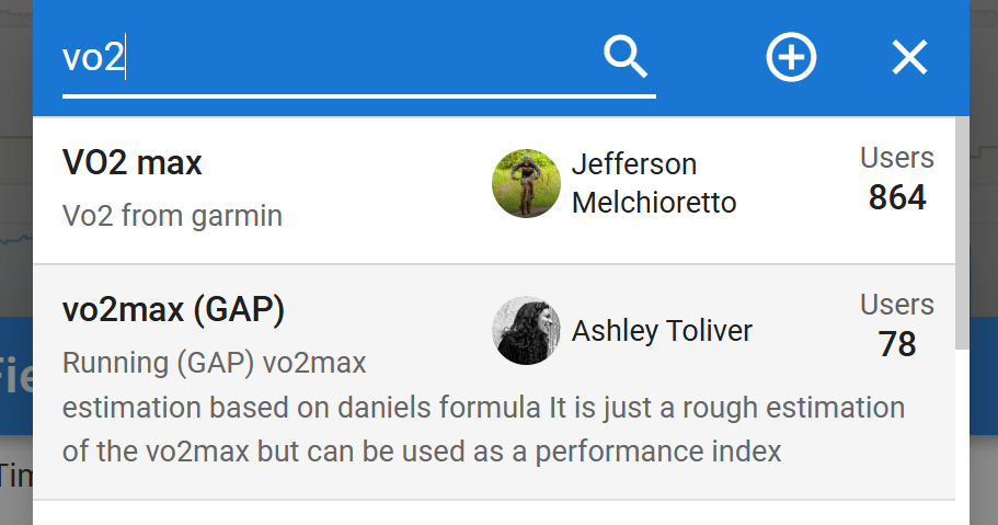
Where is the VO2max(GAP) value coming from? Since there’s no avg calculated and you have trouble plotting it, I suspect that it is formatted as text.
It’s a custom interval field, provided by Ashley Toliver. Gotcha! You are saying it is not a problem of the table, rather a problem of the custom field.
Edit to clarify: not a problem at all, @MedTechCD explained what needs to be done to get the average! See his post below.
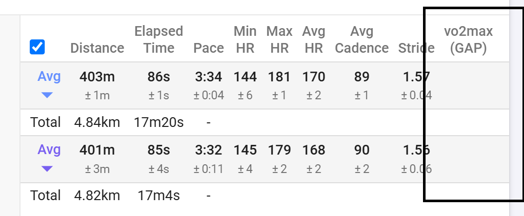
Never mind, i found it. It’s a shared interval field. You need to tick the Average checkbox to get an avg in the table.
2 Likes
Great, yes. Thanks a lot!
However, the inquiry for the plotability still stands. Or do you know a way to plot the data point for each interval below the other graphs in the analysis section for this particular activity (and in compare activities)?
I am imagining a graph like this:
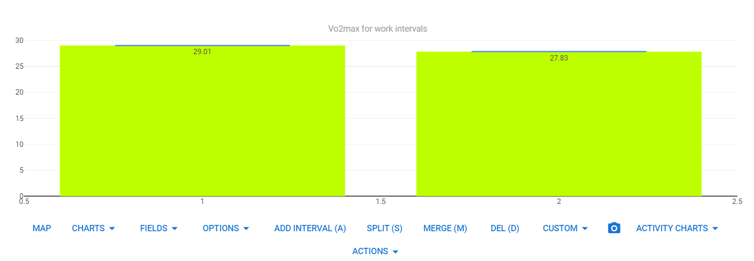
Here’s something I quickly put together based on another Activity chart. Needs some more attention to get exactly what you want, but you get the basics.
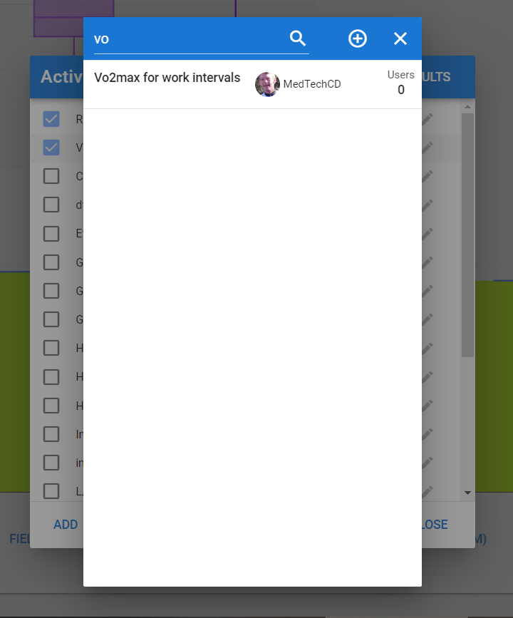
It is available as a shared Activity chart. Not sure how to do multiple sessions in one chart…
1 Like
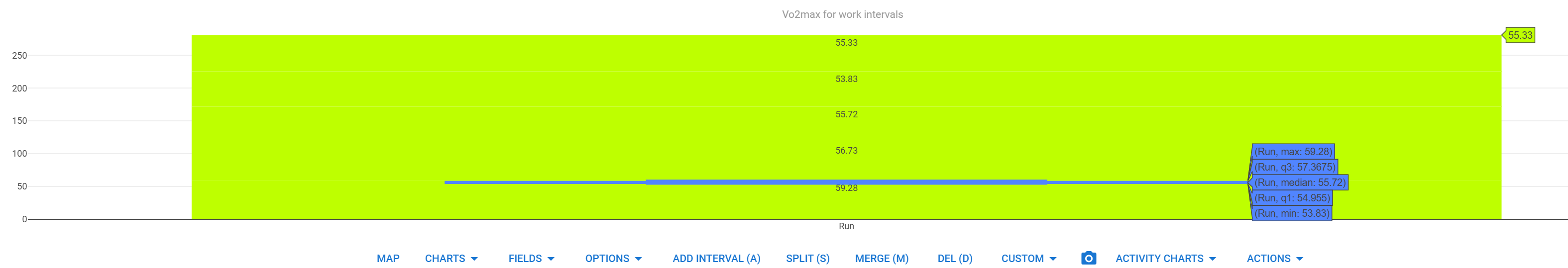
Thanks a lot @MedTechCD for your work! I have tried to recreate the chart as shown on your screenshot and that is what it shows in my chart:
Do you have any clue why it looks like that? I have 5 work intervals interrupted by recovery intervals (deleted them from the interval chart, only have the work intervals left as “intervals”). Your chart shows a bar for every interval, mine doesn’t!
Maybe I can have a look at the script myself in a few weeks time to add multiple sessions. Just don’t have the time right now!
Thanks again and regards!
Looks lt has something to do with interval numbering or label. Are all work intervals labeled ´Run´?
They are overlaying because there´s no x-axis differentiation. The script would need to be changed to handle those cases.
As a quick diagnose, delete the labels.
yes, that did the trick! Always great to learn the small quirks and features of the platform!
The chart looks like something to further build my idea on! Maybe I’ll find the time in February, because I find it quite an intersting chart for a quick glance and comparison! Anyways, thanks!
1 Like