hi, seems to me that, even when set to prioritize pace over power for running, on settings, the skyline is always by power.
if so, would it be possible to have it changed to follow the primary data from the settings?
hi, seems to me that, even when set to prioritize pace over power for running, on settings, the skyline is always by power.
if so, would it be possible to have it changed to follow the primary data from the settings?
Make sure you’re setting the correct setting, as there are 4. The one that determines the skyline is the “Intervals” setting.
for running they are all on pace, but the skyline seems more aligned with the power.
If you hover the skyline it will tell you what was used to determine it
then, there must have some kind of limitation or deviation in the way it interprets the data, because it doesn’t reflects the paces and zones.
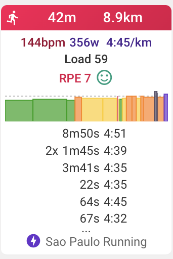
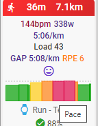
in the image here, all 30s and all 4min have the same pace/zone, but are presented different in the skyline.
Presumably those intervals have some deviation if you look at them on the activity screen.
The groupings value of intervals is not taken into account for the skyline, only the actual values.
The Skyline follows the detected/edited intervals in the activity. Check the intervals, edit as necessary and the skyline will show what you want.
the activity is using the workout laps, the same data and timestamps for all places where it has been uploaded. even then, different results.
ie, the skyline on strava… the discrepancy on the short ones are huge. and this happens only with running pace, no problems with cycling with power.
The skyline chart shows the intensity of each interval. For pace 100% intensity is threshold pace. For power 100% intensity is FTP power etc… So I think it just looks different because the y-axis runs from 0% whereas the Strava chart is starting at a much higher intensity.
sorry man, it’s not. if you look at intervals’ skyline you won’t find the same sprints
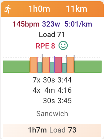
the intervals have 3 structures, 2 “sprints” with a threshold between them. you can see all of them on strava, but intervals reads them totally different.
i know this won’t be a priority, but clearly there’s something in the way it draws the data, or the avg, or something like that and seems to be more pronounced when using pace instead of watts.
hey @david,
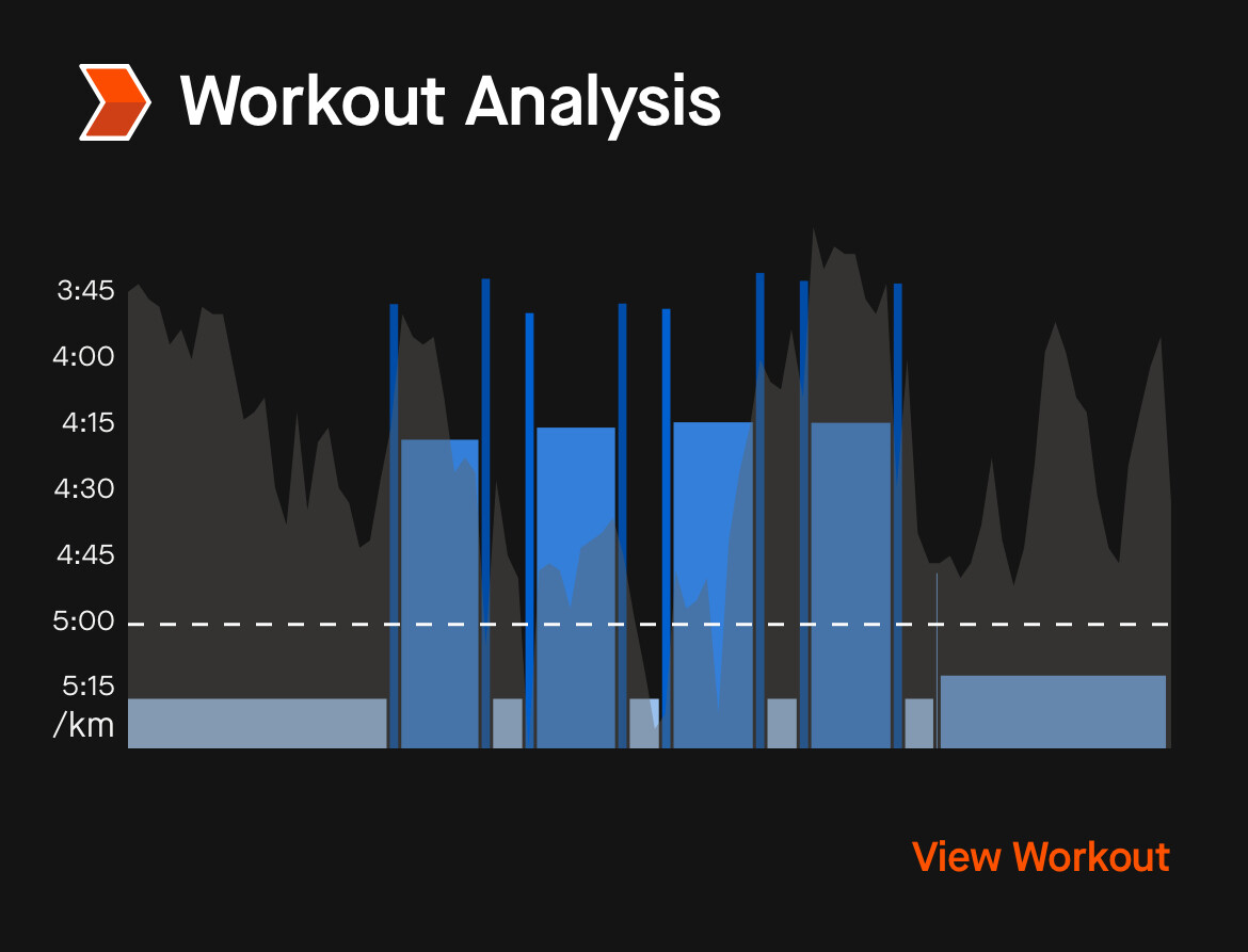
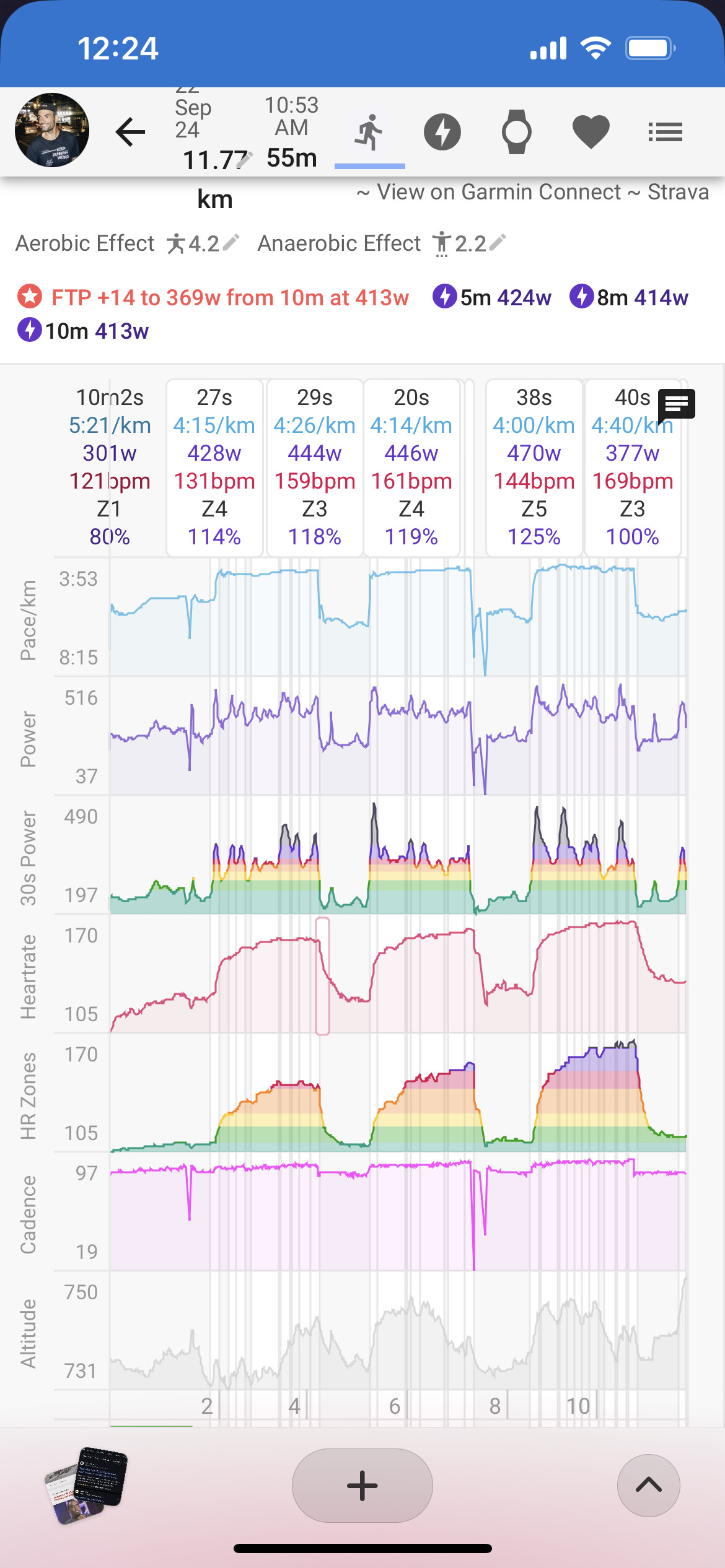
just to add to this talk, i noticed another discrepancy this week about what’s on the running activity intervals and the skyline.
if you look at it, will see that, towards the end, there’s no interval that goes beyond my threshold pace (4:08m/k), but there’s a power surge that’s clearly anaerobic… and that’s what seems to be represented on the skyline.
feel free to access the activity if you wish.
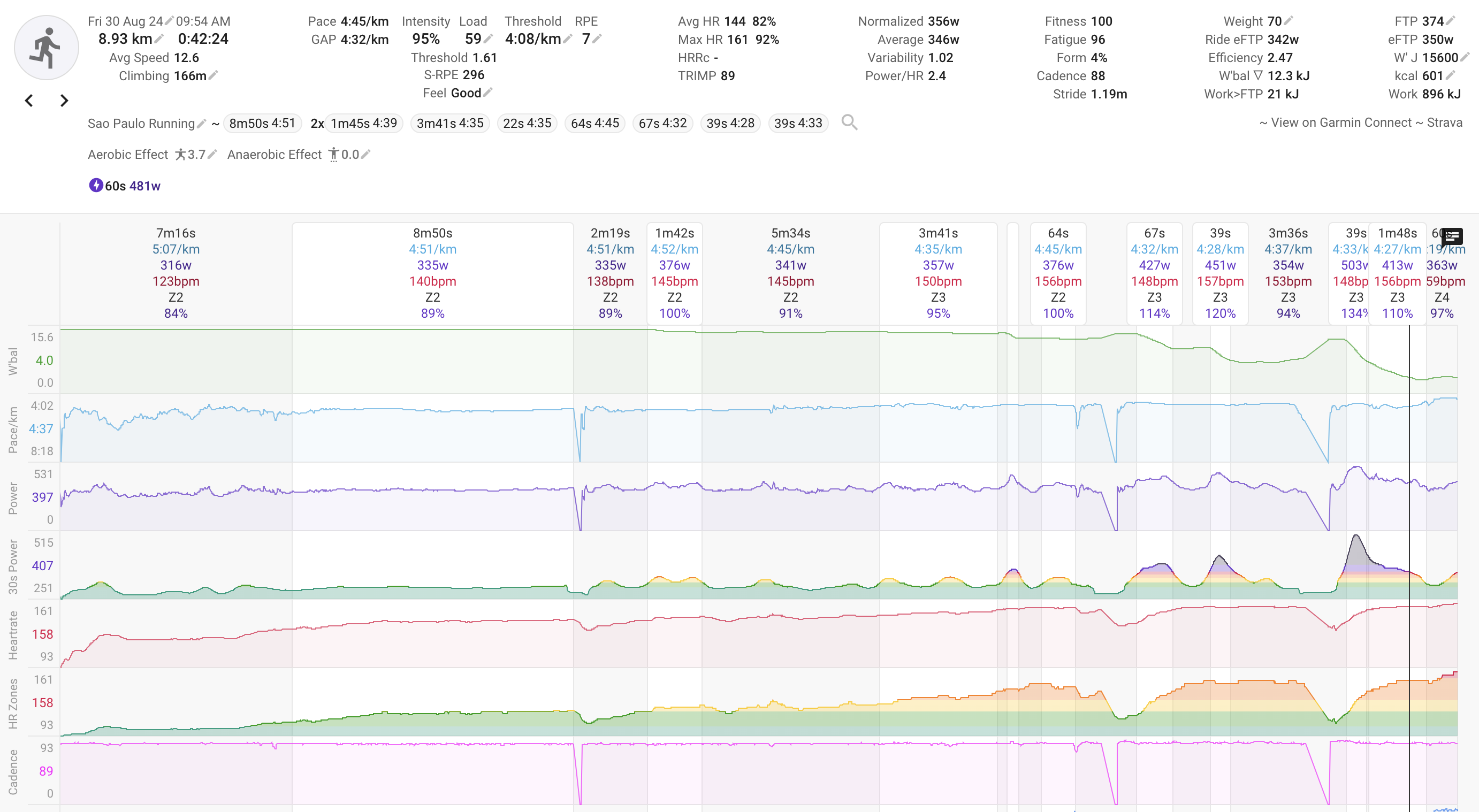
ps.: i’ve gained a few pounds over the last months, so the power zones is currently offsetting the pace zones, just because i didn’t a proper test to update them.
bumping here one of my top wishes, skyline by pace for running ![]()