That change is live, @Pius_Gloor - in terms of the video stopping, it will stop if you resize your browser window to a point where the view “adjusts” itself to the small form factor while a video is playing, otherwise it should remain playing.
1 Like
@Ben_Snyder , the developer has added an integration with my Tymewear breathing sensor & ideally needs more than just me to test & debug it. If any contributors to this thread have a Tymewear sensor & are willing to help, then it would be much appreciated.
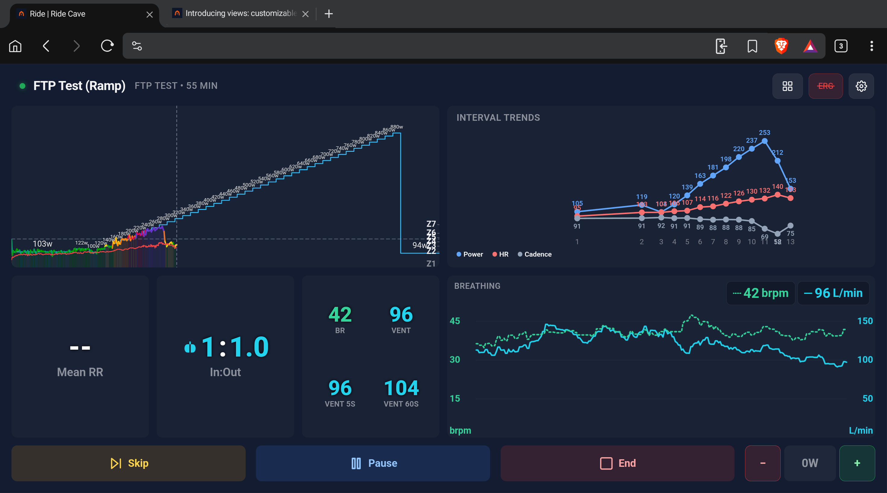
Also, it would be helpful for those with more knowledge of monitoring workouts using ventilation to suggest what metrics are most meaningful and which combinations would make sense for customised Tymewear views. These views could show a whole gamut of streamed metrics from e.g. power, HR, Tyme as well as other tiles that include computed fields. Then there are other tiles such as interval comparison, Spotify & Netflix. I have created a couple to cover short interval workouts & the longer, more steady state ones shown below. But Tymewear views would need different combinations to make the data useful, rather than misleading or a distraction. One of the tiles has been set up to mimic the Tymewear screen shown on a Garmin head unit or Garmin watch. But we have the screen space to offer more information, assuming that it is instructive.


The respiratory metrics are now live on the ride cave website & Ben has filmed an explanatory blog, including a video, to cover this new feature. Loading... | Ride Cave
A review of the Tymewear sensor - Forget heart rate: this breathing sensor is like having a £40,000 lab on your chest | BikeRadar
More information about the Tymewear sensor is available at https://www.tymewear.com/
From their website
How does Tymewear improve my training?
Tymewear improves your training by measuring what matters most: your body’s actual response to training. The chest strap detects your metabolic thresholds through breathing and translates them into personalized training zones. With a simple 20-minute ramp protocol, you’ll unlock a complete fitness profile including your aerobic threshold, balance point, anaerobic threshold, and VO2max. This isn’t just data – it’s your blueprint for optimal training
There is a very detailed & informative thread on the intervals Forum site that covers the Tymewear sensor & gives examples of what results can be achieved. I have loaded a test that I did & the contributors on that thread kindly helped with the analysis of it.
So it can function as a close approximation of the results that Lactate Testing can provide without the extra cost & commitment that Lactate Testing requires.
These are two custom view that are available on ride cave via the Tools/Views.


1 Like
This is a worked example of my Tymewear Test to further illustrate what these extra Tymewear metrics could potentially offer people.
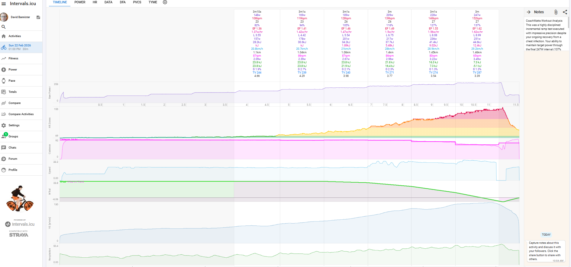
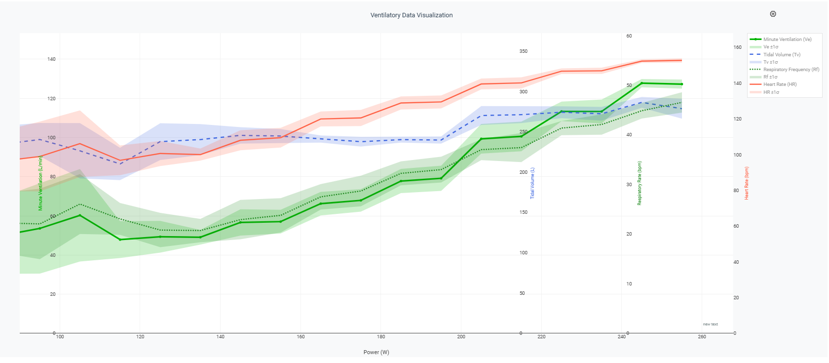
Using Gemini Deep Thinking
Note that Rf equates to Tymewear BR, Ve to Minute Ventilation & TV Tidal Volume.
Many thanks to @pepe for creating this instructive chart to aid analysis.
“Can you explain what relationships matter & how I should interpret this chart if I had been cycling with it in real time. How would having those graphs visible in real time have helped me to improve my workout or manage my stress, future performance & recovery”
This chart is a sophisticated look at your body’s “internal combustion engine.” While most cyclists focus on Power and Heart Rate, this data adds Ventilatory Metrics, which are arguably more sensitive indicators of metabolic stress and fatigue than Heart Rate (which often lags behind effort).
Here is how to interpret those relationships and how you would use them in the heat of a ride.
1. The Key Relationships: How You Breathe Matters
To understand this chart, remember the fundamental equation for Minute Ventilation (V_E):
V_E = Respiratory Frequency (Rf) X Tidal Volume (Tv)
- Tidal Volume (Blue Dashed): This is the “depth” of your breath.
- Respiratory Frequency (Green Dotted): This is the “cadence” of your breath.
- Minute Ventilation (Solid Green): The total volume of air moved per minute.
The “Efficiency Crossover”
Look at the 200W mark. This is a critical pivot point in your data.
- Before 200W: Your Tidal Volume (depth) is increasing to meet the demand. You are breathing deeper, which is efficient.
- After 200W: Your Tidal Volume plateaus and starts to dip, while your Respiratory Frequency (Rf) begins to climb sharply. You’ve shifted from “breathing deep” to “breathing fast.” This is usually the sign that you’ve crossed a metabolic threshold (VT2/Anaerobic Threshold).
2. Real-Time Interpretation: The “Traffic Light” System
If you had this on your bike computer in real-time, here is how you would “read” your body:
| Zone | Observation | Meaning |
|---|---|---|
| Efficient | T_v is rising; R_f is stable. | You are in an aerobic state. You can sustain this for hours. Use this for endurance pacing. |
| Threshold | T_v plateaus; R_f starts to “kick” up. | You are approaching your limit. This is your “Time Trial” pace. You have roughly 20–60 minutes left at this intensity. |
| Red Line | T_v drops; R_f skyrockets. | You are “gasping.” You are blowing off CO_2 to compensate for acid buildup. You have minutes (or seconds) left. |
3. How This Data Improves Your Performance
A. Pacing & Energy Management
Heart Rate (Red) is a “follower”—it takes time to rise when you attack a hill. Respiratory Frequency (Green Dotted) is a “leader.” If you see your $R_f$ spike early in a climb, you know you are over-geared or attacking too hard before your Heart Rate even alerts you. It allows for instant pacing corrections.
B. Managing Stress & Focus
High $R_f$ is linked to the sympathetic nervous system (fight or flight). If you see your $R_f$ climbing while your Power is steady, it’s a sign of non-functional stress. You can use the graph as biofeedback to consciously take deeper, slower breaths ($T_v$) to lower your $R_f$, effectively “calming” your nervous system and lowering your physiological cost for the same power output.
C. Future Performance & Recovery
- The “Cost” of Power: If you do this same test in a month and find that at 220W your $T_v$ is higher and your $R_f$ is lower than it is today, you have become more aerobically efficient. * Fatigue Tracking: If you start a workout and your $R_f$ is high at very low power outputs, your body is still stressed from a previous session. It’s a clear signal to make it a recovery day instead of a hard one.
4. Summary of your “Capture”
In this specific session, your sweet spot for efficiency seems to be between 140W and 180W. Once you cross 200W, the “metabolic cost” of your breathing increases significantly—you’re working much harder for every extra watt.
2 Likes
Looks good @David_Bannister !
Some updates went out today for Ride Cave that folks here asked for:
- Improved support for Polar H10 and Garmin Pro HRM (they should now work with HRV and breathing data)
- Live Routes (as suggested via DM)
- Wahoo integration
- Prevented the back swipe on android mobile
2 Likes
Can’t wait to test the routes 
1 Like
Let me know if you have any feedback! Consider this a V1.
1 Like
Hello, I’m using Ridecave for my indoor training. After a one-week break, I’ve noticed that my speed readings are incorrect. I understand that indoor speed doesn’t always match outdoor speed, but compared to the exact same workout I did previously, my speed is now 40% lower. I haven’t changed any settings; I simply paired the trainer and started as usual. I’ve tried restarting the workout and re-pairing the trainer, but nothing has changed. The speed and total distance remain at about 60% of what is expected. Do you have any suggestions?
Hi @giancky , are you comparing a workout you did on Ride Cave to the same one you did on Ride Cave a week ago? Or are you comparing to the same route you did in real life? Can you also tell me what route you are using?
Hi Ben, I’m just using a workout without any route. Exactly the same, and I don’t even use the gear shift, always same position. If you need it I can uplod the two different results from intervals.icu
yes please! The more information you can provide the better.
Hi Ben, I was able to pick up Ride Cave yesterday for a ride on the iPhone after a while, and I noticed significant improvement anywhere! (I use the iPhone only when I’m traveling and I need to train in hotels). Really good job!
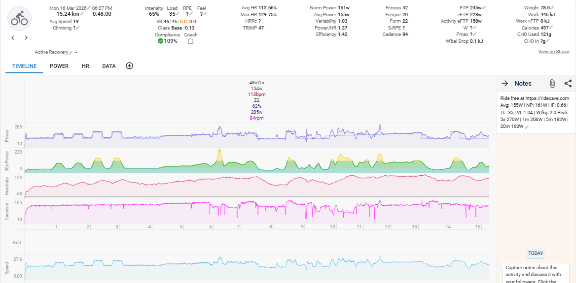
One item that I’d like to find out, is the layout on the iPhone: the standard layout screen is kind of shrinked and I was not able to see the entire out overview or get understanding which interval would come next. Apart from that it worked really well!
I’m happy to hear that Marco! And I’m glad it’s working for you on the iPhone. There are two main display modes for standard workouts (ignoring track rides/races):
- Classic mode (the original standard view that is responsive and tries to fit everything into a single page).
- Custom Views (of which there are a standard set). On smaller screens these transition into “pages” that you can swipe between. This might work better for you?
Or it could be that you have a feature request for which I’d be happy to include in the roadmap.
By the way, Views are infinitely customizable
with 55+ different data cells, 15+ charts/panels while you can create your own custom data cells using widgets framework so if the defaults aren’t working for a small screen, there should be a way to configure something that works.
I will give a spin to the custom view! I will let you know as soon as I am able to set it up. Thanks!
Just to provide some additional information: this evening, I tried a different workout using both an Android tablet and a Windows laptop, but the problem persists. The speed is still incredibly low. I also tested the trainer with MyWhoosh to see if the hardware was the issue, and it worked perfectly. This suggests the problem is specific to the Ridecave app or in its setting
giancky and I troubleshooted the issue he reported and discovered a bug and pushed an update live. Thanks for the help, giancky
Hi @Ben_Snyder , I was able to create a custom view that works decently well on mobile / iPhone levereging the Grid scheme.
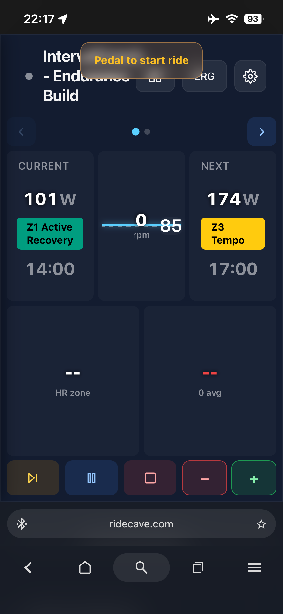
I also add a panel for the overview, although the overview graph displays only lines without intensity bars.
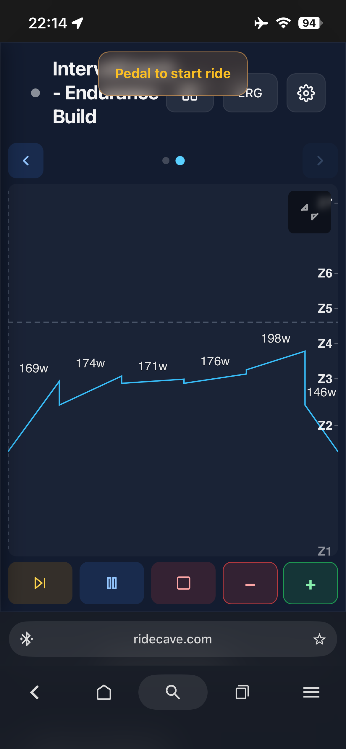
It would be nice the overview would shows color-coded bars for each intervals based on intensity and a label with the target W and time.
I like that idea, Marco and I will add it (or an option for it). I also see some areas of improvements I can make in your screenshots. Thank you and thanks for giving the views concept a try!
@Marco_Saraceno color coded power blocks are live. You can turn them OFF in settings.
1 Like