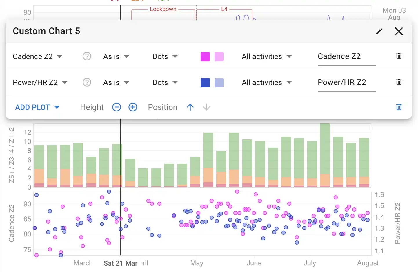
Hi - would like to build a Power Zone distribution trend chart, with Power/HR plots. In fact exactly like the example chart shown in About | Intervals.icu (Build Your Own Charts - Custom Chart 5).
Can you advise how as I have tried it in the Compare - Add Chart - Custom, but still can’t get it.
Thanks