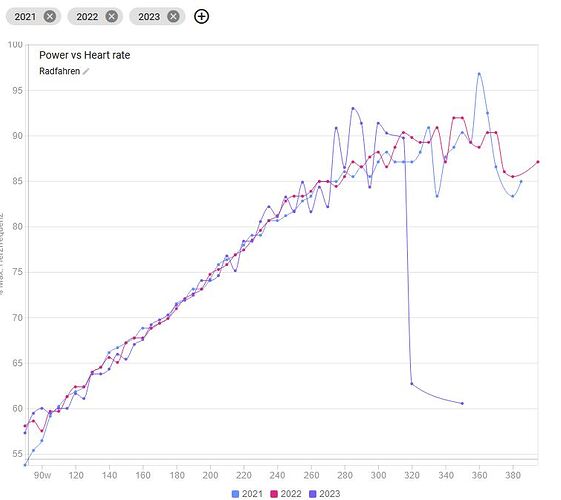
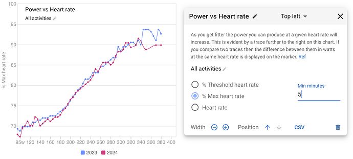
Is there a posibility to check the data source of the Power vs Heart Rate - Diagram? I have some irregularities in the diagram and don´t know why:
I’m interested in this too. I’ve been tracking my recovery from an injury last summer, and I can see clear progress. But there’s the odd bit of rogue data, which actually seems to change over time.
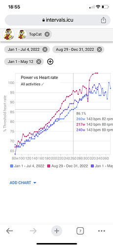
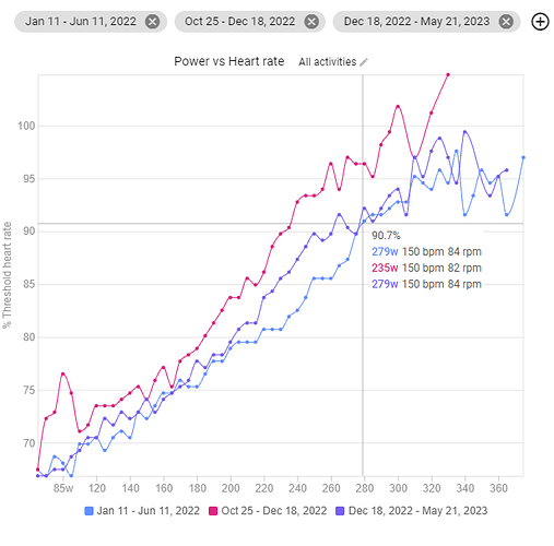
So in my first image, taken last Saturday, I had a massive dip point in my 95% HR power in the Aug 22 to Dec 22 period. Then in the second image, taken today, that dip is still there, but less big. But clearly the actual data can’t have changed as it is historical from last year.
And there’s a strange mismatch in my current season in zone 3.
On the whole, though, I can see the trend of improvement, but I’m just a bit curious about those little (possible) anomalies.
The date ranges differ in between the 2 screenshots! Aug29-Dec31 versus Oct25-Dec18

Oops, that’s a moment of muppetry and PICNIC there! Sorry you had to point that out (that’s the trouble with looking at data on the phone and then later on desktop!).
any thoughts about why there’s still a gap in the zone 3 range? It’s not like I’ve been avoiding that zone in my post injury rides and it seems odd that my post-injury figures are tracking my pre-injury figures either side of that zone.
I’ve noticed that in my data too but I’m more doing Polarized training especially during the winter on the trainer. Once i start riding outside, it gradually fills in but takes time.
I think it has to do with the way the calculations are made. The source data is buckets of 30sec with Power/HR. If you ride outdoors, things are way more variable and it happens regularly (at least in my case), that you push Z3 Power for a short while to crest a small uphill or to pass a roadsign or similar. The HR isn’t really picking up all the way like it would for a longer Z3 effort and thus the Z3 power is logged with a lower HR.
Not sure if this is the real cause, but it seems plausible.
I found my wrong data by brwosing all activites 
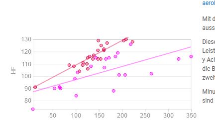
Each power vs HR point on the chart is constructed from all activities that had at least 1 good minute of power in that bucket. So there are many activities for every point and it’s not so easy to present that in the UI. Likely just about every ride in the time period will have points in all of Z2 etc. etc…
Would it be possible to add a min # of minutes maybe? To help reduce false positives?
I’m pretty confident that something with 100+ minutes at a particular power + BPM is accurate, less so when there’s 1-5 minutes
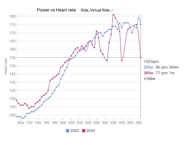
I have added the number of minutes of data in the bucket to the marker. That info is also included in the CSV download for the chart.
Thx David!
reffering to ryan´s suggestion: would it be possible to set a duration-filter?
Oops, should have been clearer, was hoping for a filter for minimum number of minutes to eliminate buggy data.
eg:
Ah ok. I have added a filter (default 5 minutes) and will deploy Friday AM (GMT+2). It cleans the chart up quite nicely. Tx.
Thanks for the lightning response and fix, you’re fantastic ![]()
Short feedback: PERFECT ![]()
I like the idea of the changeable duration but I also use the tool to compare similar rides (e.g. the same Z2 session I do every Friday morning). And setting the default to 5mins meant all the data had disappeared when I put the dates in, and I had to spend some time in the settings and then coming to this forum thread to figure it out.
I’d suggest leaving it at 1min but with the option to increase for those who need it.
