A couple of feature requests for the /Power page and graph if I may:
Ability to lock the marker as is possible on the /Fitness page/ graph - this will allow selecting the activity which is associated with a certain power much easier
Ability to export the .csv of your Power Curve to show the Model field and also Sub Maximal Efforts (5 next best efforts) for all selected timeframes (This Season, Last Season, Custom defined, etc.) - this is good to help with Cluster Analysis and Training Load to Peak assessment
Ability to toggle and overlay of the Power Profile chart onto the Power Curve to more easily identify strength and weaknesses
New to the forum so apologies if the question has been asked before. Absolutely love the custom charts that can be generated on the ‘compare’ tab. Extremely useful to plot correlations. The way in which zero-values are handled is not completely clear to me though. When multi-day averages are used for variables, I do get the impression that all days are included, also the days with no training activities. As a consequence the correlations are heavily influenced by the frequency of trainings. Are zero values included and is there an option to switch that off? Thank you!
If you use a moving average then it should behave appropriately re including zeros/no data or not depending on the underlying variable. For example “weight” does not include days with no data in the moving average but “training load” does.
So a 7 day moving average of weight with only 4 days filled in will divide the 7 day total by 4. But a 7 day moving average of training load will divide the 7 days total by 7 even if you had some rest days.
If you found somewhere where this isn’t working please post some screenshots etc. so I can sort it out. Tx.
Thank you David. Ride eFTP was one value that I was in doubt about. Also because the scale/axis values in a graph with Ride eFTP averaged over 60 days looks weird to me.
I can see the difference, thank you. Only when using Fitness Average the scale still looks a bit funny to me. That might be due to my misunderstanding of the fitness average algorithm. But an exponentially weighted average should not lead to ~40% lower values (and I did not have a very significant drop in eFTPs) right?
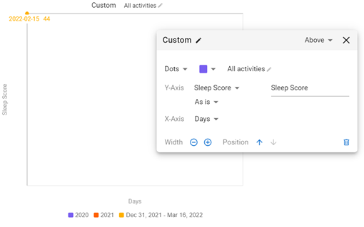
I have also been trying to plot sleep score over time. It shows data points when selecting ‘weekly total’ (only to experiment) but not when selecting ‘as is’. Is that possibly a bug?