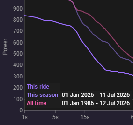
Can we get power curve colors to be more distinguishable? The first two lines selected are nearly identical, just different intensities of the same color, and I don’t think the lines actually match the text key. Doesn’t seem to matter if dark or light mode.