Here is a start. It assumes your data has 1 second per point and uses a 5 second moving average of power (power data is spikey). Intervals.icu calculates these things on an interpolated power stream with 1 second per tick. I need to make that available to scripts to do this properly.
{
  let watts = icu.streams.fixed_watts
  let maxWatts = 0
  for (let w of watts) if (w > maxWatts) maxWatts = w
  let bucketSize = 5
  let buckets = []
  let x = []
  for (let i = 0; i <= (maxWatts / bucketSize); i++) {
    buckets.push(0)
    x.push(i * bucketSize)
  }
  let totWatts = 0
  let window = 5
  for (let i = 0; i < window; i++) if (watts[i]) totWatts += watts[i]
  for (let i = window; i < watts.length; i++) {
    let w = totWatts / window
    let bucket = Math.floor(w / bucketSize)
    buckets[bucket] += w
    if (watts[i]) totWatts += watts[i]
    if (watts[i - window]) totWatts -= watts[i - window]
  }

  let data = [
    {
      x: x,
      y: buckets,
      type: 'bar',
      marker: {
        color: '#63c',
        opacity: 0.7
      }
    }
  ]

  let layout = {
    title: {
      text: "Time in " + bucketSize + "w buckets"
    },
    margin: {
      l: 30,
      r: 20,
      t: 20,
      b: 30
    }
  }

  chart = { data, layout }
}
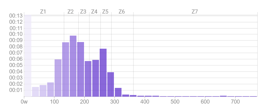
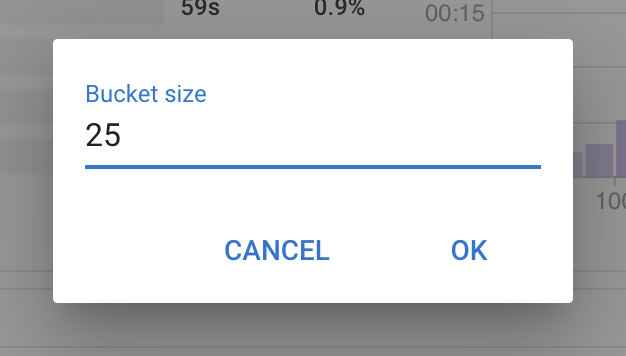
You can’t plot this histogram for lots of activities yet. That is on the todo list. I have made the bucket size for power and heart rate histograms configurable. Click the pencil icon at the bottom left of the chart:
Currently, the y-axis does not adjust its range when you change the bucket. Maybe add a line of code to make the y-axis range depend on the largest value (time in minutes or seconds), given for the selected (default) bucket size? Then it should be perfect.
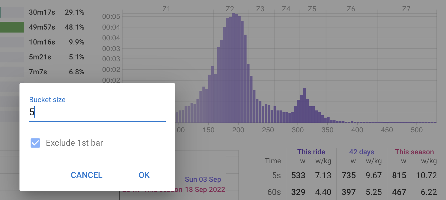
It does adjust the range but there is always a chunk of time in the 0 watts bucket. This shows up more when there are many small buckets. I have added an option to exclude the 1st bucket from the chart: