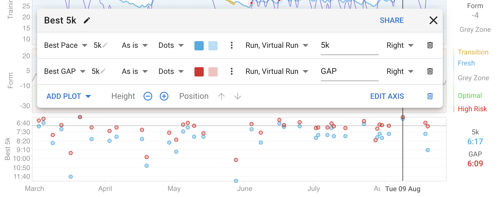
Best power and pace can now be plotted on the fitness page on custom charts.
Click the charts to get your own copy.
You can edit the charts to change the distance, units (e.g. to use mins/mile instead of km), time, sports and other settings.
Best power and pace can now be plotted on the fitness page on custom charts.
Click the charts to get your own copy.
You can edit the charts to change the distance, units (e.g. to use mins/mile instead of km), time, sports and other settings.
Fantastic David!! Very useful for plotting my 1k progress at the same HR over time.
Cool thanks.
This is a cool feature, I just played around with it. I wasn’t able, though, to generate a graph which gives me much insight, as my best say 20m power is very spread across the season, and such a chart makes it hard to recognize trends. But I noticed this: there is an option for a ‘weekly max’. Could you maybe extend that so that the maximum value for any given time period can be plotted? Say, best power over 1 month? Then, trends could be possibly visible.
It would also be super interesting to be able to plot best efficiency for given durations, say best Power/HR for 5 minutes over one moth.
Don’t know how hard that is to implement though. Cheers 
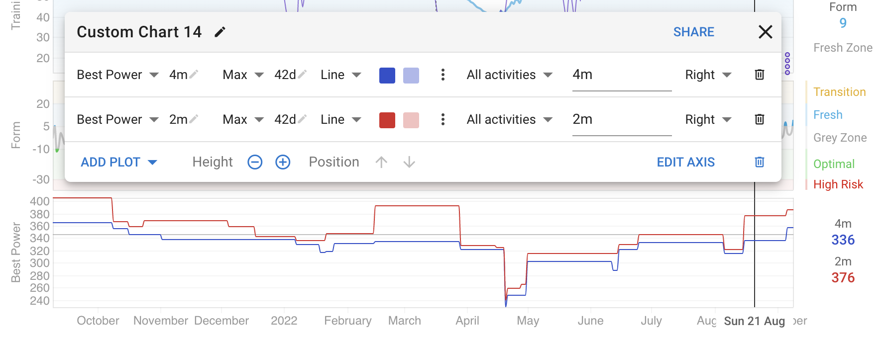
I have added support for “Max” with a configurable duration (42d by default):
I am going to be doing the same with many of the existing aggregates.
Thats hard right now. The power curves are precomputed and stored to make these charts fast.
I’m having some trouble getting this to work. I can make the plot appear but either the points or the left axis are wildly wrong. According to the chart my pace is on the order of 5:20 a mile, which is far from what I am doing.
I have fixed this. For pace the “Max” is actually a min (secs/mile).