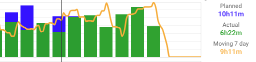
I’m noticing something odd in one of my charts, Planned vs. Actual Duration, in the attached screenshot, the bars to the right of the vertical line represent planned duration [workout time not yet completed], however their colour is green, they should be blue as green = the actual duration, see screenshot of the chart config. Surely the bars to the right should be blue?
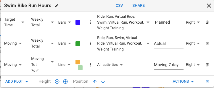
Target time is specifically just the value from the weekly snapshot.
I’m not sure why Moving Time was decided to include planned future activities - changing that now might break a lot of charts.
But Elapsed Time only counts activities you have completed so that may be useful for your chart.
Thank you David, using Elapsed worked. I agree, doesn’t make sense to include Moving Time in Planned, intuitively I thought it would not be included, which is why I configured my chart that way.