Currently, in “line” mode on a compare plot, it always connects the points on the plot from left to right according to their x-axis location. However, it would be nice to be able to connect the points according to their temporal order, thus enabling clear visualization of phase space trajectories.
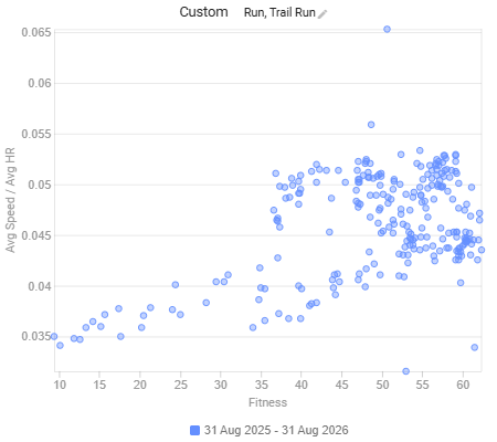
For instance, suppose you wish to understand how your efficiency has evolved in conjunction with your fitness over the course of a year. Every activity has a tuple of (x=fitness, y=efficiency), illustrated here:
(and yes I know, I am defining eff. as speed / hr, but since I do 95% of my running on a track, it’s a close enough proxy for the intervals.icu power definition)
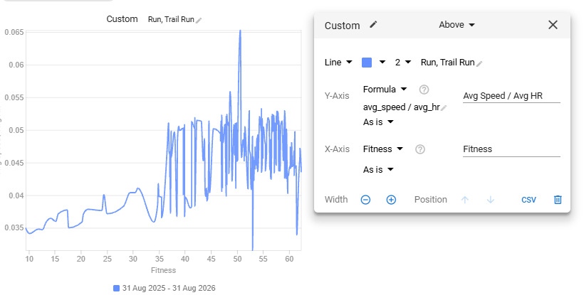
If we switch to line mode, the points are connected from left to right:
Switching to monthly averages just to generate fewer points:
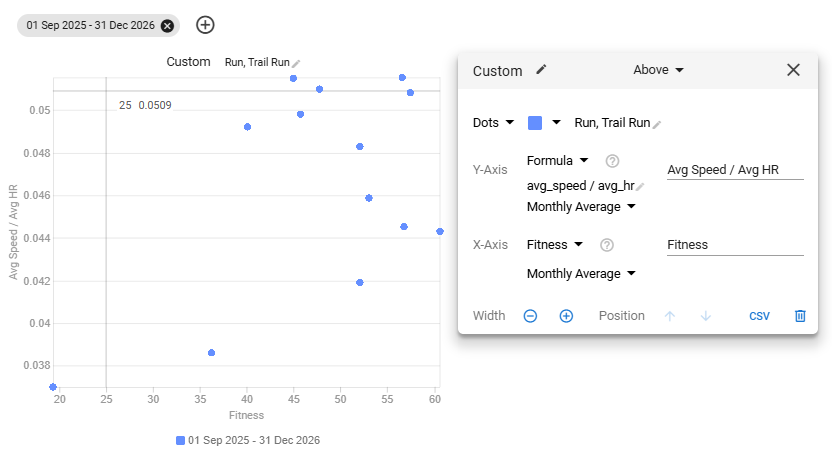
And then segmenting by time period, you can start to see the trajectory:
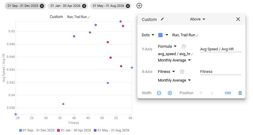
And you can of course use more colors:
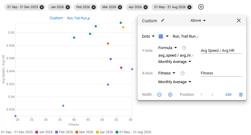
But it would be much easier if you could use a “line” mode which connects those points in their temporal order like a normal phase space plot, rather than
what currently happens in line mode:
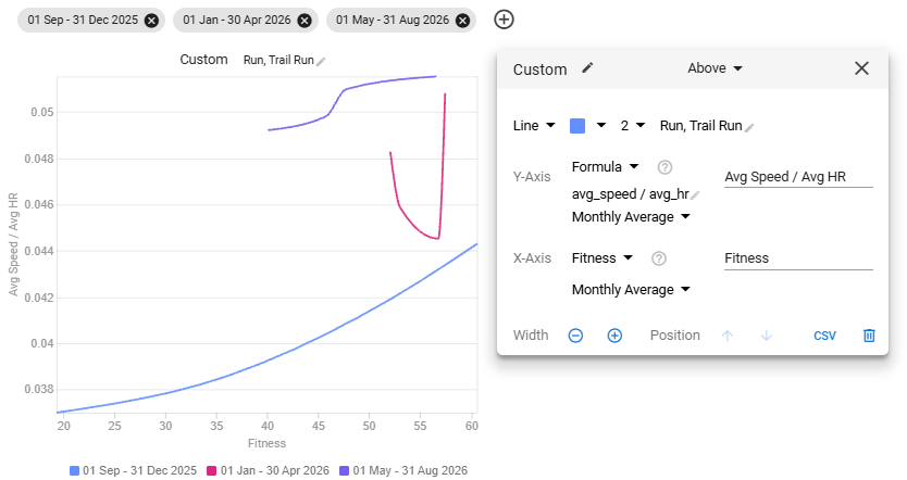
Notice how the points in the Jan-Apr segment have been connected left to right, rather than in the correct order. It’s of course worse if we do not have the monthly segmenting:
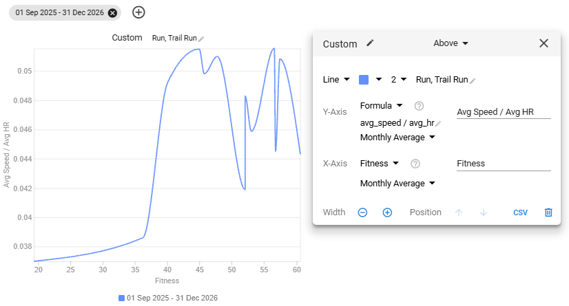
I think there are probably relatively few cases where you would ever want the left to right ordering for the line drawing (except for when the x-axis is itself time, in which case ordering connections by points would already get you the same result).
Additionally, it would be fantastic if we had the ability to set the limits of the x- and y-axes in plots (or at least have an option to have them run to 0).