Hello there,
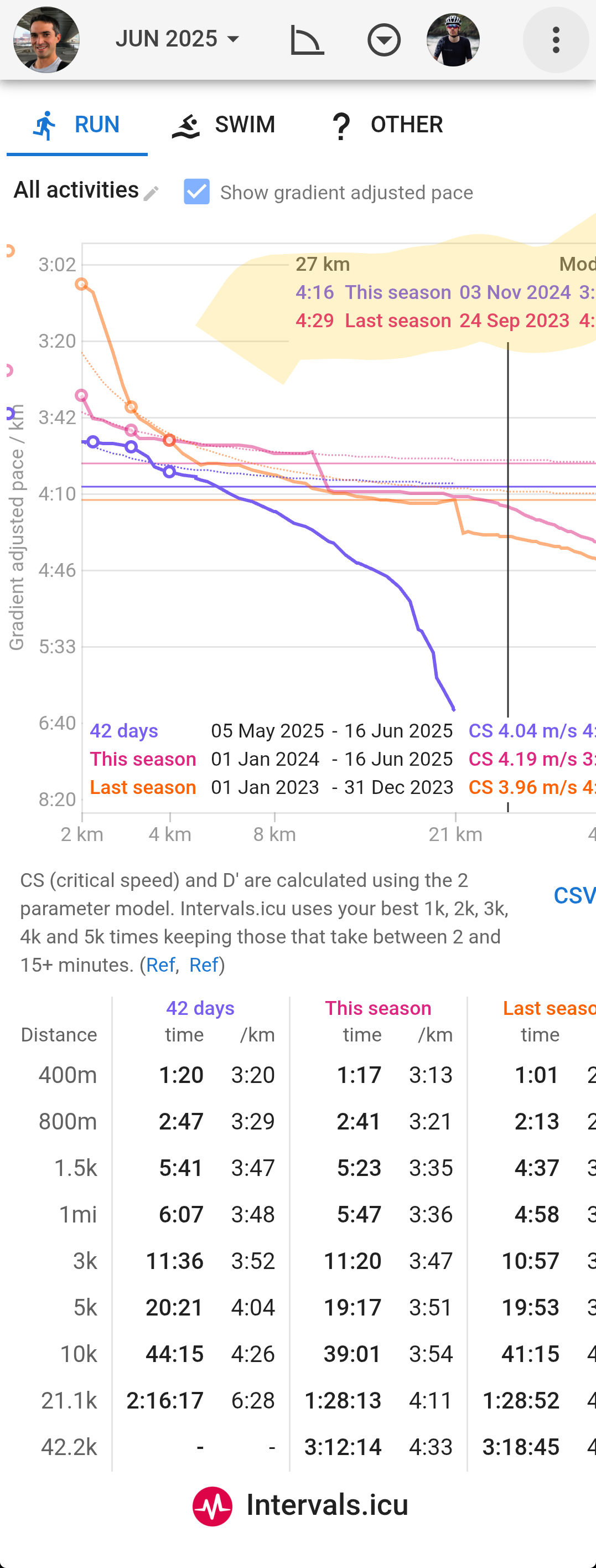
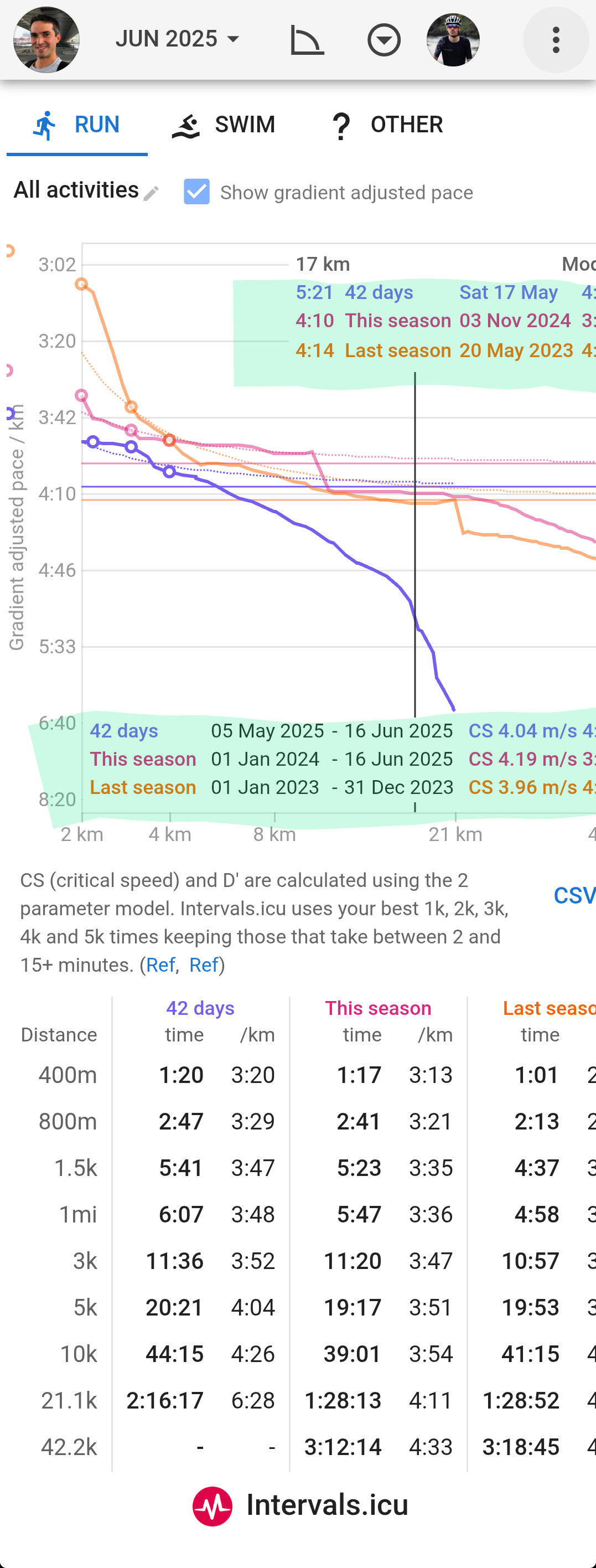
See the two screenshots attached for easy illustration.
When selecting a distance long enough so that there is no date for one of the seasons selected (e.g. no data for “42 days” and 27km in my example), the colors for the dynamic legend at the top of the graph look to be taken from the same order as the colors from the the static legend for the whole graph (where last “42 days” comes out first), whereas the text shows (correctly) only the seasons where there is data for the selected distance and where the vertical line crosses the related plot lines.