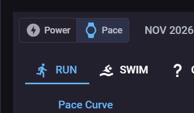
The pace curve on the pace page (Best Efforts - Pace) can now be shown against time as well as distance, the same way the power curve is. Use the new Distance / Time toggle above the chart. Your choice is remembered.

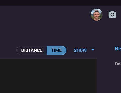
By time, each best effort is placed at how long it took instead of how far it was, so you can read off your best pace for 5, 20 or 60 minutes directly.
- Hover over the chart to see each curve’s best pace at that time, the distance it covered, and the activity it came from.
- Critical speed, the model curve and sub-maximal efforts (under Show) all work in both views.
- On phones the toggle sits on its own row under the chart title.
The pace tab on the activity page and the compare page still show the pace curve by distance for now.