I love the fitness page in intervals. It gives me a very good insight in the athletes over time. However I’m running out of space on the page. The bar on top showing the values at the highlighted time overflows to the right of the page. Would it be possible to either make it wrap or would it be possible to have multiple tabs so I can shard the data. I could make “dashboards” for: health, exercise, bike specific, run specific, etc.
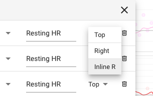
Wow I see what you mean. I recently added support for showing the marker value(s) on the right hand side of each chart instead of on top:
What I need to do is support groups of charts so then you could have different browser tabs showing different groups.
1 Like
I recently added support for showing the marker value(s) on the right hand side of each chart instead of on top
Ah that is a nice temporary solution at least.
What I need to do is support groups of charts so then you could have different browser tabs showing different groups.
Indeed I think grouping them would not only be good so I can have more graphs, but also because it is a lot clearer that way.
See it as a compliment. A lot of good graphs are to be made with the tools you’ve provided 
2 Likes